
TYPEFACE VS FONT
What if there’s a simple distinction that instantly makes you sound like an insider instead of a beginner? Everyone says “font.” Professionals say “typeface” — and they mean something different. Here’s the distinction that separates beginners from insiders.
CORE CONCEPT
IMPORTANCE OF TYPEFACE VS FONT
KEY KNOWLEDGE
1
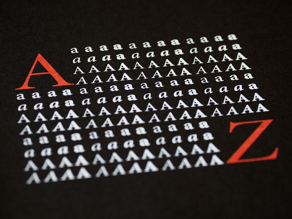
A typeface is a designed family of letterforms with a consistent visual identity (e.g., Helvetica, Garamond, Futura, Arial)

REAL WORLD EXAMPLE
Think of a Bollywood music family — the Mangeshkars. That's the family name. Lata Mangeshkar, Asha Bhosle, Usha Mangeshkar — each one is a distinct individual, but they all share something recognisable, a family resemblance. A typeface works the same way. "Helvetica" is the family. It's the name on the door. Every letter in Helvetica shares the same DNA — the same proportions, the same curves, the same personality. But within that family, there are many variations: thin, light, regular, bold, black, italic, condensed. The typeface is the identity. It's the design. It's what makes Helvetica look like Helvetica and not like Times New Roman. When someone says "I love that typeface," they're talking about the whole family.
2
A font is a specific weight, style, and size within a typeface family (e.g., Helvetica Bold, Helvetica Light Italic, Garamond 12pt Regular)
REAL WORLD EXAMPLE
If "Helvetica" is the song, then "Helvetica Bold 16pt" is a specific recording of that song — a particular version played at a particular volume. When your teacher says "type this in Times New Roman, size 12, bold" — that complete instruction is a font. "Times New Roman" alone is the typeface. "Times New Roman Bold 12pt" is the font. The distinction is like the difference between saying "let's listen to some A.R. Rahman" (the artist — that's the typeface) and "play Jai Ho, the full version, at medium volume" (the specific track at a specific setting — that's the font). In casual conversation, calling everything a "font" is fine. But in professional creative work, this precision matters because a designer saying "use Montserrat" is incomplete — they need to say "Montserrat SemiBold 24pt" for the heading.
3
Typeface = the design. Font = a specific instance of that design
REAL WORLD EXAMPLE
Think of it like this: a recipe for dal is the typeface — it's the design, the concept, the thing that makes dal "dal." But the actual bowl of dal you're eating — cooked at a specific temperature, with a specific amount of salt, served in a specific portion — that's the font. One is the idea. The other is the specific execution. Or think of a school uniform: the uniform design (white shirt, grey trousers, blue tie) is the typeface. YOUR specific uniform (size medium, sleeves rolled, tie slightly loose) is the font. The design is the system. The font is one precise expression within that system.
4
Simple analogy: typeface is the song, font is the specific recording. Or: typeface is the recipe, font is a specific serving size

REAL WORLD EXAMPLE
Your favourite song exists as a concept — the melody, the lyrics, the structure. That's the typeface. But you've heard it in different forms: the studio version, the unplugged version, the live concert version, the remix. Each one is a font — a specific version of the same core design. Some versions are louder (bold). Some are softer (light). Some are faster (condensed). Some add new textures (italic). But they're all recognisably the same song. Next time you scroll through Google Fonts and see a typeface with 18 different weights and styles, you're looking at 18 recordings of the same song — and a designer's job is to pick the right recording for the right moment.
5
A single typeface family can contain many fonts: Regular, Bold, Light, Italic, Bold Italic, Condensed, Extended, and more
REAL WORLD EXAMPLE
Open Google Fonts on your phone and search for "Roboto" — the typeface Google designed for Android. You'll find Roboto Thin, Roboto Light, Roboto Regular, Roboto Medium, Roboto Bold, Roboto Black. Then each of those has an Italic version. Then there's Roboto Condensed — a narrower version — with its own set of weights. One typeface, over a dozen fonts. That's not unusual. Some professional typeface families contain 50+ fonts. Why so many? Because a headline needs Bold, body text needs Regular, a caption needs Light, emphasis needs Italic, a tight space needs Condensed. One family handles every situation, maintaining a consistent personality throughout. It's like a cricket team — same jersey, different roles.
6
In casual conversation, “font” is used for everything — and that’s fine. In professional work, precision matters
REAL WORLD EXAMPLE
When your friend says "I love the font on that poster," nobody corrects them. It's casual. It's fine. But imagine a graphic designer on a Zoom call with a client saying "use a nice font." The client would hear... nothing useful. Which typeface? Which weight? What size? Now imagine the designer says "the headline is set in Playfair Display Bold at 36pt with 2% tracking, and the body copy is Source Sans Pro Regular at 14pt with 24pt line-height." That's professional precision. It's like the difference between telling someone "make something tasty" and giving them an actual recipe with measurements. Both versions of language are valid — in different contexts. But the moment you step into creative work, the precision is what makes you sound like an insider instead of a beginner.

7
The choice of typeface is the bigger creative decision (personality, tone). The choice of font is the detailed specification (weight, style, size)

REAL WORLD EXAMPLE
When a brand like Zomato decides to use a rounded, friendly typeface, that's the big personality decision — it says "we're approachable, fun, and casual." That choice shapes everything. But then the design team makes hundreds of smaller font decisions: the app headline is Bold 20pt, the restaurant name is SemiBold 16pt, the menu item is Regular 14pt, the price is Medium 14pt, and the delivery estimate is Light 12pt in grey. The typeface decision is like choosing which actor plays the lead role — it defines the character. The font decisions are like choosing the costumes, the lighting, and the camera angle for each scene — they bring the character to life in specific situations.
8
Typefaces are designed by type designers — an entire creative profession dedicated to crafting letterforms

REAL WORLD EXAMPLE
Somewhere right now, a person is sitting at a desk, zoomed into a single letter "g" at 400%, adjusting the curve of its ear by 0.3 millimetres. They've been working on this alphabet for two years. They've drawn the letter "a" over 200 times before getting it right. They're a type designer — and their job is to create the typefaces that the entire world reads. India has its own brilliant type designers working on Devanagari and other Indian script typefaces, because designing type for Hindi or Tamil or Bengali requires a completely different understanding of how letters connect, how strokes flow, and how readers' eyes move. It's one of the most invisible yet impactful creative professions that exists — a single type designer's work can be read by billions of people every day.
Pro Connection
In creative briefs, you’ll see “select a typeface for the brand identity” — that’s the big personality decision. Then “specify fonts for headings, body, and captions” — that’s the detailed system. A UI designer says “the heading font is Inter SemiBold 20.” A brand designer says “our brand typeface is Playfair Display.” Knowing the distinction helps you speak precisely in professional conversations.
PROFESSIONAL TERMINOLOGY
CLICK TO REVEAL and CLICK TO COVER
A family of designed letterforms sharing a consistent visual style — the "family name" (e.g., Helvetica)
What is
TYPEFACE
A specific weight, style, and size within a typeface (e.g., Helvetica Bold 16pt)
What is
FONT
The complete collection of all weights and styles within a typeface (Regular, Bold, Light, Italic, etc.)
What is
TYPE FAMILY
A professional who designs typefaces — crafting every letter, number, and symbol in a consistent style
What is
TYPE DESIGNER
How thick or thin the strokes of a typeface are — Light, Regular, Medium, Bold, Black (from thinnest to thickest)
What is
WEIGHT
A variation of a typeface beyond weight: Italic (slanted), Condensed (narrow), Extended (wide)
What is
STYLE
THE TYPE WAKE-UP
You've been reading all day — but not once have you actually noticed what the letters look like. That's about to change.
what TO DO
For the next hour, keep your eyes open for typography everywhere — on your phone, on packaging, on signs, on screens.
Find 5 different examples of typography around you.
For each example, ask yourself: how does this type make me FEEL? Pick one feeling word.
Write them down: where you found it + the feeling it gives you. ("Instagram bio — clean and modern", "Chip packet — loud and fun"…)
Show your list to someone and see if they agree with your feeling words.
CHALLENGE
DISCOVERY
You can use these SOFTWARES for this Discovery Challenge
FREE SOFTWARE : Google Fonts, Chrome Browser, Google Keep
PAID SOFTWARE : Fontstand, GoodNotes 6