
THE ANATOMY OF LETTERS
Letters have shoulders, arms, legs, spines, ears, and tails. Once you learn their anatomy, you’ll see every letter as a tiny piece of architecture.
CORE CONCEPT
IMPORTANCE OF THE ANATOMY OF LETTERS
KEY KNOWLEDGE
1
Baseline: the invisible line that letters sit on — the foundation of all typographic alignment

REAL WORLD EXAMPLE
Hold a ruler along the bottom of any line of text on your screen. See how every letter sits neatly on the same invisible line? That's the baseline — the floor that all letters stand on. It's invisible, but it's the most important structural element in typography. Without it, letters would float at random heights and reading would become impossible. The baseline is why text feels "straight" even when the letterforms themselves are complex and irregular. It's like the foundation of a building — you never see it, but remove it and everything collapses. Next time you see hand-painted lettering on a shop sign where the letters wobble up and down, you'll know exactly what's wrong: the painter lost the baseline.
2
X-Height: the height of lowercase letters (measured by “x”). A large x-height feels open, friendly, modern. A small x-height feels elegant, classical, refined
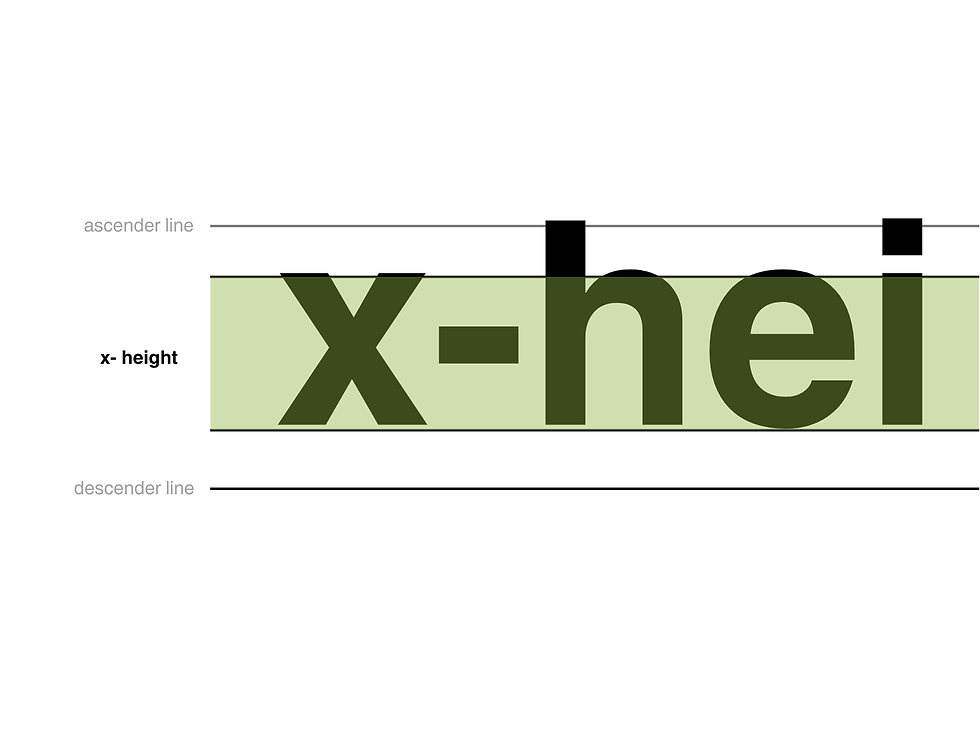
REAL WORLD EXAMPLE
Type the letter "x" in two different typefaces — say, Verdana and Didot. Same font size. Same point number. But the Verdana "x" looks noticeably bigger. That's because Verdana has a large x-height — its lowercase letters are tall relative to the capitals. Didot has a small x-height — its lowercase letters are short, with tall, elegant ascenders shooting up above them. This single measurement — how tall the lowercase letters are — changes the entire personality. Large x-height typefaces (Verdana, Open Sans, Roboto) feel open, friendly, and are easy to read on screens. Small x-height typefaces (Didot, Bodoni, Garamond) feel luxurious, classical, refined. Vogue uses small x-height. Google uses large. That's x-height doing its invisible personality work.
3
Ascender: the part of a lowercase letter that rises above the x-height (top of “b”, “d”, “h”, “l”)

REAL WORLD EXAMPLE
Look at the word "birthday" on your screen right now. See how the "b," "d," and "h" all have strokes that reach up higher than the "i," "r," "t" (well, the "t" reaches up a little too), and "a" and "y"? Those upward-reaching strokes are ascenders — the parts that rise above the x-height. In elegant typefaces, ascenders are tall and proud, creating a feeling of grace and verticality. In compact typefaces, ascenders are shorter, saving space. The ratio between ascender height and x-height is one of the key differences that make two typefaces feel completely different even when both are, say, sans-serif. Tall ascenders = elegant and airy. Short ascenders = compact and modern. One subtle measurement, a world of personality change.
4
Descender: the part of a lowercase letter that drops below the baseline (tail of “g”, “p”, “q”, “y”)

REAL WORLD EXAMPLE
Write the word "typing" and look at it carefully. The "t," "i," and "n" sit neatly between the baseline and the x-height. But the "y," "p," and "g" all have tails that drop below the baseline — reaching down into the space below. Those tails are descenders. They're the reason lines of text need space between them — if the lines are too close together, the descender of a "g" on one line will crash into the ascender of an "h" on the line below. Type designers spend enormous effort on descenders because they affect how open or cramped the text feels. A "g" with a long, flowing descender feels elegant. A "g" with a short, tucked descender feels compact. Every "y" you've ever read was a descender design decision.
5
Stroke: any line that forms a letter — can be thick, thin, curved, straight, or variable
REAL WORLD EXAMPLE
Look at the capital letter "O" in two different typefaces. In one, the stroke — the line that forms the circle — is the same thickness all the way around (uniform stroke, common in geometric sans-serifs like Futura). In another, the stroke is thick on the sides and thin at the top and bottom (variable stroke, common in classical serifs like Bodoni). That variation in stroke thickness is one of the most character-defining features of any typeface. Thick, uniform strokes feel modern and strong. Thin, delicate strokes feel elegant and refined. Variable strokes — thick and thin alternating — feel classical and sophisticated. The stroke is the actual drawn line of the letter, and its character is the first thing your eye registers, even before your brain processes the shape.

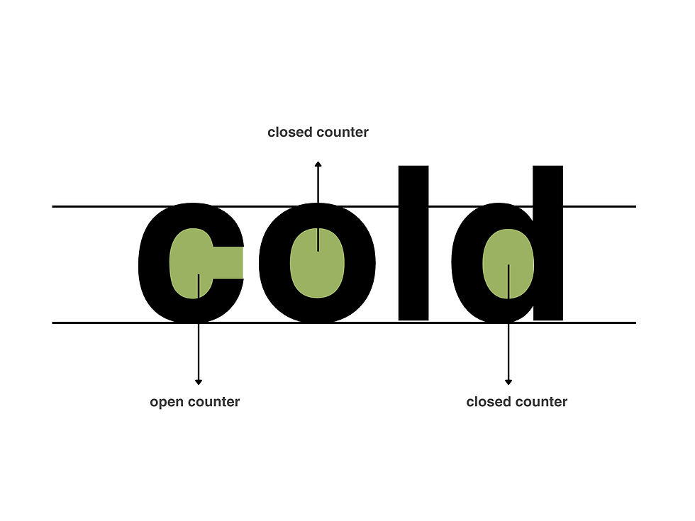
6
Counter: the enclosed or partially enclosed space inside a letter (the hole in “o”, “a”, “e”, “d”)
REAL WORLD EXAMPLE
Look at the letter "o" on your screen. See the white space inside the circle? That's the counter — the enclosed space within a letter. Now look at the letter "e" — it has a partially enclosed counter, with a small opening. Counters matter enormously for readability: if the counters are large and open, the typeface feels friendly, readable, and clear — especially at small sizes on a phone screen. If the counters are small and tight, the letters start to close up and become harder to distinguish. This is why typefaces designed for mobile screens (Roboto, San Francisco) have generously open counters. At 12 pixels on a phone, the difference between a readable "a" and an illegible blob is the size of the counter.
7
Bowl: the rounded, curved stroke that creates an enclosed space (as in “b”, “d”, “p”, “q”)
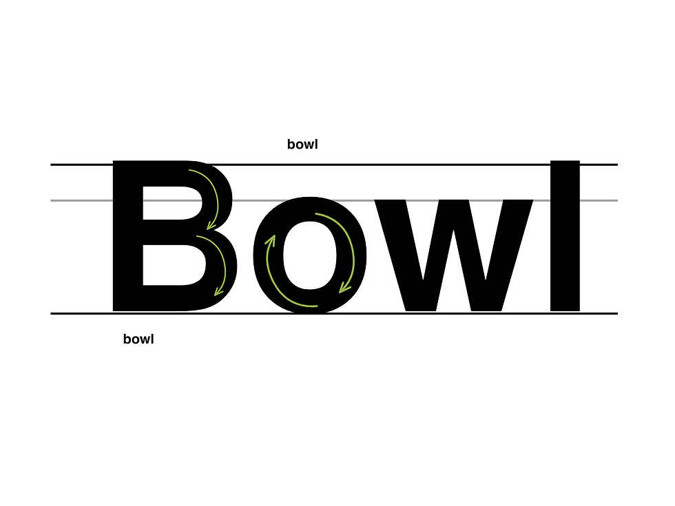
REAL WORLD EXAMPLE
Look at the letter "b." The vertical stroke going up is the stem. But that beautiful curved part that swings out to the right and comes back to create the enclosed belly — that's the bowl. It's the rounded shape in "b," "d," "p," "q," and the upper part of "g." The shape of the bowl — perfectly round or slightly squared, wide or narrow, symmetrical or organic — is one of the things that gives a typeface its distinctive character. A typeface with perfectly circular bowls (like Futura) feels geometric and precise. One with slightly squared bowls (like many humanist sans-serifs) feels warmer and more natural. You're reading hundreds of bowls right now on this screen, and each one was drawn and redrawn by a type designer until the curve felt exactly right.
8
Stem: the main vertical stroke of a letter (the backbone of “h”, “l”, “d”)
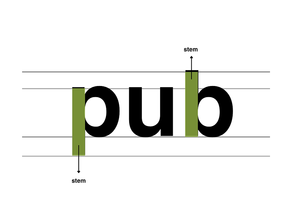
REAL WORLD EXAMPLE
If a letter were a person, the stem would be the spine — the main vertical stroke that holds everything together. In the letter "h," the left side is the stem, and the arch on the right is the shoulder. In the letter "d," the right side is the stem, and the bowl curves out to the left. In "l," the entire letter IS a stem — just a single, proud vertical stroke. The thickness of the stem determines the weight of the typeface. A thin stem = Light. A medium stem = Regular. A thick stem = Bold. When a designer says "this typeface feels heavy," they're usually talking about the stem width. It's the backbone, the structure, the skeleton that every other part of the letter attaches to.
Pro Connection
Type designers discuss anatomy constantly: “the x-height is too low,” “the counters need opening up,” “the ascenders feel short.” Graphic designers use anatomy to explain choices: “I chose this typeface because its large x-height improves screen readability.” Even if you never design a typeface yourself, knowing anatomy lets you see type with precision and talk about it with authority.
PROFESSIONAL TERMINOLOGY
CLICK TO REVEAL and CLICK TO COVER
The invisible line that letters sit on — the foundation of alignment in any text
What is
BASELINE
The height of lowercase letters (measured by "x") — dramatically affects how a typeface feels
What is
X-HEIGHT
The part of a lowercase letter rising above the x-height (top of b, d, h, l)
What is
ASCENDER
The part of a lowercase letter dropping below the baseline (tail of g, p, q, y)
What is
DESCENDER
Any line that forms part of a letter — can vary in thickness and shape
What is
STROKE
The enclosed or partially enclosed space inside a letter (the hole in o, a, e, d)
What is
COUNTER
The rounded, curved part of a letter that creates an enclosed space
What is
BOWL
The main vertical stroke of a letter — the backbone
What is
STEM
THE TYPE WAKE-UP
You've been reading all day — but not once have you actually noticed what the letters look like. That's about to change.
what TO DO
For the next hour, keep your eyes open for typography everywhere — on your phone, on packaging, on signs, on screens.
Find 5 different examples of typography around you.
For each example, ask yourself: how does this type make me FEEL? Pick one feeling word.
Write them down: where you found it + the feeling it gives you. ("Instagram bio — clean and modern", "Chip packet — loud and fun"…)
Show your list to someone and see if they agree with your feeling words.
CHALLENGE
DISCOVERY
You can use these SOFTWARES for this Discovery Challenge
FREE SOFTWARE : Notes App with Font Options, Google Fonts, Google Keep, Canva
PAID SOFTWARE : Procreate Pocket, GoodNotes 6