
TYPE IS EVERYWHERE
What if you’ve seen more typography today than paintings, photographs, and illustrations combined — and you didn’t notice it? That’s actually how good typography works. You’ve seen more typography today than paintings, photographs, and illustrations combined. You just didn’t notice it — and that’s exactly how good typography works.
CORE CONCEPT
IMPORTANCE OF TYPE IS EVERYWHERE
KEY KNOWLEDGE
1
Typography is the art and technique of designing and arranging text to make written language visible, readable, and emotionally effective

REAL WORLD EXAMPLE
Next time you open WhatsApp, look at how the contact name is bold and the message preview is lighter grey below it. That's not random — someone at WhatsApp decided bold for the name so you scan your chats faster, and lighter grey for the preview so it doesn't compete. Now open Instagram — the username is small and bold, the caption is regular weight, the timestamp is tiny and grey. Every app on your phone has a different typographic system, and each one was designed to make reading feel effortless. Typography is the reason you can glance at your phone for two seconds and know exactly who messaged you, what they said, and when. The moment reading feels effortless, a typographer did their job.
2
It’s the most common form of visual design — more widespread than photography, illustration, or any other visual medium
REAL WORLD EXAMPLE
Try counting every photograph you see in a day. Maybe fifty? A hundred? Now try counting every piece of text you see — from the alarm clock digits to the toothpaste brand name to the school signboard to every message, notification, label, menu, textbook page, and shopfront you pass. You'll lose count before lunch. Text is literally everywhere — on your uniform tag, on the auto-rickshaw's licence plate, on the medicine strip in your bathroom cabinet, on the back of the biscuit packet. Every single one of those words was set in a typeface someone chose. Photography may be common. But typography is the air of visual design — so present that you forget it exists.
3
Good typography is invisible — it creates a seamless reading experience where the message comes through clearly
REAL WORLD EXAMPLE
Think about the last time you read an entire article on your phone without once thinking about the text itself. You just... read it. The words flowed, your eyes moved smoothly, the paragraphs felt natural, and all you thought about was the content. That invisible comfort is good typography at work — typeface, size, spacing, contrast, all perfectly set so nothing interrupts you. Now think about the last time you landed on a website where the text was tiny, cramped, or weirdly spaced. You probably left within seconds. You didn't think "the typography is bad." You just thought "this is hard to read" and bounced. Good typography is invisible precisely because it gets out of the way. You only notice typography when it fails.
4
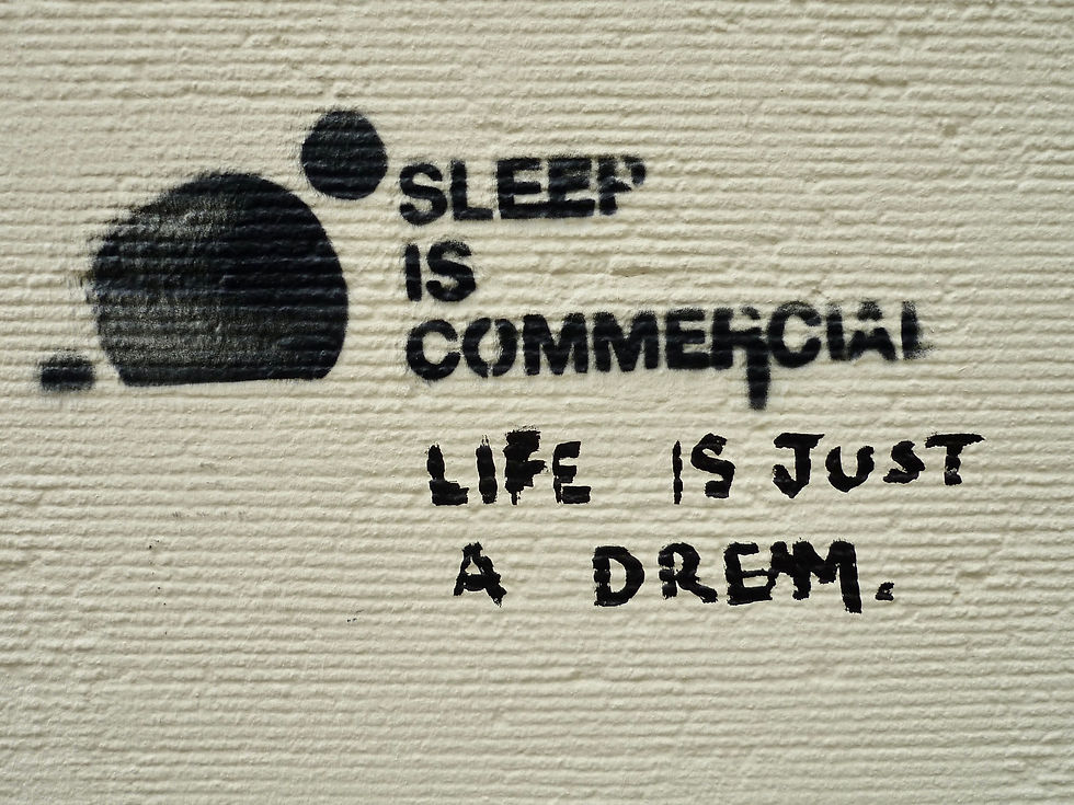
Bad typography is immediately noticeable — hard to read, confusing, or emotionally wrong for the context
REAL WORLD EXAMPLE
You've seen it — that restaurant menu printed in a horror-movie font. Or that wedding invitation set in Comic Sans. Or that chemist shop signboard where the spacing is so wrong that "CLINIC" reads as something else entirely. Bad typography doesn't just look ugly — it sends the wrong message. A hospital sign in playful, bubbly lettering would make you feel less safe, not more. A serious government notice in a casual handwriting font would feel like a joke. Bad kerning — where the space between letters goes wrong — has become an entire internet comedy genre because people photograph signs where poor spacing accidentally creates embarrassing words. You laugh, but the business behind that sign isn't laughing. Bad typography is the one design mistake that everyone notices, even people who know nothing about design.
5
Typography carries two layers of meaning: WHAT the words say (the content) and HOW the words look (the visual message)
REAL WORLD EXAMPLE
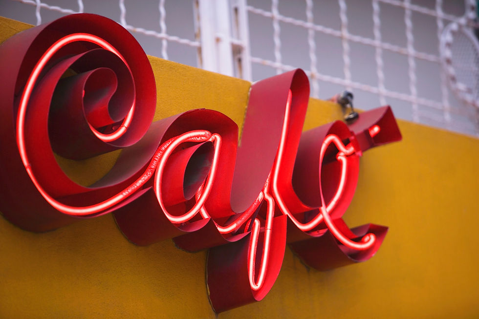
Write the word "SALE" in thin, elegant, widely-spaced capital letters with a serif typeface. It feels like a designer boutique offering a quiet, exclusive discount. Now write "SALE" in thick, red, condensed, all-caps sans-serif crammed into a yellow starburst. It feels like Big Bazaar on a Sunday afternoon. Same word. Same four letters. Completely different message. The first layer — the word "SALE" — tells you there's a discount. The second layer — how the word looks — tells you whether that discount is classy or chaotic, exclusive or mass-market, subtle or screaming. Every piece of text you've ever read has been carrying these two layers at once. You've just been hearing only one of them until now.

6
These two layers can align (serious words in a serious font) or clash (serious words in a playful font) — both are creative choices
REAL WORLD EXAMPLE
There's a famous experiment where designers write "I'm fine" in a heavy, dark, distressed typeface — and suddenly those two innocent words feel like a cry for help. The words say one thing. The type says the opposite. That clash is deliberate, and it's powerful. Film posters do this brilliantly: a romantic comedy title set in a horror typeface becomes an instant joke. Memes rely on this clash constantly — the Impact font screaming over a calm image IS the comedy. But alignment is powerful too: when a luxury perfume ad uses thin, elegant, whisper-light typography, both the word and the look say "sophistication." Alignment amplifies. Clash creates irony. Both are legitimate creative tools — and knowing the difference means you can control both.
7
Typography is used in every creative field: graphic design, branding, UI/UX, film titles, environmental signage, social media, publishing, advertising, spatial design

REAL WORLD EXAMPLE
A graphic designer picks the typeface for a Swiggy campaign. A brand designer specifies the exact font for Tata's annual report. A UI designer decides what size the "Add to Cart" button text should be on Flipkart. A film title designer crafts the opening credits of an OTT series. A signage designer chooses the typeface for the new metro station. A social media manager picks the font overlay for an Instagram reel. A book publisher selects the body text typeface for a bestselling novel. A spatial designer decides what the wall lettering in a WeWork office should look like. Every single one of those people is making typographic decisions — and every single one of those fields needs people who understand type. Typography isn't a niche skill. It's the one skill that touches every creative profession.
8
Learning to see typography is like learning to hear individual instruments in a song — once you notice, you can't un-notice

REAL WORLD EXAMPLE
Before someone points it out, a Bollywood song is just... a song. It sounds good or it doesn't. But the moment a musician says "listen to the tabla in the background — hear how it drops out in the second verse and comes back stronger in the chorus?" — you can't unhear it. Every time that song plays, your ear finds the tabla automatically. Typography works exactly the same way. Right now, you look at a poster and see "a poster." But the moment someone says "notice the headline is a bold sans-serif while the body text is a lighter serif, and see how the tracking in the title is wider than the body?" — it's done. The switch flips. You'll never look at a Zomato notification, a book cover, or a movie poster the same way again. Typography awareness is permanent. The switch doesn't have an off button.
Pro Connection
In every creative studio, typography is taken as seriously as colour, imagery, and composition. Graphic designers may spend days choosing a single typeface. Brand designers specify exact fonts in brand guidelines. UI designers build entire type systems for apps. When a creative director says “the type isn’t right,” they mean the visual message of the text doesn’t match the intent. Typography is one of the primary languages of professional creative work.
PROFESSIONAL TERMINOLOGY
CLICK TO REVEAL and CLICK TO COVER
The art and technique of designing and arranging text — making written language visible and expressive
What is
TYPOGRAPHY
Short for typography — the visual form of written text
What is
TYPE
Any deliberate decision about how text looks: which font, what size, what weight, how much space
What is
TYPOGRAPHIC CHOICE
How easily and comfortably text can be read and understood in context
What is
READABILITY
The emotional or aesthetic meaning communicated by how text looks, separate from what it says
What is
VISUAL MESSAGE
THE TYPE WAKE-UP
You've been reading all day — but not once have you actually noticed what the letters look like. That's about to change.
what TO DO
For the next hour, keep your eyes open for typography everywhere — on your phone, on packaging, on signs, on screens.
Find 5 different examples of typography around you.
For each example, ask yourself: how does this type make me FEEL? Pick one feeling word.
Write them down: where you found it + the feeling it gives you. ("Instagram bio — clean and modern", "Chip packet — loud and fun"…)
Show your list to someone and see if they agree with your feeling words.
CHALLENGE
DISCOVERY
You can use these SOFTWARES for this Discovery Challenge
FREE SOFTWARE : Google Keep, Phone Camera, Apple Notes / Samsung Notes
PAID SOFTWARE : Notability, Day One Journal