
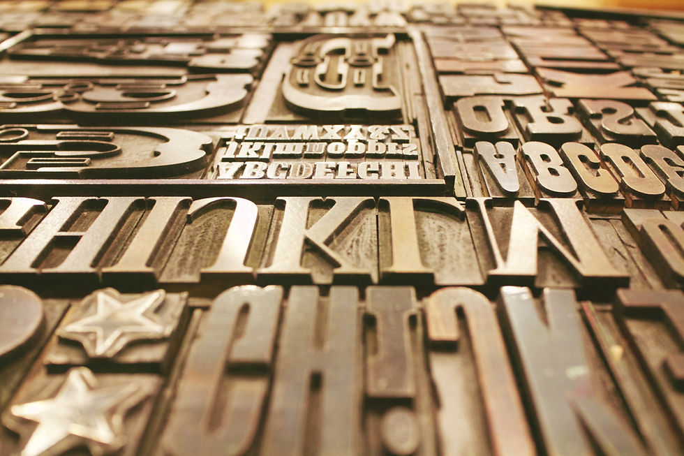
THE BIG CATEGORIES - SERIF, SANS-SERIF, & BEYOND
There are hundreds of thousands of typefaces in the world. But they almost all fall into a handful of categories — and knowing these categories is like knowing the genres of music.
CORE CONCEPT
IMPORTANCE OF THE BIG CATEGORIES - SERIF, SANS-SERIF, & BEYOND
KEY KNOWLEDGE
1
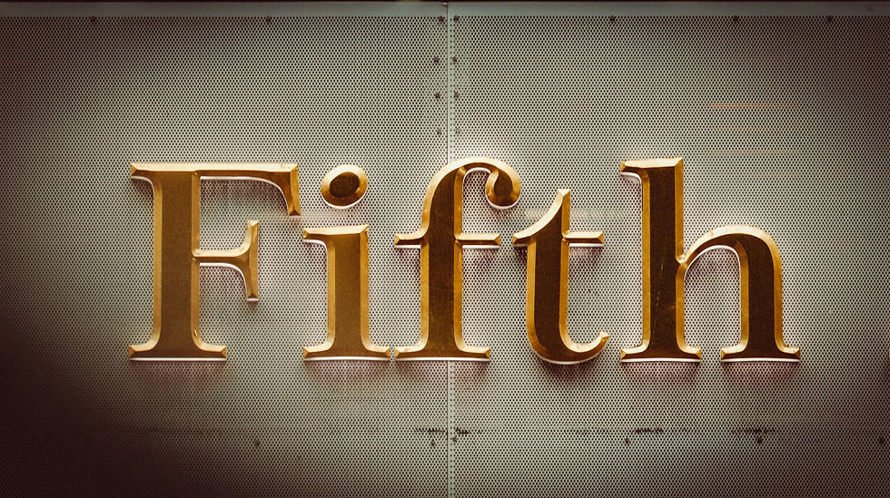
Serif: typefaces with small decorative strokes (“serifs”) at the ends of letters. Feel: traditional, trustworthy, literary, authoritative, elegant
REAL WORLD EXAMPLE
Pick up any newspaper — Times of India, The Hindu, any one. Look at the body text closely. You'll see tiny feet and tails at the ends of letters — small horizontal strokes at the bottom of an "h," little flicks at the top of a "t." Those are serifs. Newspapers have used serif typefaces for over a century because those small strokes do something powerful: they make the text feel trustworthy. Authoritative. Like it comes from somewhere that takes itself seriously. Banks use them. Law firms use them. The Constitution of India is printed in a serif typeface. When you see serifs, your brain registers "this is established, this is reliable, this has been here a while." It's not a coincidence — it's 500 years of typographic tradition doing its job.
2
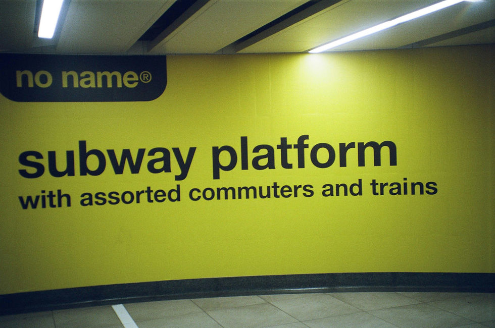
Sans-Serif: typefaces without serifs (“sans” = without). Feel: modern, clean, minimal, neutral, contemporary. Dominate digital/screen design
REAL WORLD EXAMPLE
Open your phone. Look at the system text — the settings menu, the app names, the notification text. It's almost certainly a sans-serif typeface. No feet. No tails. No decorative strokes. Just clean, stripped-down letters. Apple uses San Francisco. Google uses Roboto. Samsung uses One UI Sans. Every major tech company chose sans-serif because it feels modern, it renders cleanly on tiny pixels, and it says "we are the present, not the past." The word "sans" is French for "without" — so sans-serif literally means "without serifs." If serif says "tradition and trust," sans-serif says "clean and contemporary." It's not a coincidence that every startup, every tech brand, and every new app defaults to sans-serif. The category IS the visual language of the digital age.
3
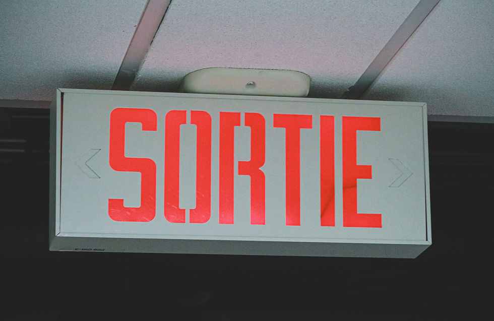
Display: decorative or highly stylised typefaces designed for impact at large sizes (headlines, posters, logos). NOT designed for reading long text
REAL WORLD EXAMPLE
Think about a Bollywood movie poster. The film title is always in some dramatic, stylised, one-of-a-kind typeface — maybe with 3D effects, maybe with textures, maybe with letters that look like they're on fire or dripping or made of gold. That's a display typeface. It's designed to grab your attention at poster size. But now imagine reading an entire textbook in that movie poster font. Ten pages of it. Twenty pages. Your eyes would burn. Display typefaces are built for impact, not endurance. They're the fireworks of the type world — spectacular for a moment, unbearable for an hour. A movie title. A magazine headline. A logo. A poster. That's their territory. Body text? Never.
4
Script: typefaces based on handwriting or calligraphy. Feel: personal, elegant, fluid, artistic. Range from formal (wedding invitations) to casual (friendly notes)

REAL WORLD EXAMPLE
You've received a wedding invitation at home — maybe your cousin's, maybe a neighbour's. Look at the couple's names. Almost always, they're in a flowing, connected, calligraphic script typeface. It feels personal. Special. Like someone sat down with a fountain pen and wrote it by hand — even though a computer printed it. That's the power of script typefaces. They carry the warmth of human handwriting. Formal scripts feel like calligraphy — perfect for weddings, certificates, and luxury branding. Casual scripts feel like a friend's handwriting — warm for café menus, greeting cards, and personal blogs. But script has limits: read a whole paragraph of it and your eyes get tired fast. Like display type, script is best in small doses — a name, a title, a signature moment.
5
Monospaced: every character occupies the same width (an “i” takes the same space as an “m”). Feel: technical, precise, code-like. Used in programming and technical documents
REAL WORLD EXAMPLE
If you've ever seen a computer programmer's screen — green or white text on a black background, neat columns of code — that's a monospaced typeface. In normal typefaces, a narrow letter like "i" takes less space than a wide letter like "m." But in monospaced type, every character gets the exact same width. Why? Because when you're writing code, alignment matters. You need columns to line up perfectly. You need to spot a missing bracket instantly. Monospaced type treats every character as equal — like graph paper for letters. It's also the typeface of typewriters, of old computer terminals, of receipts from billing machines. Whenever text needs to feel technical, mechanical, or code-like, monospaced is the choice.
6
Most professional design uses serif or sans-serif for body text, with display, script, or contrasting typefaces for headlines and accents
REAL WORLD EXAMPLE
Open any well-designed magazine — Vogue, GQ, National Geographic, or even Femina. You'll see a clear pattern: the headlines are in a bold, personality-driven typeface (sometimes display, sometimes a contrasting serif or sans-serif). The body text — the actual article you read — is in a quiet, comfortable serif or sans-serif. The pull quotes might be in italic. A caption might use a lighter weight. The system is always the same: the headline grabs attention, the body text does the reading work, and the accents add flavour. It's like a meal: the headline is the presentation, the body text is the main dish, and the accents are the garnish. Professionals never use display or script for body text — that would be like making the garnish the main course.

7
Serifs were dominant in print for centuries. Sans-serifs became dominant in screen/digital design because they render more clearly at small sizes
REAL WORLD EXAMPLE
For 400 years after the printing press was invented, almost everything was printed in serif typefaces — books, newspapers, legal documents, government papers. Serifs were the only serious choice. Then screens happened. In the early days of computing, screens had very few pixels — and those tiny serif strokes would blur, break, or disappear at small sizes. Sans-serif typefaces, with their simpler shapes and cleaner edges, rendered much more clearly on crude pixel grids. That's when the shift began. Today, almost every interface on your phone is sans-serif — not because serif is bad, but because sans-serif won the screen readability war. It's a technology-driven evolution: the medium changed, and the type adapted. Print still loves its serifs. Screens chose their own champion.
8
There are no "good" or "bad" categories — only appropriate and inappropriate choices for the context

REAL WORLD EXAMPLE
Comic Sans is the most mocked typeface in the world. Designers make jokes about it constantly. But here's a fact: Comic Sans was designed specifically for children's software — and for young, dyslexic readers, its irregular letterforms are actually easier to read than "proper" typefaces. In a children's hospital or a primary school worksheet, Comic Sans is a perfectly appropriate choice. On a corporate annual report? Inappropriate. The typeface didn't change — the context did. A decorative script typeface is wrong for a highway sign but perfect for a wedding card. A heavy display font is wrong for a novel but perfect for a protest poster. Every type category has a job it's built for. The skill isn't knowing which categories exist — it's knowing which context demands which category.
Pro Connection
When a designer asks “are we going serif or sans?” they’re making the foundational tone decision. A brand designer presenting options might show “Option A: serif for heritage and trust” vs “Option B: sans-serif for modernity and clarity.” A film title designer chooses between serif (period drama), sans-serif (sci-fi), or display (horror) to match the genre. Knowing the categories is knowing the first language of typographic conversation.
PROFESSIONAL TERMINOLOGY
CLICK TO REVEAL and CLICK TO COVER
A typeface with small decorative strokes at the ends of letterforms — traditional, authoritative, literary
What is
SERIF
A typeface without serifs ("sans" = without) — modern, clean, minimal
What is
SANS-SERIF
Decorative, expressive typefaces designed for headlines and large sizes — not for body text
What is
DISPLAY TYPE
Typefaces based on handwriting or calligraphy — flowing, personal, elegant
What is
SCRIPT
A typeface where every character has the same width — technical, precise, used in code
What is
MONOSPACED
The main readable text in a design, as opposed to headings or decorative text — requires high readability
What is
BODY TEXT
THE TYPE WAKE-UP
You've been reading all day — but not once have you actually noticed what the letters look like. That's about to change.
what TO DO
For the next hour, keep your eyes open for typography everywhere — on your phone, on packaging, on signs, on screens.
Find 5 different examples of typography around you.
For each example, ask yourself: how does this type make me FEEL? Pick one feeling word.
Write them down: where you found it + the feeling it gives you. ("Instagram bio — clean and modern", "Chip packet — loud and fun"…)
Show your list to someone and see if they agree with your feeling words.
CHALLENGE
DISCOVERY
You can use these SOFTWARES for this Discovery Challenge
FREE SOFTWARE : Phone Screenshot, Google Fonts, Google Keep, Apple Notes / Samsung Notes
PAID SOFTWARE : WhatTheFont, Notability