
TYPE PERSONALITY
If a typeface walked into a room, how would it dress? What music would it listen to? That’s type personality — and every typeface has one.
CORE CONCEPT
IMPORTANCE OF TYPE PERSONALITY
KEY KNOWLEDGE
1
Every typeface has an inherent personality created by its visual characteristics: stroke weight, shape, proportion, and style

REAL WORLD EXAMPLE
Go to Google Fonts and open three typefaces: Futura, Garamond, and Pacifico. Without reading a single word of their descriptions, you can already feel their personalities. Futura: geometric, precise, modern — like an architect in a minimalist apartment. Garamond: elegant, literary, warm — like a professor in a library with wooden shelves. Pacifico: casual, beachy, fun — like a surfer at a juice stall. You didn't learn those personalities — you felt them instantly from the visual characteristics. Futura's perfect circles say "precision." Garamond's variable strokes say "tradition." Pacifico's flowing curves say "relaxed." Every typeface walks into the room with a personality already formed — and that personality comes entirely from how the letters are drawn.
2
Thick strokes: strong, bold, confident, stable. Thin strokes: elegant, refined, delicate, sophisticated

REAL WORLD EXAMPLE
Think about handwriting. When someone presses hard with a marker and writes in thick, heavy strokes, the message feels strong, certain, emphatic. When someone writes with a fine pen in thin, light strokes, the message feels careful, delicate, considered. Typefaces work the same way. A thick-stroked typeface like Impact or Anton feels like it's shouting with confidence — that's why it's used for protest signs, sports headlines, and urgent announcements. A thin-stroked typeface like Didot or Playfair Display Light feels like it's whispering elegance — that's why it's used for fashion magazines, jewellery brands, and perfume packaging. The thickness of a letter's stroke is the first personality signal, before the shape, before the category, before anything else.
3
Geometric shapes (perfect circles, straight lines): modern, precise, technical, futuristic

REAL WORLD EXAMPLE
Look at the lowercase "o" in Futura. It's a perfect circle. Not an oval, not a slightly squished shape — a mathematically perfect circle. The "a" is built from a circle with a stem. The "n" is built from precise straight lines and a semicircle. Every letter in Futura can be traced back to basic geometry — circles, straight lines, and consistent angles. This geometric construction gives Futura its personality: rational, modern, technical, almost machine-made. It's no accident that NASA used Futura on the Apollo 11 plaque left on the moon. When you want something to feel like the future — precise, clean, engineered — geometric type is the choice. It's the typography of science, technology, and progress.
4
Organic/humanist shapes (slight irregularities, calligraphic influence): warm, friendly, human, approachable
REAL WORLD EXAMPLE
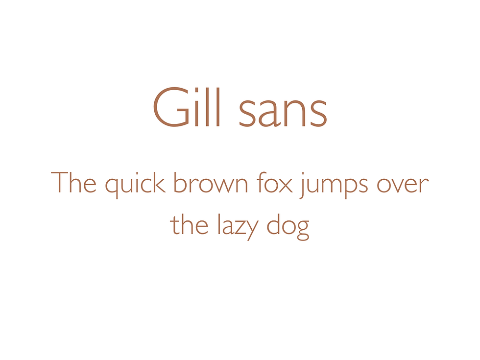
Now look at the lowercase "o" in Gill Sans or Frutiger. It's not a perfect circle — it's slightly oval, with stroke widths that vary subtly, reflecting the hand of a human holding a pen rather than a compass drawing a circle. Those tiny irregularities are what make humanist typefaces feel warm and approachable instead of cold and mechanical. It's the same reason people prefer a hand-written birthday message over a printed one — imperfection signals humanity. Humanist typefaces carry the ghost of a human hand in their curves, which is why they're used for schools, healthcare, airports, and any context where you want people to feel welcome. The British road sign system uses a humanist typeface because when you're lost and stressed, the letters that guide you home should feel human, not robotic.
5
Serif personality: traditional, authoritative, literary, trustworthy, established, classic
REAL WORLD EXAMPLE
Think about every courtroom, law office, and government document you've seen in a film. The nameplate on the judge's desk. The diploma on the lawyer's wall. The masthead of The Times of India or The Hindu. All serif. When an institution wants to communicate "we've been here for decades, you can trust us, we take this seriously," they reach for a serif typeface. It's the visual equivalent of a dark wood desk and a leather chair — you don't question the authority. Banks, universities, publishing houses, and national newspapers all default to serif because the category itself carries 500 years of printed heritage. When you see serif, your brain registers: established. That's not an accident — it's the accumulated personality of half a millennium.
6
Sans-serif personality: modern, clean, neutral, minimal, contemporary, efficient
REAL WORLD EXAMPLE
Every tech company you can name — Google, Apple, Microsoft, Amazon, Meta, Netflix, Spotify, Uber — uses a sans-serif typeface for its primary brand identity. Not one of them uses a serif. Why? Because sans-serif says "we are modern." It says "we are efficient." It says "we move fast." Sans-serif strips away the decorative strokes and leaves only the essential letter shapes — and that minimalism maps perfectly to the tech industry's values: simplicity, efficiency, forward-thinking. When a new startup launches and needs a typeface, they almost never choose serif — because serif would signal "we've been around for decades," and a startup wants to signal "we are the future." Sans-serif is the uniform of the digital economy.

7
The personality of a typeface should match the personality of the project, brand, or message

REAL WORLD EXAMPLE
Imagine a children's birthday party invitation set in the typeface used for legal contracts. Or a funeral notice set in a circus poster font. Both would feel deeply wrong — not because the typefaces are bad, but because the personality doesn't match the occasion. Type personality matching is the most important creative decision in any project: a yoga studio needs calm, organic type; a gaming company needs bold, edgy type; a bookshop needs literary, serif type; a streetwear brand needs urban, display type. The typeface IS the first impression. Before a customer reads a word, the type personality has already told them: "This is for someone like you" or "This is not for you." Get the match right, and everything feels natural. Get it wrong, and nothing else can fix it.
8
A mismatch between type personality and content creates dissonance — a legal document in a playful font feels untrustworthy; a party invitation in a formal serif feels stuffy

REAL WORLD EXAMPLE
There's a famous design exercise where you set the text "You are sentenced to life imprisonment" in Comic Sans — the bubbly, childlike typeface. The result is unsettling precisely because the gravity of the words clashes violently with the playfulness of the type. Your brain receives two conflicting signals: the words say "serious" but the type says "fun." That dissonance creates distrust. In real life, you feel this every time a restaurant's menu uses an overly formal typeface for a casual chai stall, or when a serious medical clinic's sign uses a rounded, cartoon-style font. The mismatch doesn't make you laugh — it makes you hesitate. "Do I trust this place?" The typeface answers before you decide.
Pro Connection
When brand designers present typeface options, they describe personality: “Option A feels premium and established. Option B feels modern and approachable. Option C feels bold and disruptive.” When a creative director says “the type doesn’t feel right,” they mean the typeface personality doesn’t match the brand or project. The ability to read and describe type personality is a fundamental professional skill.
PROFESSIONAL TERMINOLOGY
CLICK TO REVEAL and CLICK TO COVER
The inherent character or feeling a typeface communicates through its visual design
What is
TYPE PERSONALITY
Type built from precise geometric shapes (circles, straight lines) — feels modern and precise
What is
GEOMETRIC
Type with organic, calligraphic influences — feels warm, friendly, and human
What is
HUMANIST
The overall personality and feeling communicated by typographic choices in a design
What is
TONE OF VOICE
The distinctive personality and feel of a typeface — what makes it unique and recognisable
What is
CHARACTER
THE PERSONALITY MATCH
If a typeface walked into a room, what would it be wearing? The brands already know the answer.
what TO DO
Pick 3 very different brands you know (e.g. Nike, a bank, a children's brand, a wellness brand).
For each one, search for their logo or website on your phone.
Identify the typeface style: serif, sans-serif, display, script, etc.
Write 3 personality words the type communicates.
Ask: does the type personality match the brand personality?
CHALLENGE
DISCOVERY
You can use these SOFTWARES for this Discovery Challenge
FREE SOFTWARE : Chrome Browser, Google Fonts, Google Keep, Phone Screenshot
PAID SOFTWARE : WhatTheFont, Notion