
TYPE ACROSS CULTURES & HISTORY
Typography has a 500-year history — and every era’s type tells you what that era believed in, valued, and aspired to.
CORE CONCEPT
IMPORTANCE OF TYPE ACROSS CULTURES & HISTORY
KEY KNOWLEDGE
1
Typefaces carry historical associations: using a Blackletter typeface evokes medieval or Gothic feelings; a geometric sans-serif evokes modernism
REAL WORLD EXAMPLE
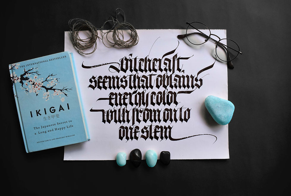
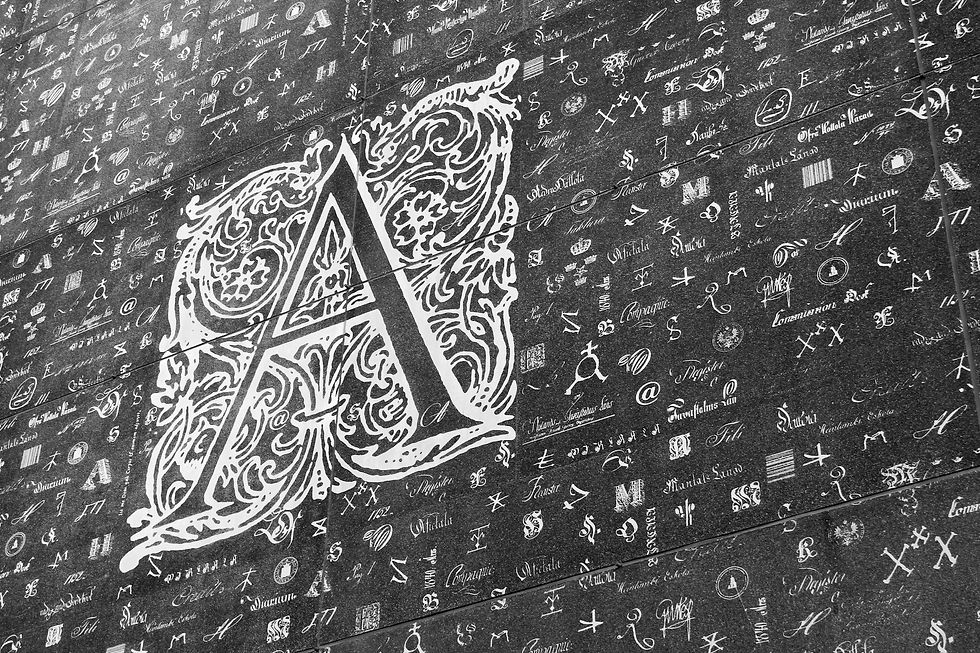
You've seen Blackletter type without knowing its name — it's the ornate, heavy, angular lettering used on newspaper mastheads like The New York Times, on Kingfisher beer labels, and in the opening credits of Game of Thrones. The moment you see it, you feel "old." "Medieval." "Gothic." "European tradition." That feeling comes from 600 years of history — Blackletter was the typeface of Gutenberg's first printed Bible. Similarly, when you see Futura's geometric circles, you feel "modern." "Progressive." "Forward-looking." That feeling comes from the 1920s Bauhaus movement that believed design should be clean and rational. Typefaces don't just look like things — they remember where they came from. Every era's type carries the values of its time like a time capsule.
2
Classical Serifs (Garamond, Baskerville): elegant, literary, timeless. Associated with books, academia, and tradition

REAL WORLD EXAMPLE
Walk into any old bookshop — not a modern chain, but the kind with wooden shelves and books stacked to the ceiling. Pull out a classic novel. The body text is almost certainly set in Garamond, Baskerville, or Caslon — classical serif typefaces that have been used for printing books since the 1500s and 1700s. They feel literary, timeless, and warm. There's a reason universities put Garamond on their diplomas — it connects to centuries of academic tradition. These typefaces have survived the printing press, the industrial revolution, two world wars, and the digital age — and they're still used every day. When you want text to feel as though it belongs in a library, you reach for a classical serif. The typeface itself says "this is knowledge that has stood the test of time."
3
Geometric Sans-Serifs (Futura, Avant Garde): precise, minimal, rational. Associated with modernism and progressive thinking

REAL WORLD EXAMPLE
In the 1920s, a school called the Bauhaus in Germany declared that design should be stripped down to pure function — no decoration, no ornament, only what's necessary. Their typography reflected this belief: geometric sans-serifs built from perfect circles, straight lines, and consistent strokes. Futura, designed in 1927, was the embodiment of this philosophy. Its letters look like they were drawn with a compass and a ruler. Today, Futura still appears on Supreme's logo, on Volkswagen's branding, on the NASA plaque left on the moon. When a brand or a designer wants to say "we believe in the future, in progress, in rational thinking," geometric sans-serif is the visual manifesto. The typeface isn't just a style — it's an ideology made visible.
4
Humanist Sans-Serifs (Gill Sans, Frutiger, Open Sans): warm, readable, human. Associated with clarity and friendliness

REAL WORLD EXAMPLE
The next time you're at an airport, look at the wayfinding signs. In many airports worldwide, the typeface is Frutiger — a humanist sans-serif designed specifically for the Charles de Gaulle airport in Paris. Why humanist? Because when you're in a massive, unfamiliar space, rushing for a flight, stressed and disoriented, the signs that guide you shouldn't feel cold and mechanical. They should feel clear and reassuring. Humanist sans-serifs carry a subtle warmth — the organic curves of a human hand underneath the clean modern structure. They're the friendly face of sans-serif: all the clarity and modernity of geometric type, but with the warmth and approachability that makes people feel guided rather than processed. Hospitals, schools, public transport — anywhere people need clear, kind guidance — humanist sans-serif is the natural choice.
5
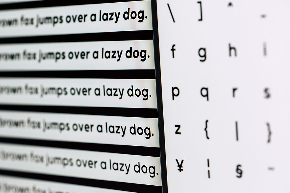
Digital-Native Typefaces (San Francisco, Roboto, Inter): optimised for screens, variable weights, designed for the digital age
REAL WORLD EXAMPLE
Apple didn't just pick an existing typeface for the iPhone — they built one from scratch. San Francisco was designed pixel by pixel for Apple screens: it's legible at tiny smartwatch sizes, comfortable at phone sizes, and elegant at large display sizes. The same letter adapts its proportions depending on whether it's on your Apple Watch or your iMac. Google did the same with Roboto for Android. These aren't typefaces that happened to work on screens — they were born on screens, for screens, by designers who understood that the future of reading is digital. Variable font technology allows a single typeface file to contain every weight from thin to black, adjusting smoothly. These are typefaces designed for a reading world that didn't exist twenty years ago.
6
Different writing systems (Arabic, Devanagari, CJK, Cyrillic) have their own typographic traditions and aesthetic principles
REAL WORLD EXAMPLE
Hindi signboards across India use Devanagari script, which has its own beautiful typographic tradition — the horizontal headline (shirorekha) connecting the tops of letters, the curves and vertical strokes completely different from Latin letters. Arabic calligraphy flows right-to-left with connected letters that change shape depending on their position in a word. Japanese uses three writing systems simultaneously — Kanji, Hiragana, and Katakana — and a type designer must make all three harmonise on a single page. Each writing system has its own rules about spacing, weight, flow, and proportion that are as deep and nuanced as everything you've learned about Latin type. When global brands design for India, they need type designers who understand Devanagari's unique structures — you can't just translate the Latin letters and assume the type system works.

7
Using a typeface from a culture you don't belong to as a "style" can be disrespectful — cultural sensitivity applies to type just as it does to colour

REAL WORLD EXAMPLE
You've seen it on menus of restaurants that serve Chinese food but aren't Chinese-owned — the restaurant name set in a "Chinese-looking" decorative font with strokes meant to imitate brush calligraphy. The letters are Latin (English), but the style is designed to "look Chinese." It reduces an entire writing system and cultural heritage to a costume — a visual shorthand that says "Asian" without any understanding or respect for actual Chinese calligraphy. The same thing happens with "Indian-looking" fonts that add decorative curves to make Latin letters look like Devanagari. It's the typographic equivalent of wearing a culture's traditional clothing as a Halloween costume. Cultural sensitivity applies to type choices just as it applies to imagery and language. Using a script tradition authentically requires understanding; using it as decoration is appropriation.
8
Historical awareness helps designers make informed choices: using a 1920s typeface for a retro project or a digital-native typeface for a tech brand
REAL WORLD EXAMPLE
A designer is briefed to create a poster for a café that celebrates 1950s rock-and-roll culture. They choose a thick, bold, retro sans-serif from that era — and it instantly feels right. The type carries the era with it. Another designer is creating an app for a fintech startup. They choose Inter — a digital-native typeface designed for screen interfaces. That also feels right because the type signals "this is built for today's technology." Historical awareness lets designers reach into typography's timeline and pick the right era for the right project. A period film set in the 1970s should use typefaces from the 1970s. A heritage brand relaunch should reference classical serifs. A futuristic product should use something designed for screens. Knowing when a typeface was born tells you what story it naturally tells.
Pro Connection
Brand designers consider historical associations: “A modern serif says heritage with sophistication. A geometric sans says innovation.” Film production designers choose era-appropriate type for period films. Global brands work with native type designers for each market’s writing system. When a designer says “this typeface feels dated,” they’re reading its historical associations. When they say “this feels forward,” they’re recognising contemporary type design.
PROFESSIONAL TERMINOLOGY
CLICK TO REVEAL and CLICK TO COVER
Heavy, ornate, angular typefaces from medieval European tradition — also called Gothic or Old English
What is
BLACKLETTER
Serifs with moderate contrast between thick and thin strokes — a bridge between classical and modern
What is
TRANSITIONAL SERIF
Serifs with extreme contrast between thick and thin strokes (Didot, Bodoni) — high fashion and luxury
What is
MODERN SERIF
Sans-serifs built from precise geometric shapes (Futura) — rational, modern, clean
What is
GEOMETRIC SANS-SERIF
Sans-serifs with organic, human proportions (Gill Sans, Frutiger) — warm, friendly, readable
What is
HUMANIST SANS-SERIF
The visual alphabet or character system of a language — Latin, Arabic, Devanagari, CJK, Cyrillic, etc.
What is
WRITING SYSTEM
Being aware that typographic styles carry cultural associations and using them respectfully
What is
CULTURAL SENSITIVITY
THE PERSONALITY MATCH
If a typeface walked into a room, what would it be wearing? The brands already know the answer.
what TO DO
Pick 3 very different brands you know (e.g. Nike, a bank, a children's brand, a wellness brand).
For each one, search for their logo or website on your phone.
Identify the typeface style: serif, sans-serif, display, script, etc.
Write 3 personality words the type communicates.
Ask: does the type personality match the brand personality?
CHALLENGE
DISCOVERY
You can use these SOFTWARES for this Discovery Challenge
FREE SOFTWARE : Google Fonts, Chrome Browser, Google Keep, Wikipedia
PAID SOFTWARE : Fonts Ninja, GoodNotes 6