
TYPE & EMOTION
A word written in a different typeface doesn’t just look different — it feels different. Type is emotion made visible.
CORE CONCEPT
IMPORTANCE OF TYPE & EMOTION
KEY KNOWLEDGE
1
Typography delivers emotion on two levels: the content of the words AND the visual character of the type
REAL WORLD EXAMPLE
Your phone buzzes with a notification. It says "We need to talk." If those words appeared in a light, friendly, rounded typeface with generous spacing, you might think "Oh, a catch-up call." But if those same words appeared in a bold, heavy, dark serif with tight spacing, your stomach would drop. The words are identical. The emotional delivery is completely different. Typography is the tone of voice that written words don't naturally have. In speech, "we need to talk" can sound light or serious depending on how you say it. In text, the typeface IS the "how you say it." Every creative professional — from the graphic designer making an ad to the UI designer crafting a notification — knows that the visual character of the type delivers emotion alongside, and sometimes even before, the meaning of the words.
2
These two levels can align (amplifying the emotion) or clash (creating irony, humour, or dissonance)

REAL WORLD EXAMPLE
A Save the Planet poster with the word "URGENT" set in a heavy, bold, red condensed typeface — the word and the type both scream urgency. The two levels align, and the message hits twice as hard. Now take the same word "URGENT" and set it in a delicate, pastel pink, thin, widely-spaced script typeface. It's hilarious — because the word says "hurry!" but the type says "relax, take your time, have some chai." This clash can be used intentionally for comedy, irony, or social commentary. Meme culture lives on this clash: Impact font shouting over absurd images. The key insight is that designers choose alignment when they want to amplify, and clash when they want to subvert. Both are tools — and knowing when to use which is creative power.
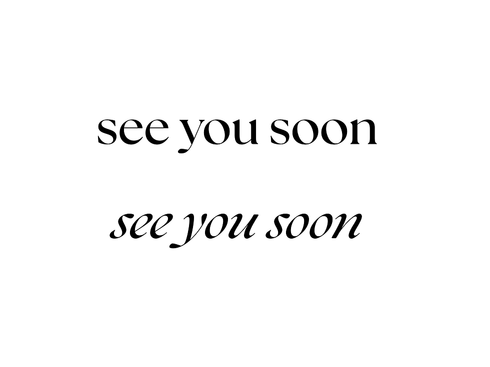
3
Light weight + generous spacing = calm, gentle, luxurious, refined

REAL WORLD EXAMPLE
Open any premium wellness app — Calm, Headspace, or even the spa section of a luxury hotel's website. The text is thin. Light. Widely spaced. It feels like it's speaking in a whisper. There's no urgency, no pressure — just quiet, elegant breathing room. This combination — light weight type with generous spacing — is the universal typographic recipe for calm. Luxury skincare brands use it. Yoga studios use it. Five-star hotel lobbies use it. It works because the thin strokes ask nothing of you (no visual weight pressing on your attention) and the space between letters gives you time (no crowding, no rush). Together, they create a reading experience that physically slows you down. It's the typographic equivalent of soft music and low lighting.
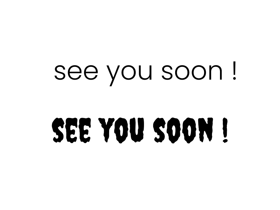
4
Heavy weight + tight spacing = powerful, urgent, bold, impactful

REAL WORLD EXAMPLE
Think of a cricket match graphic when a batsman hits a century — "CENTURY!" in massive, bold, condensed letters packed tight, maybe with a black background and a gold flash. That heaviness and tightness create impact. The letters feel like they're pressing forward, demanding your attention, refusing to be ignored. Newspaper front pages use this for breaking headlines. Sale posters use it to scream "70% OFF." Political rally banners use it to shout slogans. Heavy weight says "this matters." Tight spacing says "right now." Together, they create urgency that light, airy type could never match. It's the typographic equivalent of a drumbeat — heavy, close together, impossible to ignore.
5
All-caps = authoritative, loud, formal, attention-demanding. Lowercase = friendly, casual, approachable
REAL WORLD EXAMPLE
Your parents' WhatsApp messages versus your friend's. Parents: "COME HOME NOW." All caps. Feels like an order. Friends: "come home na." Lowercase. Feels like a request. This isn't just a generational habit — it's a genuine emotional difference that typography professionals use deliberately. Brands like Adidas use all-caps in their ads because sport is bold, competitive, commanding. Brands like Instagram use lowercase for their logo because social media is casual, personal, friendly. Government buildings use all-caps on inscriptions because institutions need to feel authoritative. A coffee shop uses lowercase on its menu because it wants to feel approachable. The case — uppercase or lowercase — is one of the simplest emotional switches in typography. Same word. Different case. Different relationship with the reader.

6
Italic = emphasis, movement, elegance, voice-like quality (as if someone is speaking with expression)
REAL WORLD EXAMPLE
In a novel, when the author wants you to hear a character's inner thought, it's set in italics: I can't believe she said that. The italic isn't just a formatting choice — it signals a shift in voice. It feels like someone leaning in and whispering. In typography, italic creates movement — the letters slant forward as if they're in motion, walking somewhere, leaning into the wind. Fashion brands use italic for taglines because it feels dynamic and elegant. Pull quotes in magazines are set in italic because they should feel like someone speaking aloud. Film title credits in italic feel cinematic and in motion. Italic is the one typographic tool that makes text feel like speech — with rhythm, emphasis, and the personal quality of a human voice.
7
The speed of reading is affected by typography: bold, short text is read quickly (urgency). Long, generous, flowing text is read slowly (contemplation)

REAL WORLD EXAMPLE
A traffic sign that says "STOP" in bold red capitals is designed to be read in a fraction of a second. You don't contemplate it. You don't savour it. You read and react. Now think of the first page of a beautifully typeset novel — generous margins, elegant serif text, wide line-spacing, a gentle first sentence that unfurls slowly across the page. You settle in. You slow down. The typography is telling your brain: take your time. Both of these are deliberate typographic choices that control reading speed. Advertising uses short, bold, tight type because you have two seconds of attention. Poetry uses spacious, flowing type because the words deserve to be lingered over. The typography doesn't just deliver the words — it sets the speed at which you receive them.
8
Emotional typography is what makes a poster stop you, a brand feel trustworthy, and a notification demand action

REAL WORLD EXAMPLE
You're scrolling your Instagram feed at speed — thumb moving, eyes glazing, everything blurring into the same visual stream. And then one image stops you. It's a poster. The word "ENOUGH" in a massive, heavy, black typeface on a white background. No image. No colour. Just five letters — but the heaviness of the type, the boldness, the sheer visual weight, made your thumb pause. That pause is emotional typography at work. It's the same force that makes a Tanishq ad feel trustworthy (elegant serif, warm gold, generous spacing) and a Paytm notification feel urgent (bold, condensed, red). Typography isn't just delivering information — it's creating feeling. And feeling is what makes people stop, trust, and act.
Pro Connection
When a brand designer says “the type needs to feel warmer,” they might mean: switch to a humanist typeface, increase the tracking, or use lowercase instead of all-caps. When a film title designer presents options, they’re presenting emotional options: “This feels ominous. This feels epic. This feels intimate.” Emotional typography is where all typographic knowledge comes together in service of a feeling.
PROFESSIONAL TERMINOLOGY
CLICK TO REVEAL and CLICK TO COVER
The deliberate use of typographic choices to create a specific emotional response in the reader
What is
EMOTIONAL TYPOGRAPHY
Text set entirely in capital / uppercase letters — feels authoritative, loud, formal
What is
ALL-CAPS
Text set in small letters — feels friendly, casual, approachable, modern
What is
LOWERCASE
A slanted or cursive variation of a typeface — used for emphasis, movement, or vocal quality
What is
ITALIC
A narrow version of a typeface — feels tall, urgent, space-efficient
What is
CONDENSED
A wide version of a typeface — feels expansive, stable, grounded
What is
EXTENDED
THE PERSONALITY MATCH
If a typeface walked into a room, what would it be wearing? The brands already know the answer.
what TO DO
Pick 3 very different brands you know (e.g. Nike, a bank, a children's brand, a wellness brand).
For each one, search for their logo or website on your phone.
Identify the typeface style: serif, sans-serif, display, script, etc.
Write 3 personality words the type communicates.
Ask: does the type personality match the brand personality?
CHALLENGE
DISCOVERY
You can use these SOFTWARES for this Discovery Challenge
FREE SOFTWARE : Canva, Google Fonts, Instagram Stories, Google Keep
PAID SOFTWARE : Procreate Pocket, Canva Pro