
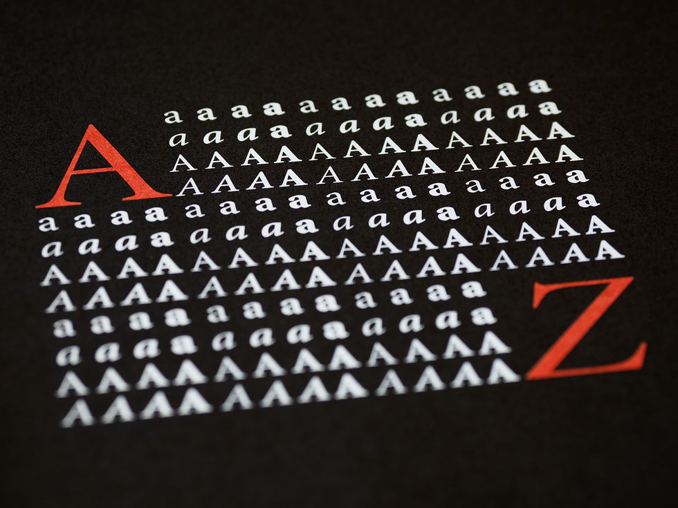
PAIRING TYPEFACES
One typeface is a statement. Two typefaces in harmony is a conversation. Two typefaces in conflict is a headache.
CORE CONCEPT
IMPORTANCE OF PAIRING TYPEFACES
KEY KNOWLEDGE
1
Most professional designs use 2 typefaces: one for headings, one for body text. Occasionally a third for accents or captions
REAL WORLD EXAMPLE
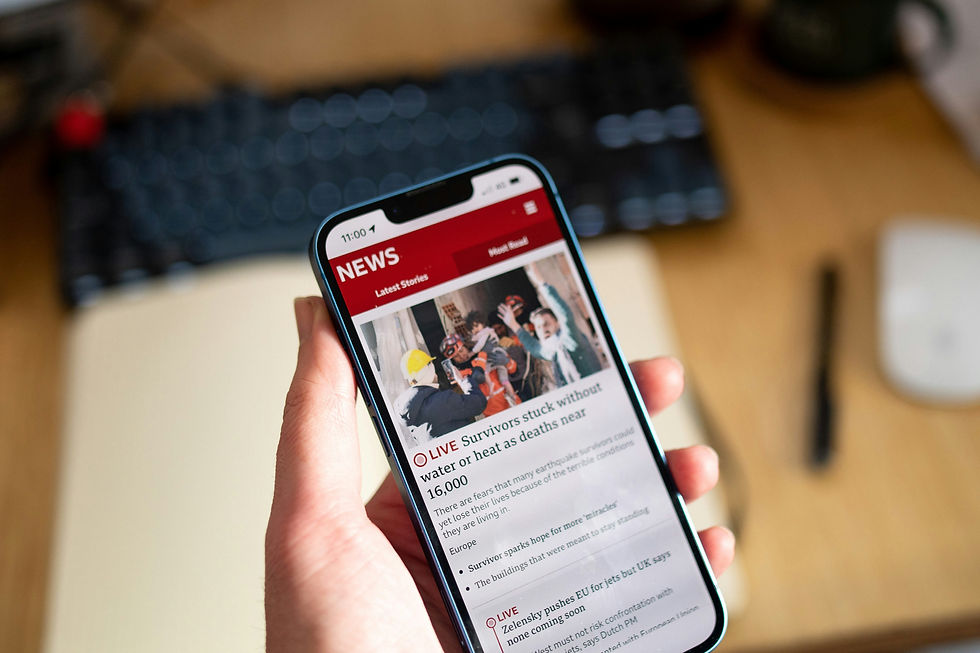
Open any news app — say, Google News or Inshorts. The article headline is in one typeface (usually bolder, with more personality). The article body text is in a different typeface (usually quieter, more readable). There might be a third used for the source attribution or timestamp. That's it. Two or three typefaces — not seven, not twelve. And this isn't just news apps. Open a well-designed restaurant menu: one typeface for the dish names, another for the descriptions. Open a magazine: one for headlines, another for body text. The professional standard is restraint — two typefaces give you contrast and variety without chaos. Each one has a clear role: the heading type attracts, the body type sustains, and the accent type supports.
2
Type pairing = choosing two typefaces that create contrast while maintaining harmony

REAL WORLD EXAMPLE
Think of the best jodi in any Bollywood film — two actors who are completely different but electrifying together. One is intense and brooding, the other is light and witty. Different personalities, but they share a chemistry that makes the pairing feel natural. Type pairing works the same way: the two typefaces must look different enough that the contrast feels deliberate (not like a mistake), but share enough in common — similar proportions, similar mood, a compatible era — that they feel like they belong together. A bold, decorative serif headline paired with a clean, neutral sans-serif body is the typographic equivalent of that great film jodi: different strengths, shared chemistry, stronger together than alone.
3
The golden rule: contrast, not conflict. Different enough to be intentional. Harmonious enough to belong together
REAL WORLD EXAMPLE
There's a fine line between contrast and conflict. Two typefaces with clearly different categories — a serif and a sans-serif — create contrast that feels designed. But two typefaces from the same category that are only slightly different — say, Arial and Helvetica — create conflict because they look almost the same and your brain registers it as a mistake. "Did someone accidentally use two different typefaces?" The viewer doesn't think "interesting contrast" — they think "error." Similarly, two completely clashing display typefaces — one dripping horror, one bubbly children's — create conflict because nothing connects them. Contrast means you can explain why they're different and why they still work together. Conflict means even you can't explain it. If you can't justify the pairing, it's not a pairing — it's a collision.
4
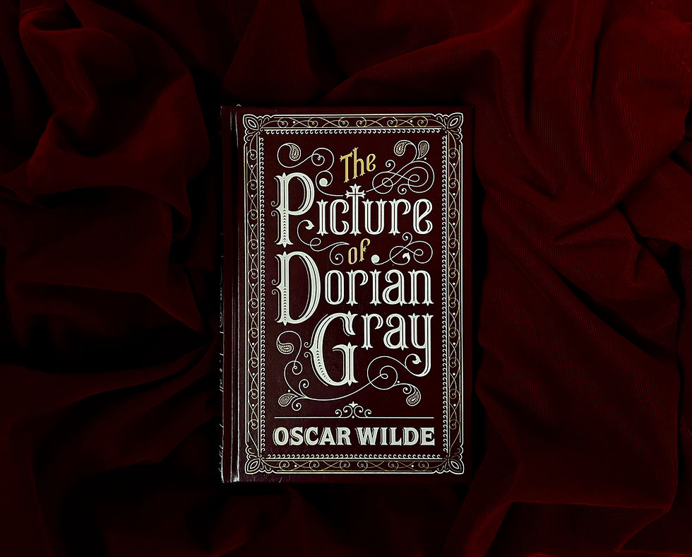
The safest, most reliable pairing: one serif + one sans-serif. Their structural contrast is clear; their mood can harmonise
REAL WORLD EXAMPLE
If you're ever stuck choosing a type pairing and don't know where to start, here's the universal starting point: pick a serif for headings and a sans-serif for body text (or vice versa). This works because the structural contrast is obvious — serifs have feet, sans-serifs don't — so the pairing always looks intentional. Nobody will mistake it for an error. Then match the mood: if the serif is warm and classical (Garamond), pair it with a warm humanist sans-serif (Lato). If the serif is sharp and modern (Bodoni), pair it with a geometric sans-serif (Futura). This serif + sans-serif formula is used by thousands of professional websites, magazines, and brands. It's not boring — it's proven. Start safe, then experiment from a position of understanding.
5
Pairing two typefaces from the same category (two sans-serifs) requires careful selection — they must be different enough to feel intentional
REAL WORLD EXAMPLE
Pairing two sans-serifs is like wearing two shades of almost-the-same blue. If the blues are clearly different — navy and sky blue — it looks intentional and sophisticated. If the blues are barely different — navy and slightly-less-navy — it looks like you couldn't match your clothes. The same logic applies to type. Pairing Futura (geometric, precise) with Gill Sans (humanist, warm) works because they're structurally very different despite both being sans-serif. Pairing Arial with Helvetica doesn't work because they're too similar — the viewer senses something is off but can't name it. If you pair within the same category, the contrast must come from a clear structural difference: geometric vs humanist, condensed vs extended, light vs bold. The difference must be visible and unmistakable.

6
Pairing two display or decorative typefaces almost never works — too much personality competing
REAL WORLD EXAMPLE
Imagine two of the loudest, most dramatic people you know arriving at the same party and both trying to tell a story at the same time. Neither gets heard. Both get annoying. That's what happens when you pair two display typefaces — a dripping horror font next to a 3D chrome font, or a hand-brushed script next to a graffiti typeface. Each one is designed to be the star. When two stars compete for the spotlight, the result is chaos, not contrast. Display typefaces are soloists — they perform alone, supported by a quiet, neutral body typeface in the background. One loud voice + one quiet voice = a conversation. Two loud voices = a fight. This is why you'll never see two display typefaces on the same poster in professional work.
7
One typeface should lead (usually the heading type — more personality) and one should support (usually the body type — more neutral and readable)
REAL WORLD EXAMPLE
Think of a news anchor and a field reporter. The anchor leads — they're the face of the broadcast, confident, personality-forward, the first thing you see when you tune in. The reporter supports — they deliver the detail, the substance, the information you actually need. Neither role is less important, but they serve different functions. Type pairing works identically. The heading typeface is the anchor: bold, distinctive, personality-driven, the first thing the eye reads. The body typeface is the reporter: neutral, readable, quietly doing the heavy lifting of delivering the actual content. If both typefaces tried to be the anchor, the design would feel like a shouting match. If both were as quiet as the reporter, the design would feel flat. Lead and support. Star and ensemble. Heading and body.
8
Limiting to 2 typefaces keeps a design cohesive. Using 3+ typefaces is risky and requires strong experience to pull off
REAL WORLD EXAMPLE
Here's a rule that every design teacher repeats: "When in doubt, use two typefaces." Two gives you enough contrast to create hierarchy and enough unity to feel cohesive. Three can work — a heading typeface, a body typeface, and a caption typeface — but the third must earn its place. Four almost never works. Five is a ransom note. The more typefaces you add, the harder it becomes to maintain visual harmony — every new typeface is a new personality in the room, and managing a room full of competing personalities is difficult even for experts. Beginners who use five or six typefaces on one poster think they're adding variety. What they're actually adding is noise. Restraint is the professional instinct: achieve maximum effect with minimum typefaces.
Pro Connection
Designers say “the pairing feels off” when two typefaces create conflict rather than contrast. Brand style guides specify exact pairings: “Headline: Montserrat Bold. Body: Merriweather Regular.” Web designers use Google Fonts’ pairing suggestions as a professional starting point. The ability to choose and justify a type pairing is a core portfolio skill for any visual designer.
PROFESSIONAL TERMINOLOGY
CLICK TO REVEAL and CLICK TO COVER
Choosing two (or occasionally more) typefaces that work together — creating contrast while maintaining harmony
What is
TYPE PAIRING
Choosing typefaces that are visibly different from each other — so the pairing feels intentional, not accidental
What is
CONTRAST (IN PAIRING)
Choosing typefaces that feel like they belong together despite their differences
What is
HARMONY (IN PAIRING)
The typeface used for titles and headlines — usually more expressive and personality-driven
What is
HEADING TYPE
The typeface used for main text — must be highly readable and usually more neutral
What is
BODY TYPE
THE PERSONALITY MATCH
If a typeface walked into a room, what would it be wearing? The brands already know the answer.
what TO DO
Pick 3 very different brands you know (e.g. Nike, a bank, a children's brand, a wellness brand).
For each one, search for their logo or website on your phone.
Identify the typeface style: serif, sans-serif, display, script, etc.
Write 3 personality words the type communicates.
Ask: does the type personality match the brand personality?
CHALLENGE
DISCOVERY
You can use these SOFTWARES for this Discovery Challenge
FREE SOFTWARE : Chrome Browser, Fontjoy, Google Fonts, Google Keep
PAID SOFTWARE : Canva Pro, Fontstand