
TYPE ON SCREEN
You spend hours every day reading on screens. Every word has been set in a typeface chosen specifically for that screen, that size, that context. Here’s what makes screen type work.
CORE CONCEPT
IMPORTANCE OF TYPE ON SCREEN
KEY KNOWLEDGE
1
Screens display type using pixels — at small sizes, fine typographic details can be lost or distorted

REAL WORLD EXAMPLE
Take a beautifully detailed serif typeface like Bodoni — with its extreme contrast between thick and thin strokes. Print it on paper at 10pt and every hairline stroke is crisp and visible. Now display it on a phone screen at the same size. Those thin strokes? Some of them vanish. They're thinner than a single pixel, so the screen can't render them. The curves become jagged stair-steps instead of smooth arcs. What looked exquisite on paper looks broken on screen. This is why typefaces designed for print don't automatically work on screens — the medium is fundamentally different. Paper prints with ink at hundreds of dots per inch. Screens display with pixels that are visible blocks of light. Screen type must be designed for the pixel grid, or it loses the very details that make it beautiful.
2
Screen-optimised typefaces are designed for clarity on pixels: larger x-heights, open counters, consistent stroke widths
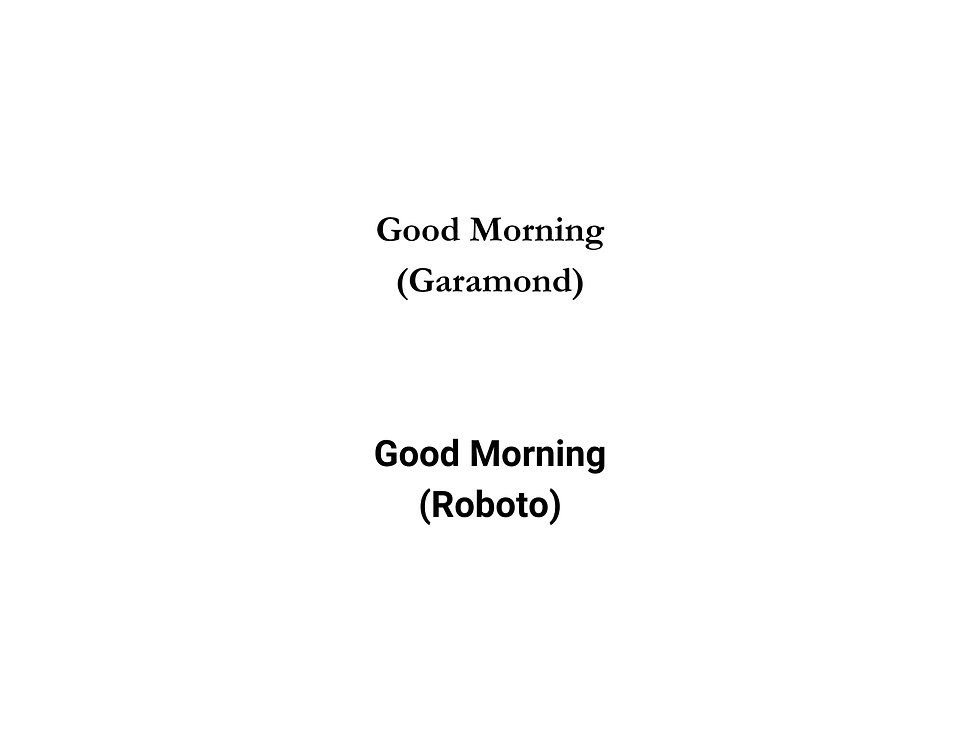
REAL WORLD EXAMPLE
Compare two typefaces at 14px on your phone: Garamond (designed for print in the 1500s) and Roboto (designed for screens in 2011). Garamond's delicate thin strokes struggle. Its small x-height makes lowercase letters tiny. Its narrow counters start closing up. Roboto, built for screens, has a larger x-height so lowercase letters are bigger and clearer, wider counters so letters stay open even at small sizes, and more consistent stroke widths so nothing disappears on the pixel grid. Roboto wasn't designed to be "better" than Garamond — it was designed for a different battlefield. Garamond wins on paper. Roboto wins on screen. The best typeface for any job is the one designed for the medium it's displayed on.
3
System fonts (San Francisco for Apple, Roboto for Google, Segoe for Microsoft) are meticulously engineered for screen readability
REAL WORLD EXAMPLE
Apple employed a team of type designers who spent years building San Francisco — testing every letter at every size on every Apple device, from the tiny Apple Watch screen to the massive iMac display. They built in optical sizing: the same typeface automatically adjusts its letter proportions depending on the size it's displayed at. Small sizes get wider spacing and more open counters. Large sizes get tighter spacing and more refined details. Google did the same with Roboto, testing it across thousands of Android devices with different screen resolutions. These aren't typefaces that were picked from a library — they were engineered from scratch for their platforms. When you read your phone's settings menu or notification text, you're reading the most meticulously crafted type in the world.
4
Responsive typography means type that adapts its size, spacing, and sometimes even weight to different screen sizes

REAL WORLD EXAMPLE
Open any major website — say, Amazon or Flipkart — on your phone. The text is a certain size. Now open the same website on a laptop or desktop. The text is different — bigger headings, wider spacing, longer lines. The typeface might be the same, but the typography has adapted to the screen. That's responsive typography: a system where the type automatically adjusts its size, spacing, and sometimes weight based on the device and screen width. It's why a website that looks perfect on your phone also looks perfect on your laptop — someone designed the type to respond to the change. In a world where the same content is read on a 4-inch phone and a 27-inch monitor, responsive typography isn't optional — it's essential.
5
On mobile screens, readability is paramount: body text is typically 16–18px minimum, with generous leading
REAL WORLD EXAMPLE
If you've ever pinched-to-zoom on a website because the text was too small to read on your phone, that website failed at mobile typography. The professional standard for body text on mobile is 16px minimum — anything smaller, and reading becomes a strain. Apple's guidelines say 17pt for iOS body text. Google's Material Design says 16sp for Android. These aren't random numbers — they're the result of extensive testing on how human eyes read glowing screens at arm's length. Combined with generous line-spacing (typically 1.4 to 1.6 times the font size), these standards ensure that reading on a phone is comfortable for minutes at a time. The best mobile typography is the kind where you never think "this is hard to read" — because the size and spacing were set right from the start.
6
Dark mode (light text on dark background) requires typographic adjustments: slightly increased weight and spacing for comfort
REAL WORLD EXAMPLE
Switch your phone to dark mode right now. The background turns dark, the text turns light. Looks slick. But look carefully — does the text feel slightly thinner than it did in light mode? That's an optical illusion called "halation": light text on a dark background appears lighter and thinner than dark text on a light background. Professional apps compensate for this by slightly increasing the font weight in dark mode — bumping Regular to Medium, or Light to Regular. They also add a touch more spacing because light letters on dark backgrounds can feel tighter. Twitter, Slack, and Apple's own apps all make these dark mode adjustments. If a designer just inverts the colours without adjusting the type, the text in dark mode feels fragile and harder to read. The swap isn't just colour — it's a typographic recalibration.
7
Web fonts allow any typeface to be used on websites — loaded from services like Google Fonts or Adobe Fonts

REAL WORLD EXAMPLE
In the early internet, websites could only use typefaces that were already installed on the viewer's computer — Arial, Times New Roman, Verdana. Every website looked the same typographically. Then web fonts arrived. Services like Google Fonts (free) and Adobe Fonts (subscription) allow designers to load any typeface from the internet, so when you visit a website, the typeface downloads and displays — even if it's not installed on your device. This was a revolution. Suddenly every brand could have its own typographic identity online. That beautiful typeface on your favourite website? It's being loaded live from a server, just for you, every time you visit. Google Fonts alone serves typefaces to billions of webpages every day — the invisible infrastructure of web typography.
8
Screen typography is where the majority of typographic work happens today — more text is read on screens than on paper

REAL WORLD EXAMPLE
Think about your own day. The first text you read was on your phone — the alarm, the time, a notification. Then WhatsApp messages. Then something on Instagram or YouTube. Maybe a news headline. Your schoolwork might be on a tablet or laptop. You read menus on Swiggy, scores on ESPN, messages on Discord, homework on Google Classroom. By the time you pick up a physical book or newspaper, you've already read thousands of words on screens. This is the reality of modern typography: screens are where reading lives now. Which means screen typography — with all its specific rules about size, spacing, rendering, and responsiveness — is the most important typographic skill of our time. Print typography is still valuable and beautiful. But screen typography is where the world reads.
Pro Connection
UI designers specify exact type sizes in design systems: “body text 16px/24px leading on mobile, 18px/28px on desktop.” Front-end developers implement responsive typography that scales across devices. When a designer says “the type doesn’t render well at this size,” they’re identifying a screen typography problem. Mastering screen type is essential for anyone working in digital design.
PROFESSIONAL TERMINOLOGY
CLICK TO REVEAL and CLICK TO COVER
The practice of designing and setting type specifically for digital displays — phones, tablets, monitors
What is
SCREEN TYPOGRAPHY
A typeface pre-installed on an operating system, optimised for that platform's screen rendering
What is
SYSTEM FONT
Type that adapts its size, spacing, and layout to different screen sizes and devices
What is
RESPONSIVE TYPOGRAPHY
A typeface loaded from the internet for use on websites — as opposed to system fonts installed locally
What is
WEB FONT
The smallest unit of display on a screen — type is rendered using grids of pixels
What is
PIXEL
A display setting with light text on dark backgrounds — requires typographic adjustments for readability
What is
DARK MODE
THE DEVICE COMPARISON
The same website is living two completely different lives — one on your phone, one on a bigger screen. What exactly changed?
what TO DO
Open the same website on your phone and (if available) on a laptop or tablet screen.
Compare the typography carefully: is the text size different? Is the spacing different? Is the typeface the same?
If you only have a phone, try opening the same site in "desktop mode" vs standard mobile mode in your browser settings.
Write down 3 specific typographic differences you notice between the two views.
what TO SUBMIT
2 Screenshots | The same website in two different views (mobile vs desktop, or phone vs larger screen). |
Text | Your 3 typographic differences (be specific: size, spacing, weight, alignment). |
Text | One sentence: "The most noticeable change between screen sizes was [what] and I think that's because [reason]." |
CHALLENGE
DISCOVERY
You can use these SOFTWARES for this Discovery Challenge
FREE SOFTWARE : Chrome Browser, Phone Screenshot, Google Keep
PAID SOFTWARE : GoodNotes 6, Notability