
TYPE IN BRANDING
Remove the logo. Remove the images. If the brand is still recognisable by its type alone, the typographer did their job.
CORE CONCEPT
IMPORTANCE OF TYPE IN BRANDING
KEY KNOWLEDGE
1
Typography is often the most used and most consistent element of a brand identity — it appears everywhere words appear

REAL WORLD EXAMPLE
Think about a brand like Zomato. Their logo is distinctive, yes — but their logo appears in maybe three or four places: the app icon, the website header, delivery bags. Their typography, though? It appears on every single screen of the app, every push notification, every email, every receipt, every social media post, every billboard, every restaurant partner sticker, every delivery person's notification. The typography shows up a thousand times more often than the logo. It's the most repeated, most visible, most consistent element of the brand's identity — because wherever words exist, typography exists. A brand can survive without its logo in many contexts. It cannot survive without its typography. When a designer says "type does the heavy lifting," they mean the typeface is the brand's voice in every room it enters.
2
A brand’s typographic system typically includes: a primary typeface for headings, a secondary for body text, and sometimes a special display typeface for the logo

REAL WORLD EXAMPLE
Open any major brand's website and look carefully. The large headline at the top is in one typeface — bold, distinctive, personality-forward. The paragraph text beneath it is in another typeface — quieter, highly readable, designed for extended reading. The logo in the corner might use a third — a custom or display typeface that's unique to the brand. That's a typographic system: a set of typefaces with defined roles, working together like actors in a cast. The heading typeface is the lead. The body typeface is the supporting actor. The logo typeface is the cameo. Each has a specific job, and the brand guidelines specify exactly which typeface, weight, and size goes where. It's not random — it's a system as carefully planned as the brand's colour palette.
3
Custom typefaces are designed exclusively for a brand — ensuring no other brand looks the same
%20Jonas%20Augustin.jpg)
REAL WORLD EXAMPLE
Netflix used to use the typeface Gotham — which hundreds of other brands also used. Then they commissioned Netflix Sans, designed exclusively for them. Now, no other company in the world can use their typeface. It's theirs alone — as unique as their red "N" logo. Apple has San Francisco. Google has Product Sans. Airbnb has Cereal. Samsung has One UI. These custom typefaces cost hundreds of thousands of dollars and take months or years to design — but for brands operating at global scale, it's worth it. A custom typeface ensures that even if you remove the logo, the colours, and the images, the brand is still recognisable by its type alone. It's the ultimate expression of typographic identity: letters that belong to no one else.
4
A logotype is a logo made entirely from designed lettering (Coca-Cola, Google, Disney) as opposed to a symbol mark
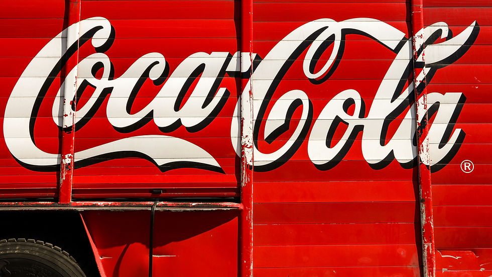
REAL WORLD EXAMPLE
Close your eyes and picture the Coca-Cola logo. You're not picturing a symbol or an icon — you're picturing the word "Coca-Cola" in that distinctive flowing script. That's a logotype: a logo that IS the brand name, written in a designed typeface so specific that the lettering itself becomes the icon. Google is the same — no symbol needed, just the word "Google" in those coloured letters. Disney is the same — that elaborate "D" and the flowing script are so iconic that the word IS the logo. Logotypes work because they combine two things at once: the name you need to remember and the visual identity you need to recognise. When a logotype is done well, you can spot it from across a room, across a highway, across a feed — just from the shape of the letters.
5
Brand typography must work across all sizes (billboard to business card), all media (screen to print to physical signage), and often multiple languages
REAL WORLD EXAMPLE
A brand like Tata operates in India and globally. Its typography must work on a highway billboard seen at 100km/h, on a business card read at arm's length, on a phone app at 14px, on a print ad in a magazine, on a metal plaque on a building, and in English, Hindi, Bengali, Tamil, and every other language in every market they serve. The typeface must be legible at every size, render well on every medium, and have Devanagari and other script versions that feel just as considered as the Latin version. This is why major brands invest heavily in typographic systems — they need type that works everywhere, at every size, in every script, across every touchpoint. A typeface that looks beautiful on screen but breaks down on a sign is not a brand typeface — it's a liability.

6
Typography consistency is enforced through brand guidelines that specify exact typefaces, weights, sizes, and usage rules
REAL WORLD EXAMPLE
Every major brand has a document — usually 30 to 100 pages — called brand guidelines, and a significant section is dedicated entirely to typography. It specifies: "The heading typeface is Montserrat Bold. It must be set at minimum 24pt. The body typeface is Source Sans Pro Regular at 14pt with 22pt line-height. The heading must never be set in italic. The body must never be set in all-caps. The minimum size for any text is 10pt. These rules apply across all media." This document is distributed to every designer, every agency, every printer, and every developer who works with the brand. It's the law. Without it, one designer might use Montserrat, another might use Arial, a third might use Futura — and the brand would look different everywhere. Consistency isn't creative instinct — it's enforced through documentation.

7
The trend toward custom brand typefaces has grown because it ensures unique ownable identity and can save licensing costs at scale

REAL WORLD EXAMPLE
Here's a business case that would surprise most people: licensing a commercial typeface for a global brand can cost millions of dollars per year. Every employee's computer needs a licence. Every website visitor triggers a web font licence. Every app download requires a mobile licence. At scale, these fees add up astronomically. Netflix's decision to create Netflix Sans wasn't just about uniqueness — it was also about eliminating annual licensing fees for third-party typefaces. Samsung did the same. IBM did the same. The custom typeface pays for itself in a few years through licensing savings alone — and the brand gets a typeface nobody else can use. It's both a creative decision and a business decision, which is why every year, more brands commission custom typefaces.
8
Even the spacing, weight, and colour of brand type is specified — nothing is left to chance

REAL WORLD EXAMPLE
In Apple's brand guidelines, the typography section doesn't just say "use San Francisco." It says: "San Francisco Pro for marketing materials. SF Pro Display for headlines above 20pt. SF Pro Text for body below 20pt. Headlines in Semibold weight. Body in Regular weight. Minimum body size 11pt. Line height 1.4x font size. Tracking: -0.01em for Display, 0 for Text. Never stretch, compress, or outline the typeface." Every measurement. Every scenario. Nothing is left to the individual designer's judgment — because consistency requires precision. This level of specification seems obsessive until you realise that Apple's type appears on billions of devices, millions of ads, thousands of retail stores, and hundreds of thousands of web pages worldwide. At that scale, even a small inconsistency multiplies into brand erosion. Precision protects the brand.
Pro Connection
Brand designers present type systems alongside logos and colour palettes: “The headline typeface is [X] for personality. The body typeface is [Y] for readability. They pair because [reason].” Rebranding projects often include a typeface change as one of the most significant decisions. When professionals say “the type does a lot of heavy lifting for this brand,” they mean the typeface carries a major share of the brand’s identity and personality.
PROFESSIONAL TERMINOLOGY
CLICK TO REVEAL and CLICK TO COVER
The complete typographic system that defines how a brand's text looks across all touchpoints
What is
BRAND TYPOGRAPHY
A typeface designed exclusively for one brand — ensuring unique, ownable identity
What is
CUSTOM TYPEFACE
A logo made entirely from designed lettering rather than a symbol or icon
What is
LOGOTYPE
A document specifying exactly how brand elements (including type) should be used across all applications
What is
BRAND GUIDELINES
Any place where a person encounters the brand — app, website, packaging, store, ad, email, etc.
What is
TOUCHPOINT
The complete set of rules governing type use in a brand: typefaces, sizes, weights, spacing, and colour
What is
TYPOGRAPHIC SYSTEM
THE DEVICE COMPARISON
The same website is living two completely different lives — one on your phone, one on a bigger screen. What exactly changed?
what TO DO
Open the same website on your phone and (if available) on a laptop or tablet screen.
Compare the typography carefully: is the text size different? Is the spacing different? Is the typeface the same?
If you only have a phone, try opening the same site in "desktop mode" vs standard mobile mode in your browser settings.
Write down 3 specific typographic differences you notice between the two views.
what TO SUBMIT
2 Screenshots | The same website in two different views (mobile vs desktop, or phone vs larger screen). |
Text | Your 3 typographic differences (be specific: size, spacing, weight, alignment). |
Text | One sentence: "The most noticeable change between screen sizes was [what] and I think that's because [reason]." |
CHALLENGE
DISCOVERY
You can use these SOFTWARES for this Discovery Challenge
FREE SOFTWARE : Phone Screenshot, Phone Camera, WhatTheFont, Google Keep
PAID SOFTWARE : Canva Pro, Fonts Ninja