
TYPE IN THE ENVIRONMENT
Every sign you follow, every door you find, every street you navigate — somebody designed the type that guided you there.
CORE CONCEPT
IMPORTANCE OF TYPE IN THE ENVIRONMENT
KEY KNOWLEDGE
1
Environmental typography = type in physical space: signs, wayfinding, building identities, murals, architectural lettering

REAL WORLD EXAMPLE
Walk out of your house and look around. The street name plate on the corner. The shop signs lining the road. The auto-rickshaw fare chart. The bus route number. The painted wall advertisement for a coaching class. The temple or mosque name engraved over the entrance. The "This Way →" sign at the mall. All of it is environmental typography — type that exists not on a screen or a page, but in the physical world, on walls, on posts, on buildings, on roads. It's the most ancient form of typography — humans have been carving letters into stone for thousands of years — and also the most overlooked. You navigate your entire physical world using environmental type, and you've never once thought of it as design. But every letter on every sign in your neighbourhood was placed there by someone who made a typographic decision.
2
It must work at real-world distances, speeds, angles, and lighting conditions — very different from screen or print

REAL WORLD EXAMPLE
A typeface that looks gorgeous on your phone at arm's length might be completely useless on a highway sign at 100 metres. Environmental type must solve problems that screen type never faces: Can a driver read this sign at 80km/h? Can a pedestrian read this shop name from across the street? Can someone find the exit sign in a smoky corridor during a fire? Can this building name be read at night when it's backlit? Can this wayfinding sign be read by someone walking quickly while looking at an angle? These constraints are fundamentally different from designing type for a phone screen. Size, contrast, letterform simplicity, and viewing angle become survival factors — not just aesthetic choices. Environmental typography is where design decisions can literally save lives.
3
Wayfinding is a design discipline dedicated to helping people navigate spaces through typographic and visual systems
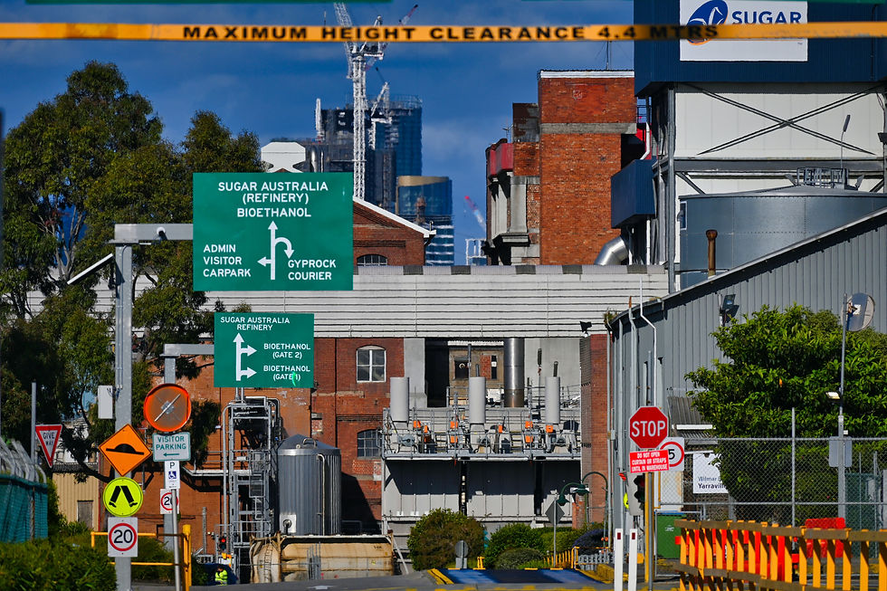
REAL WORLD EXAMPLE
The next time you're at a train station, an airport, or a hospital, pay attention to the signs that guide you. The platform numbers. The departure boards. The exit arrows. The "Way to Gate 4" signs. That entire system — designed to take a confused, rushing, possibly anxious person from Point A to Point B without asking anyone for directions — is wayfinding. And wayfinding is built primarily on typography. The typeface must be instantly legible. The hierarchy must be clear (destination large, direction arrows medium, distance small). The consistency must be absolute — the sign at Gate 1 must use the same typeface, size, and colour as the sign at Gate 47. Wayfinding designers don't make "signs." They design typographic systems that turn chaos into clarity. It's an entire profession built on the belief that the right type in the right place helps people find their way.
4
Legibility at distance requires: large size, high contrast, simple letterforms, generous spacing, and clean backgrounds
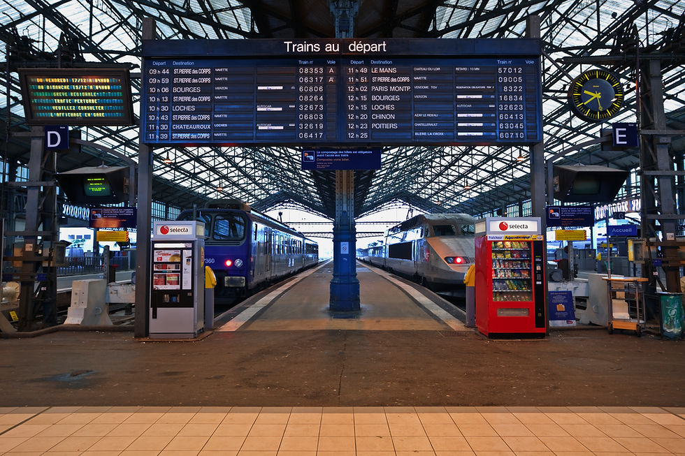
REAL WORLD EXAMPLE
You're standing at one end of a railway platform in a busy Indian station. The platform number sign is 50 metres away. Can you read it? If it uses large, bold sans-serif letters with high contrast (white on dark blue, or black on yellow) and generous spacing, yes — in one glance. If it uses a decorative script font in grey on a grey background with tight letter spacing, you'll squint, walk closer, and still struggle. Every element of distance legibility works together: large size so the letters are physically visible, high contrast so they separate from the background, simple letterforms so there are no ambiguous shapes, generous spacing so letters don't merge, and a clean background so nothing competes. Remove any one of these, and the sign fails from 50 metres away. It might fail from 20.
5
Road signage typefaces (like Highway Gothic in the US or Transport in the UK) are designed specifically for legibility at speed
REAL WORLD EXAMPLE
India's highway signs use a specific set of typeface and design rules — because when you're driving at 100km/h, you have approximately 2–3 seconds to read a sign, process the information, and make a decision. The typeface must be legible in a quarter of a second. The spacing must prevent letters from merging at high speed. The contrast must be strong enough to work in headlights at night and in blazing sun during the day. Countries invest millions in testing these typefaces — the US tested Clearview against Highway Gothic for years before adopting it, then reverted. These aren't aesthetic decisions. They're safety decisions. A highway typeface that's 10% more legible might prevent dozens of accidents per year. The typeface on a road sign isn't a design choice — it's a life-or-death specification.

6
Airports use consistent wayfinding type systems so travellers from any country can navigate without speaking the local language
REAL WORLD EXAMPLE
You land at an airport in a country where you don't speak the language. You don't know anyone. You need to find baggage claim, immigration, your connecting gate, the exit. You look up — and the signs guide you. Yellow arrows. Clear numbers. Simple icons. And text in the local language alongside English, both set in a legible, neutral sans-serif typeface with consistent hierarchy and spacing. Every airport in the world uses the same typographic principles because the problem is universal: people from every country must navigate the same space. The typography must transcend language — working through size, colour, hierarchy, and iconography alongside text. It's the ultimate test of typographic clarity: when the reader might not even speak the language, the type system itself must do the guiding.

7
Expressive environmental type (murals, neon signs, hand-painted signage) gives neighbourhoods and businesses their visual character

REAL WORLD EXAMPLE
Think of the most photogenic streets in your city — the ones people go to specifically to take pictures. Chances are, they're full of expressive environmental type: hand-painted shop signs with beautiful lettering, neon signs glowing in windows, murals with typographic messages, vintage signboards with character that no computer font could replicate. A neighbourhood's typographic character — the mix of hand-lettered chai stall signs, temple inscriptions, painted cinema hoardings, and old-style pharmacy signboards — is as much a part of its identity as its buildings and streets. When a neighbourhood gets "gentrified" and all the hand-painted signs get replaced with uniform corporate fonts, something dies. The typography was the personality. Remove it, and the neighbourhood becomes anywhere.
8
Environmental typography overlaps with spatial planning, experience design, and interior design — connecting to multiple EYEAM programs

REAL WORLD EXAMPLE
When someone designs a new co-working space like WeWork or a retail store like Fabindia, the environmental typography is designed alongside the interior, not after. The wall lettering in the café area matches the spatial mood. The meeting room names are in a typeface that matches the brand. The wayfinding signs are positioned based on how people move through the space. The restroom signage fits the overall design language. Typography in physical space is never separate from the space itself — it's part of the spatial experience. This is where typography connects to architecture, interior design, experience design, and spatial planning. Every EYEAM program touches this intersection. The type on the wall isn't just a sign — it's a designed element of a designed experience.
Pro Connection
Environmental graphic designers and wayfinding specialists are dedicated professionals who design typographic systems for airports, hospitals, campuses, and cities. Interior designers specify signage type as part of their spatial design. Experience designers plan how type guides visitors through exhibitions and events. When a spatial planner says “the signage isn’t working,” they’re identifying an environmental typography problem.
PROFESSIONAL TERMINOLOGY
CLICK TO REVEAL and CLICK TO COVER
Typography designed for physical spaces — signage, wayfinding, architectural lettering, murals
What is
ENVIRONMENTAL TYPOGRAPHY
A design system of signs and visual cues that helps people navigate through physical spaces
What is
WAYFINDING
Any visual sign in a physical environment that communicates information — directions, names, warnings
What is
SIGNAGE
The size of type relative to its environment and viewing distance — critical in environmental design
What is
SCALE
How clearly type can be read from far away — requires large size, high contrast, and simple letterforms
What is
LEGIBILITY AT DISTANCE
Type formed from illuminated neon tubes — a distinctive expressive form of environmental type
What is
NEON LETTERING
THE DEVICE COMPARISON
The same website is living two completely different lives — one on your phone, one on a bigger screen. What exactly changed?
what TO DO
Open the same website on your phone and (if available) on a laptop or tablet screen.
Compare the typography carefully: is the text size different? Is the spacing different? Is the typeface the same?
If you only have a phone, try opening the same site in "desktop mode" vs standard mobile mode in your browser settings.
Write down 3 specific typographic differences you notice between the two views.
what TO SUBMIT
2 Screenshots | The same website in two different views (mobile vs desktop, or phone vs larger screen). |
Text | Your 3 typographic differences (be specific: size, spacing, weight, alignment). |
Text | One sentence: "The most noticeable change between screen sizes was [what] and I think that's because [reason]." |
CHALLENGE
DISCOVERY
You can use these SOFTWARES for this Discovery Challenge
FREE SOFTWARE : Phone Camera, Google Keep, Google Photos, WhatTheFont
PAID SOFTWARE : VSCO Membership, Halide Mark II