
TOUCHPOINTS
What if every time someone interacts with something you’ve created — whether they see it, tap it, walk into it, or read it — that moment was designed?
CORE CONCEPT
IMPORTANCE OF TOUCHPOINTS
KEY KNOWLEDGE
1
A touchpoint is any moment where a person interacts with or is affected by your work — every tap, view, visit, or message

REAL WORLD EXAMPLE
Think about ordering food on Zomato. Seeing the app icon is a touchpoint. The loading screen is a touchpoint. The restaurant photos, the “Add to cart” button, the payment screen, the “Your food is on its way” notification, the delivery person’s smile — ALL touchpoints. Each one shapes whether you love the experience or delete the app.
2
The total experience is the sum of all touchpoints — one bad touchpoint can ruin the whole journey

REAL WORLD EXAMPLE
Imagine a perfect restaurant: beautiful entrance, friendly host, amazing food. Then the bill arrives and it’s wrong, the waiter argues, and you leave annoyed. One bad touchpoint at the end erased every good one. That’s why designers obsess over EVERY moment — because the chain is only as strong as its weakest touchpoint.
3
Touchpoints exist before, during, and after the main experience: hearing about it, using it, and remembering it

REAL WORLD EXAMPLE
Before: your friend tells you about an amazing new game (touchpoint). During: you download and play it (multiple touchpoints). After: you see a screenshot from the game in your camera roll weeks later and smile (touchpoint). The experience doesn’t start when you open the app and end when you close it — it stretches much further in both directions.
4
Every touchpoint is a design opportunity: a chance to create delight, build trust, or solve a problem

REAL WORLD EXAMPLE
Most apps show a boring loading screen. Zomato shows a fun food fact while you wait. Same touchpoint — completely different feeling. One wastes your time; the other entertains you. That’s a designer who saw the loading screen not as a necessary evil, but as a chance to make you smile.
5
Digital touchpoints: ads, app icons, loading screens, notifications, buttons, error messages, emails
REAL WORLD EXAMPLE
Even an error message is a touchpoint. “Error 404: Page not found” makes you feel abandoned. But a page that says “Oops! This page wandered off. Let’s get you back home” with a friendly illustration makes you smile even when things go wrong. Every digital moment — including the broken ones — is designed.

6
Physical touchpoints: packaging, shop entrance, seating, signage, staff interaction, receipt
REAL WORLD EXAMPLE
Walk into a Nike store. The door handle feels solid (touchpoint). The shoe displays are at eye level (touchpoint). The trial area has mirrors and good lighting (touchpoint). The staff member brings you the right size without you asking twice (touchpoint). Even the bag they give you feels premium. Nothing is accidental.

7
The most thoughtful brands design EVERY touchpoint consistently — nothing is left to chance
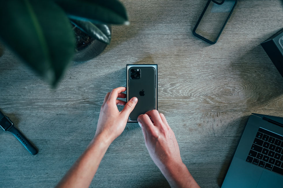
REAL WORLD EXAMPLE
Unboxing a new phone feels special because the box weight, the way the lid lifts slowly, the first glimpse of the screen, even the peel-off plastic film are all designed. Compare that to a product that arrives in a dented cardboard box with no instructions. Same product category — completely different feeling. Consistency across touchpoints is what creates trust.
8
What if even the error message on an app was designed to be helpful and friendly instead of frustrating?

REAL WORLD EXAMPLE
Next time an app crashes, notice the message. Does it blame you? (“Invalid input.”) Or does it help you? (“Something went wrong on our end. Try again, and we’ll do better this time.”) The difference is one designer who saw an error as a dead end and another who saw it as a touchpoint worth caring about. Every moment is a chance to be human.
Pro Connection
Experience designers map every touchpoint in a customer journey. Brand designers ensure touchpoints are consistent. UX designers obsess over micro-interactions. When someone says “the onboarding experience needs work,” they mean the early touchpoints aren’t creating the right feeling.
PROFESSIONAL TERMINOLOGY
CLICK TO REVEAL and CLICK TO COVER
Any moment where a person interacts with or is affected by a product, brand, space, or experience
What is
TOUCHPOINT
The very first touchpoint — the moment that shapes all expectations going forward
What is
FIRST IMPRESSION
The final touchpoint — the moment that determines what the person remembers and tells others
What is
LAST IMPRESSION
A tiny, designed moment within a larger experience: a button animation, a sound effect, a confirmation message
What is
MICRO-INTERACTION
The total feeling created by all touchpoints combined — not just the product, but the entire journey around it
What is
EXPERIENCE
THE TOUCHPOINT TRACKER
One app. Six moments. Rate each one: delightful, neutral, or frustrating. You just mapped a user experience.
what TO DO
Pick any app you used today.
List every touchpoint from the moment you noticed the app icon to the moment you closed it: seeing the icon, tapping it, the loading screen, the first thing you saw, every key tap and scroll, and finally closing it.
Write down at least 6 touchpoints in order.
For each touchpoint, rate it: Delightful (😊), Neutral (😐), or Frustrating (😤). Add one word explaining the rating.
Identify your best touchpoint and your worst. Write one sentence about each: what made the best one work, and what would you change about the worst one?
CHALLENGE
DISCOVERY
You can use these SOFTWARES for this Discovery Challenge
FREE SOFTWARE : Phone Screenshot, Google Keep, Apple Notes / Samsung Notes
PAID SOFTWARE : Notion, GoodNotes 6