
THE USER JOURNEY MAP
What if you could draw a map of someone’s entire experience — from discovery to memory — and use it to make every moment better?
CORE CONCEPT
IMPORTANCE OF THE USER JOURNEY MAP
KEY KNOWLEDGE
1
A user journey map visualises the complete experience from the user’s perspective: what they do, think, and feel at each stage

REAL WORLD EXAMPLE
Imagine drawing your morning from alarm to school gate: wake up (groggy), check phone (happy), shower (okay), can’t find socks (frustrated), eat breakfast (neutral), miss the bus (panic), finally arrive (relieved). That emotional rollercoaster IS a journey map. Now imagine a designer smoothing out every low point — that’s what journey mapping does.
2
Journey maps have stages (the timeline), actions (what the user does), emotions (how they feel), and touchpoints (where interaction happens)

REAL WORLD EXAMPLE
A journey map of ordering food online might show: Stage 1 — Browse (action: scroll menus, emotion: excited). Stage 2 — Order (action: tap “Add,” emotion: happy). Stage 3 — Wait (action: refresh tracker, emotion: impatient). Stage 4 — Receive (action: open bag, emotion: delighted or disappointed). Four layers, one story.
3
The emotional line shows peaks (moments of delight) and valleys (moments of frustration) — the goal is to raise the valleys and amplify the peaks

REAL WORLD EXAMPLE
On your journey map, the emotional line might dip when the delivery tracker says “15 more minutes” and you’re starving. A designer sees that valley and thinks: “What if we showed a fun countdown animation instead of a boring timer?” The food still takes 15 minutes, but the emotional valley becomes less deep. That’s the power of designing for emotions.
4
Journey maps reveal opportunities: wherever the emotional line dips, there’s a chance to improve the experience

REAL WORLD EXAMPLE
Airbnb noticed that guests felt anxious between booking and arrival (“Will the place look like the photos?”). That valley in the journey map led them to create the host messaging feature and verified photos. They didn’t change the property — they smoothed the emotional dip with better communication.
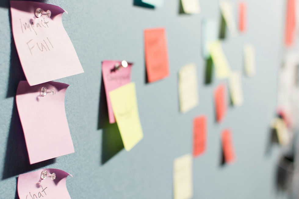
5
They can be simple (sticky notes on a wall) or detailed (designed documents with research data)
REAL WORLD EXAMPLE
You don’t need special software to make a journey map. A blank wall, some sticky notes, and a marker are enough. Write each step on a note, stick them in order, then draw a smiley or frowny face on each. Congratulations — you’ve made a journey map. The world’s top design firms started the exact same way.
6
Journey maps work for anything: apps, shops, events, films, school experiences, even a morning routine
REAL WORLD EXAMPLE
You could map a student’s journey through the school library: entering (confused), finding a section (wandering), discovering a book (delighted), sitting down (comfortable), getting kicked out at closing time (annoyed). Now the librarian knows exactly which moments to improve. Journey maps don’t just work for tech — they work for LIFE.

7
The best journey maps are built from real observation and feedback — not just the designer’s imagination

REAL WORLD EXAMPLE
If you imagine the school library journey from your desk, you’ll miss details. But if you sit in the library for an hour and WATCH students, you’ll notice things you’d never guess: they can’t find the return shelf, they don’t know the seating rules, they leave because there are no charging points. Real observation makes maps real.
8
What if you mapped your own daily journey through your school or home and looked for the low points? Those are design opportunities waiting to be discovered

REAL WORLD EXAMPLE
Draw your journey from waking up to reaching your first class. Circle every frustrating moment. Can’t find your ID card? That’s a design opportunity (a hook by the door). Bus is always late? That’s a design opportunity (a live tracker). School entrance is chaotic? That’s a design opportunity (better queue management). Your daily frustrations are tomorrow’s design projects.
Pro Connection
UX designers create journey maps as standard practice. Service designers map customer journeys across entire businesses. When a product manager says “where are we losing users?” the journey map shows the exact point where the emotional line drops.
PROFESSIONAL TERMINOLOGY
CLICK TO REVEAL and CLICK TO COVER
A visual map showing the complete experience from the user's perspective: actions, thoughts, emotions, and touchpoints
What is
USER JOURNEY MAP
A phase or step in the journey: discover, explore, use, react, remember
What is
STAGE
The line showing how feelings rise and fall throughout the experience — peaks of delight and valleys of frustration
What is
EMOTIONAL ARC
A point in the journey where the experience could be improved — usually where emotions dip
What is
OPPORTUNITY
The complete path someone follows through an experience, from first awareness to lasting memory
What is
JOURNEY
THE TOUCHPOINT TRACKER
One app. Six moments. Rate each one: delightful, neutral, or frustrating. You just mapped a user experience.
what TO DO
Pick any app you used today.
List every touchpoint from the moment you noticed the app icon to the moment you closed it: seeing the icon, tapping it, the loading screen, the first thing you saw, every key tap and scroll, and finally closing it.
Write down at least 6 touchpoints in order.
For each touchpoint, rate it: Delightful (😊), Neutral (😐), or Frustrating (😤). Add one word explaining the rating.
Identify your best touchpoint and your worst. Write one sentence about each: what made the best one work, and what would you change about the worst one?
CHALLENGE
DISCOVERY
You can use these SOFTWARES for this Discovery Challenge
FREE SOFTWARE : Pen and Paper + Phone Camera, Sketchbook by Autodesk, Google Keep, Canva
PAID SOFTWARE : Procreate Pocket, Figma