
SCREEN, PRINT & PHYSICAL
What if the same brand identity needs to look perfect on a tiny phone screen, a printed business card, and a giant shop sign — and the designer has to make all three work?
CORE CONCEPT
IMPORTANCE OF SCREEN, PRINT & PHYSICAL
KEY KNOWLEDGE
1
Creative work lives in three worlds: screen (digital), print (paper/packaging), and physical (environments/products)

REAL WORLD EXAMPLE
Think about a brand like Domino's Pizza. Their work appears on three completely different stages. World one — screens: their app, their Instagram, their food delivery ads. World two — print: the menu card you receive with your order, the pizza box itself. World three — physical: the giant Domino's sign on their store, the colour of the walls inside. Each world has different rules — but the brand has to feel like the SAME Domino's everywhere. That balancing act across three worlds is what creative professionals do every day.
2
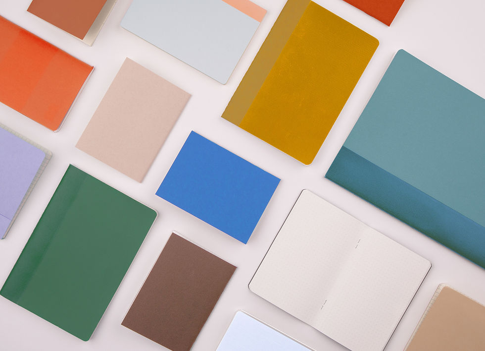
Each world has different rules for colour (RGB vs CMYK vs Pantone), resolution (PPI vs DPI vs viewing distance), and materials
REAL WORLD EXAMPLE
Every world has its own grammar. Screens speak RGB and pixels. Printed paper speaks CMYK and dots-per-inch. Physical objects speak Pantone (a worldwide colour code system) and depend on materials — metal, vinyl, fabric, paint. A designer who only knows screen language will produce work that looks great online and terrible in a print shop. Multilingual designers — those who speak all three colour languages — are the ones brands trust with the big projects. Each world has rules. The professional learns all of them.
3
Consistency across all three is the mark of professional work: the brand should look and feel the same everywhere

REAL WORLD EXAMPLE
Take a brand like Tata Salt. Open their packet — that exact shade of blue. Look at their TV ad — same shade of blue. Visit their website — same blue. Drive past their factory — same blue. This is not by accident. Someone, somewhere, made sure that blue stays exactly the same on every surface in every world. That obsessive consistency is what makes a brand feel TRUSTWORTHY. Inconsistent brands feel cheap and chaotic. Consistent brands feel like a friend you recognise everywhere.
4
Screen design considerations: pixel resolution, RGB colour, interactive elements, loading speed, responsive sizing

REAL WORLD EXAMPLE
Designing for screens has its own checklist. Are your pixels enough for high-density displays? Are your RGB colours within range? Are buttons large enough to tap? Will the page load fast on slow internet? Does it work on phones of every size? A great screen designer carries this checklist in their head, like a pilot doing pre-flight checks. Skip even one, and somewhere a user will see something broken. Screen design is not just 'making things pretty' — it is making things work flawlessly across millions of devices.
5
Print design considerations: CMYK colour, DPI resolution (300 for quality), bleed (extra area for trimming), paper stock
REAL WORLD EXAMPLE
Print design has its own dragons. CMYK colour mode. 300 dots per inch resolution. 'Bleed' — extra space at the edges so the trimming machine does not leave white edges. Paper stock — glossy or matte, thick or thin. None of these matter on screen, but ALL of them matter on paper. Many beginners design a beautiful poster on screen, send it to print, and get back a disaster. The fix is not talent — it is knowing the print rules BEFORE you start. A few minutes of planning saves a few thousand rupees in reprints.

6
Physical design considerations: viewing distance (big enough to read from far away?), materials (weatherproof?), lighting (readable in all conditions?), installation
REAL WORLD EXAMPLE
Designing in the physical world adds dragons that print designers never deal with. Will it be readable from across the road? Will the rain ruin the material? Will it still be visible at night without lights? Can it survive heat, dust, and birds? When designers create a giant Wagh Bakri Tea hoarding next to a highway, they are not just choosing colours — they are choosing materials, sizes, and lighting that hold up in monsoon, summer, and winter alike. Physical design lives in the real world. The real world is harsh. Plan for it.

7
Brand guidelines specify how the identity works across all three worlds: exact colours, minimum sizes, clear space rules

REAL WORLD EXAMPLE
Big brands have a secret document called a 'brand guideline' — sometimes hundreds of pages long. It tells everyone exactly how to use the brand: 'This blue is hex code #003B5C, CMYK 100/85/35/30, Pantone 295. Logo must never appear smaller than 20mm. Always leave this much empty space around it.' This document means anyone — a tiny print shop in Mumbai or a massive ad agency in New York — can use the brand correctly. Brand guidelines are why your favourite brand looks the same everywhere on Earth.
8
What if thinking about all three worlds from the start saves you from redesigning later?

REAL WORLD EXAMPLE
Most beginner designers think only about ONE world while making something — usually the screen. Then later, when the boss says 'we need this on a hoarding too', they realise the design does not work in print. Now they have to redesign from scratch. Smart designers think about ALL three worlds from the very start: 'How will this look on a phone? On paper? On a wall?' Asking those three questions at the beginning saves weeks of redoing work later. Multi-world thinking is the difference between hobby designer and professional.
Pro Connection
Brand designers create comprehensive guidelines covering screen, print, and environmental applications. When a designer says “what are the deliverables?” they’re asking: will this be screen, print, physical, or all three?
PROFESSIONAL TERMINOLOGY
CLICK TO REVEAL and CLICK TO COVER
Work designed to function across screen, print, and physical environments consistently
What is
MULTI-PLATFORM
A 6-digit code specifying exact colours for screens (e.g., #E94560 is a specific pink-red)
What is
HEX CODE
A universal colour matching system for physical production — ensures the same colour reproduces exactly in any material
What is
PANTONE
Extra area beyond the edge of a print design — ensures no white edges when the paper is trimmed
What is
BLEED
The practice of ensuring a brand looks and feels the same across every medium and touchpoint
What is
BRAND CONSISTENCY
THE COLOUR SYSTEM SPOTTER
That electric blue on your screen and the dull navy in the printed brochure are the same colour — which means something has gone very wrong somewhere.
what TO DO
Find one thing designed for screens — an app, a website, or a digital advertisement.
Find one thing designed for print — a magazine, a food package, or a poster.
Compare the colour vibrancy in both: which has brighter, more vivid colours?
Screenshot or photograph both examples.
Write down one specific colour in the screen version that you think would be difficult to reproduce accurately in print — and explain why.
what TO SUBMIT
1 Screenshot + 1 Photo | The screen version (screenshot) and the print version (photo of the physical object) |
Text | One sentence comparing vibrancy: 'The [screen/print] version has more vivid colours because [RGB/CMYK reason].' Then: name one colour from the screen version you think can't be accurately printed, and say why. |
CHALLENGE
DISCOVERY
You can use these SOFTWARES for this Discovery Challenge
FREE SOFTWARE : Phone Screenshot, Phone Camera, Google Keep, Canva
PAID SOFTWARE : Canva Pro, GoodNotes 6