
RGB VS CMYK
What if the colours on your screen and the colours on a printed page are created in completely different ways — and that’s why prints sometimes look different from what you see on screen?
CORE CONCEPT
IMPORTANCE OF RGB VS CMYK
KEY KNOWLEDGE
1
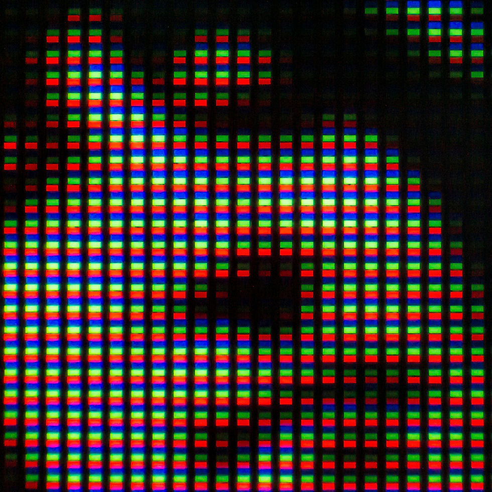
RGB (Red, Green, Blue): the colour system for screens. Additive — mixing light creates colour. All light = white
REAL WORLD EXAMPLE
Look very, very closely at your phone screen with a magnifying glass — you will see something amazing. Every single pixel is actually three tiny lights stuck together: a red one, a green one, and a blue one. By turning each one up or down, the screen creates every colour you have ever seen. All three off? Black. All three at maximum? White. That is RGB. Every cricket match on TV, every Reel, every video call with your cousin — all built from millions of tiny red, green, and blue lights, mixing in front of your eyes.
2
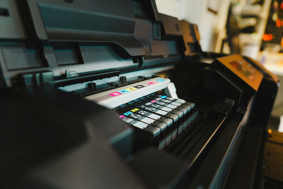
CMYK (Cyan, Magenta, Yellow, Black): the colour system for print. Subtractive — mixing ink absorbs light. All ink = near-black
REAL WORLD EXAMPLE
Now think about how a colour printer works at the local print shop. There are no lights inside — just ink. Four cartridges: Cyan, Magenta, Yellow, and Black. The printer drops tiny dots of these four inks on white paper, and they mix together to create every colour your eye can name. Notice it is the opposite of a screen — instead of adding light, ink blocks light from reflecting off the paper. That is why CMYK is called 'subtractive'. Two completely opposite ways to make colour. Same colourful world.
3
Screens can display a wider range of colours than print — especially bright, vivid, neon colours

REAL WORLD EXAMPLE
Open Instagram and look at any neon-coloured outfit ad — the kind of glowing electric pink or shocking yellow-green that almost hurts your eyes. Now imagine printing that exact image on a poster at the local shop. The colour comes out duller, calmer, more boring. That is not a printer problem. Screens use light, which can shine ANY colour brilliantly. Printers use ink, which can never glow. Some colours simply live in screen-world and refuse to come into print-world. Knowing which colours travel and which do not is part of every designer's job.
4
Some screen colours (vivid blues, bright greens, neon pinks) are “out of gamut” for CMYK — they can’t be accurately reproduced in print

REAL WORLD EXAMPLE
Designers have a phrase for colours that look brilliant on screen but cannot be printed: 'out of gamut'. Imagine a singer who can hit a note in the studio but not live on stage — the note exists, but the live setup just cannot reach it. Some colours are like that. They live in the world of screen-light and refuse to be born in the world of ink. So when professional designers pick colours for a brand that will be both digital AND printed, they avoid the screamingly neon ones. Pretty on the phone is not the same as printable on paper.
5
Designs for screen are created in RGB. Designs for print are created in or converted to CMYK
REAL WORLD EXAMPLE
Before professional designers even pick colours, they make one decision first: where will this work live? If it is for Instagram, a website, an app, a video — they switch their software to RGB. If it is for a poster, a book cover, a t-shirt, a wedding card — they switch to CMYK. This is not a small thing. This one click at the start prevents heartbreak at the end, when colours that looked perfect on the laptop come out looking sad on paper. Professional means starting with the right setting.
6
This is why printed material sometimes looks different from what you see on screen — the colour systems are fundamentally different
REAL WORLD EXAMPLE
You design a beautiful birthday card on Canva. The screen shows a glowing turquoise background. You print it at the local shop and it comes out a calmer, slightly muddy blue-green. You feel cheated. But the print shop did nothing wrong. Your screen lied — or rather, it showed you a colour that your printer's inks could never make. Once you know this, you stop being shocked. You start designing with print in mind from the start, choosing colours that will translate cleanly between both worlds.

7
Professional designers set the colour mode (RGB or CMYK) at the very start of a project based on where the work will appear

REAL WORLD EXAMPLE
There is a saying in design studios: 'Colour mode at start, no panic at end.' Decide RGB or CMYK in the first minute of a new project. Why? Because changing colour mode halfway through can shift every colour in your design unpredictably. It is like building a house and then trying to change the foundation. So before they choose any colour, before they place any text, professionals ask: 'Where will this LIVE?' Their answer becomes the very first setting they touch. Discipline at the start. Beauty at the end.
8
What if knowing this one fact saves you from ever being surprised by a print that doesn’t match your screen?

REAL WORLD EXAMPLE
From now on, when you design something for printing, you will not blindly trust your screen. You will ask the print shop, 'Should I send this in CMYK?' You will avoid neon colours for printed work. You will check colour samples before printing 100 copies of a flyer. This one piece of knowledge saves you money, time, and disappointment your whole life. The reason adults often look professional and confident at print shops is not magic — it is that someone, somewhere, taught them about RGB and CMYK. Now you know too.
Pro Connection
Graphic designers set projects to RGB for digital or CMYK for print from the very start. When a printer says “convert to CMYK,” they need the file in a format their machines can reproduce accurately.
PROFESSIONAL TERMINOLOGY
CLICK TO REVEAL and CLICK TO COVER
Red, Green, Blue — the colour system for screens, using light to create colour (additive)
What is
RGB
Cyan, Magenta, Yellow, Black — the colour system for print, using ink to create colour (subtractive)
What is
CMYK
Creating colour by adding light — more light = brighter. Used in screens
What is
ADDITIVE COLOUR
Creating colour by adding ink that absorbs light — more ink = darker. Used in printing
What is
SUBTRACTIVE COLOUR
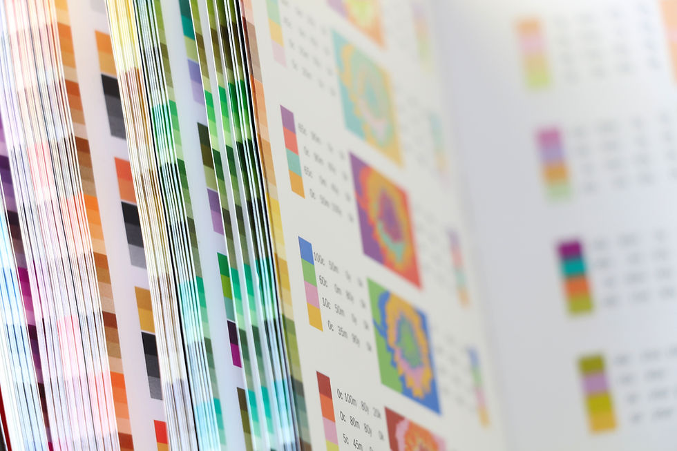
The range of colours a system can display or reproduce — screens have a wider gamut than print
What is
COLOUR GAMUT
The setting that determines whether you're working in RGB (screen) or CMYK (print)
What is
COLOUR MODE
THE COLOUR SYSTEM SPOTTER
That electric blue on your screen and the dull navy in the printed brochure are the same colour — which means something has gone very wrong somewhere.
what TO DO
Find one thing designed for screens — an app, a website, or a digital advertisement.
Find one thing designed for print — a magazine, a food package, or a poster.
Compare the colour vibrancy in both: which has brighter, more vivid colours?
Screenshot or photograph both examples.
Write down one specific colour in the screen version that you think would be difficult to reproduce accurately in print — and explain why.
what TO SUBMIT
1 Screenshot + 1 Photo | The screen version (screenshot) and the print version (photo of the physical object) |
Text | One sentence comparing vibrancy: 'The [screen/print] version has more vivid colours because [RGB/CMYK reason].' Then: name one colour from the screen version you think can't be accurately printed, and say why. |
CHALLENGE
DISCOVERY
You can use these SOFTWARES for this Discovery Challenge
FREE SOFTWARE : Phone Camera, Phone Screenshot, Google Keep, Chrome Browser
PAID SOFTWARE : Adobe Lightroom Premium, Procreate Pocket