
ASPECT RATIOS
What if the SHAPE of your image — not just what’s in it — changes how it feels and where it works?
CORE CONCEPT
IMPORTANCE OF ASPECT RATIOS
KEY KNOWLEDGE
1
Aspect ratio = the proportional relationship between width and height (e.g., 16:9 means 16 units wide for every 9 tall)
REAL WORLD EXAMPLE
An aspect ratio is just the SHAPE of a rectangle written as two numbers. 16:9 means 'wider than tall', like a movie theatre screen. 1:1 means 'a perfect square', like an Instagram post. 9:16 means 'taller than wide', like your phone held upright for Reels. The numbers are not measurements — they are proportions. A 16:9 image can be the size of a stamp or the size of a wall, but the shape stays the same. Once you can name the shape, you can choose the shape — and that is when design begins.
2
16:9 (widescreen): YouTube, most TVs, laptops, cinema. Feels cinematic and expansive

REAL WORLD EXAMPLE
Every YouTube video, every Bollywood film at the cinema, every cricket match on TV — all in the 16:9 shape. Why? Because human eyes are naturally wider than they are tall, so a wider frame feels closer to how we actually see the world. That is why widescreen feels 'big', 'epic', and 'cinematic'. When you watch a movie in 16:9 on a giant theatre screen, your peripheral vision is filled in. Your brain forgets it is watching a screen. The shape is doing half the magic.
3
1:1 (square): Instagram feed, some social media. Feels balanced and iconic

REAL WORLD EXAMPLE
When Instagram launched, every post was a square — 1:1. The square feels different from any other shape. It does not pull your eye left or right or up or down. It just sits, calm and balanced, like a samosa on a plate. That is why brand logos, profile photos, and product shots love the square. It feels stable, complete, iconic. Even though Instagram now allows other shapes, the square is still the most 'Instagram-feeling' shape there is. The shape became the platform's personality.
4
9:16 (vertical): TikTok, Instagram Reels/Stories, Snapchat. Feels personal and mobile-first

REAL WORLD EXAMPLE
Hold your phone the way you naturally hold it — upright. That tall, narrow shape is 9:16. It is exactly how Reels, TikToks, Stories, and Snapchat fill the screen. There is a reason this shape feels so personal: it matches the way someone would stand in front of you talking. When a creator looks straight into the camera in 9:16, it feels like they are speaking directly to you. The shape collapses the distance. That intimacy is what made vertical video the language of an entire generation.
5
4:5 (portrait): Instagram feed (newer), some social media. Taller than square, takes more screen space. 4:3 (classic): older TVs, iPads.
REAL WORLD EXAMPLE
Walk through these shapes for a second. 4:5 is slightly taller than a square — Instagram introduced it because it takes more space on a phone scroll, so people stop and look longer. 4:3 is the older TV shape from before flat screens — slightly wider than tall, used by older iPads and old computer monitors. Each shape was invented for a reason — usually to fit the screens of its time. Aspect ratios are not random rules — they are little time capsules of which devices people were using.

6
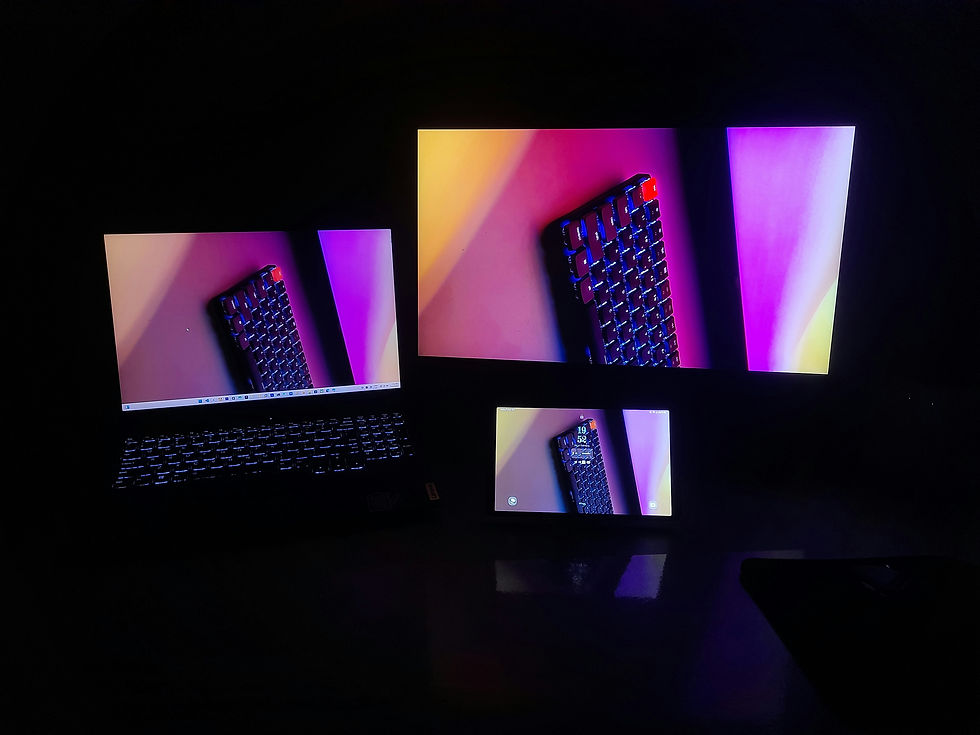
Different platforms require different aspect ratios — content creators often re-crop the same content for multiple platforms.
REAL WORLD EXAMPLE
Watch any popular YouTuber and notice something: the same video clip often appears on YouTube (wide 16:9), as a Reel (tall 9:16), and on Instagram feed (square 1:1). They did not film three times — they re-cropped one video into three different shapes. This is so common now that creators plan their shots with all three crops in mind. Smart professionals leave 'safe space' in the middle of every shot, knowing the edges will be cut. One creation, three platforms, three shapes.

7
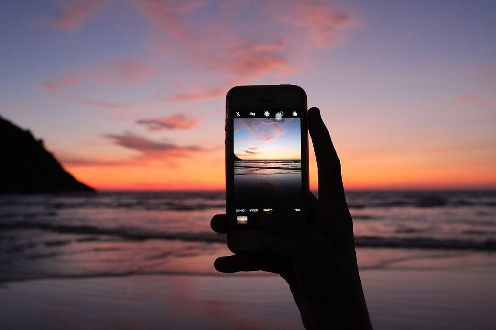
The aspect ratio affects composition: a landscape shot works in 16:9 but loses impact in 9:16. A portrait works in 9:16 but gets cropped in 16:9.
REAL WORLD EXAMPLE
Take a stunning sunset photo of a wide horizon. In 16:9, it looks majestic — the eye sweeps across the whole sky. Try to fit that same sunset into 9:16 vertical, and most of it disappears. The horizon becomes a thin sliver. Now take a vertical photo of a tall building. In 9:16, it soars. In 16:9, the top and bottom get chopped off. The shape of the frame and the shape of the subject HAVE to match — or you lose the magic. The wisest photographers think about the frame BEFORE they press the shutter.
8
What if thinking about the shape of your frame FIRST makes every composition decision easier?

REAL WORLD EXAMPLE
Most beginners take a photo first and worry about the shape later. Professionals do the opposite — they decide the shape first, then compose for it. Because once you know your photo is going on Reels (9:16), you frame the subject vertically with extra space at the top. Once you know it is going on YouTube (16:9), you compose with sides in mind. The frame is not the last decision — it is the first. Try this once, and you will wonder why you ever did it the other way around.
Pro Connection
Designers and video editors set the canvas to the correct aspect ratio before starting. When a social media manager says “we need a 9:16 version,” they need vertical content for stories or reels.
PROFESSIONAL TERMINOLOGY
CLICK TO REVEAL and CLICK TO COVER
The proportional relationship between width and height of an image or screen
What is
ASPECT RATIO
16:9 or wider — the standard ratio for modern TVs, YouTube, and cinema
What is
WIDESCREEN
1:1 ratio — equal width and height
What is
SQUARE
Taller than wide (9:16, 4:5) — optimised for mobile phone viewing
What is
VERTICAL/PORTRAIT
Wider than tall (16:9, 3:2) — optimised for TVs, laptops, and cinema
What is
HORIZONTAL/LANDSCAPE
Adjusting an image by cutting edges to match a required aspect ratio
What is
CROP TO FIT
THE COLOUR SYSTEM SPOTTER
That electric blue on your screen and the dull navy in the printed brochure are the same colour — which means something has gone very wrong somewhere.
what TO DO
Find one thing designed for screens — an app, a website, or a digital advertisement.
Find one thing designed for print — a magazine, a food package, or a poster.
Compare the colour vibrancy in both: which has brighter, more vivid colours?
Screenshot or photograph both examples.
Write down one specific colour in the screen version that you think would be difficult to reproduce accurately in print — and explain why.
what TO SUBMIT
1 Screenshot + 1 Photo | The screen version (screenshot) and the print version (photo of the physical object) |
Text | One sentence comparing vibrancy: 'The [screen/print] version has more vivid colours because [RGB/CMYK reason].' Then: name one colour from the screen version you think can't be accurately printed, and say why. |
CHALLENGE
DISCOVERY
You can use these SOFTWARES for this Discovery Challenge
FREE SOFTWARE : Snapseed, Phone Photos Editor, Google Keep, Canva
PAID SOFTWARE : Darkroom, Adobe Lightroom Premium