
RESPONSIVE DESIGN
What if a website could magically rearrange itself to look perfect on a phone, a tablet, and a giant desktop monitor — all at the same time?
CORE CONCEPT
IMPORTANCE OF RESPONSIVE DESIGN
KEY KNOWLEDGE
1
Responsive design = layouts that automatically adapt to different screen sizes and orientations

REAL WORLD EXAMPLE
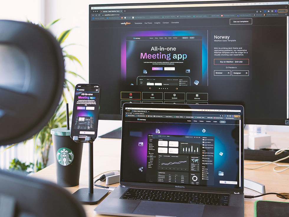
Open the Flipkart website on your phone. Then open the same Flipkart website on a laptop. Same brand, same products — but the layout looks completely different. On your phone, everything is in one column you scroll through. On the laptop, things are spread out into multiple columns with bigger images. Did Flipkart build two separate websites? No. They built ONE website that changes its layout based on the screen. That magic is called responsive design — and once you notice it, you will see it everywhere.
2
The same content appears on all devices, but the arrangement changes: single column on phone, multi-column on desktop

REAL WORLD EXAMPLE
Imagine your school bag. When you have just two books, you carry them under your arm. When you have ten books, you arrange them in a backpack with multiple sections. Same books — different arrangement based on the situation. Responsive websites work exactly the same way. The content (text, photos, buttons) stays the same. But the arrangement shifts: stacked on phones, spread out on laptops. Smart design is not about showing different things — it is about arranging the same things smartly for each space.
3
Mobile-first design: designing for the smallest screen first, then adapting for larger ones — the modern standard

REAL WORLD EXAMPLE
Twenty years ago, designers built websites for laptops first and then squeezed them into phones. Today, almost everything is the opposite — they design for the phone FIRST and then expand for laptops. Why? Because most people in India browse on phones. By starting small, designers are forced to keep things simple, fast, and clear. Then they add extra features for bigger screens. Mobile-first is not just a method — it is a respect for how the majority of people actually live online today.
4
Key responsive principles: flexible grids, flexible images, and media queries (rules that change layout at specific screen sizes)

REAL WORLD EXAMPLE
Three quiet helpers make responsive design possible. Flexible grids — invisible columns that stretch or shrink to fit. Flexible images — pictures that resize without breaking. Media queries — secret rules in the code that say things like 'if the screen is smaller than a tablet, do THIS instead'. Together, these three tools let one design fluidly transform across thousands of different devices. You never see the helpers — you only see the smooth result. That is the mark of brilliant invisible design.
5
Breakpoints are the screen widths where the layout changes: a common set is phone (<768px), tablet (768–1024px), desktop (>1024px)
REAL WORLD EXAMPLE
Breakpoints are the exact moments when a website decides 'OK, the screen has changed enough — time to rearrange'. If you slowly drag a browser window from very small to very large on a laptop, you will see the website suddenly 'jump' to a new layout at certain points. Those jumps are breakpoints. Most websites use three of them: phone, tablet, desktop. It is like three outfits for three occasions — small, medium, and large — and the website automatically wears the right one based on who is visiting.
6
Text, images, buttons, and spacing all need to scale appropriately for each screen size
REAL WORLD EXAMPLE
Responsive design is not just rearranging things — it is also about making everything the right size. A button that looks fine on a laptop might be too tiny to tap on a phone. Text that is comfortable on a desktop screen might be too small to read on mobile. Spacing that feels right on a big screen might feel cramped on small. Designers test every element across screen sizes, scaling each one carefully. The goal is never 'small website looks like big website'. The goal is 'each version feels like it was made just for THIS device'.

7
Testing on real devices is essential: a layout that looks good in a design tool may behave differently on an actual phone

REAL WORLD EXAMPLE
There is a famous rule among web designers: 'Never trust the design tool. Always trust the real device.' A layout might look perfect on the designer's giant monitor, but the moment they open it on an actual budget Android phone, things shift, break, or disappear. So serious designers keep a drawer of old phones — small ones, cracked ones, slow ones — and test their work on each one. Designing for screens you do not actually use is like cooking for people you have never met. Always test in the real world.
8
What if every creative professional who works with screens (which is almost all of them) needs to understand responsive thinking?

REAL WORLD EXAMPLE
Whether you grow up to be a graphic designer, a content creator, an app maker, a marketer, a teacher, or a small business owner — almost every job today involves something that lives on multiple screens. So thinking responsively is not just a designer's skill anymore. It is a basic literacy. Knowing that things should adapt to different screens, not be forced into one shape, is one of the most useful mindsets you can carry into the future. Because the future has more screens, not fewer.
Pro Connection
Web and app designers create responsive layouts as standard practice. Design tools like Figma have “auto-layout” features for responsive testing. When a developer says “it breaks at mobile,” they mean the responsive design isn’t working at small screen sizes.
PROFESSIONAL TERMINOLOGY
CLICK TO REVEAL and CLICK TO COVER
Layouts that automatically adapt to different screen sizes — one design, every device
What is
RESPONSIVE DESIGN
Designing for small screens first, then adapting upward for tablets and desktops
What is
MOBILE-FIRST
A screen width at which the layout changes to better fit the device
What is
BREAKPOINT
A layout grid that stretches and contracts based on screen size
What is
FLEXIBLE GRID
The visible area of a screen — the space your design occupies
What is
VIEWPORT
THE COLOUR SYSTEM SPOTTER
That electric blue on your screen and the dull navy in the printed brochure are the same colour — which means something has gone very wrong somewhere.
what TO DO
Find one thing designed for screens — an app, a website, or a digital advertisement.
Find one thing designed for print — a magazine, a food package, or a poster.
Compare the colour vibrancy in both: which has brighter, more vivid colours?
Screenshot or photograph both examples.
Write down one specific colour in the screen version that you think would be difficult to reproduce accurately in print — and explain why.
what TO SUBMIT
1 Screenshot + 1 Photo | The screen version (screenshot) and the print version (photo of the physical object) |
Text | One sentence comparing vibrancy: 'The [screen/print] version has more vivid colours because [RGB/CMYK reason].' Then: name one colour from the screen version you think can't be accurately printed, and say why. |
CHALLENGE
DISCOVERY
You can use these SOFTWARES for this Discovery Challenge
FREE SOFTWARE : Chrome Browser, Phone Screenshot, Google Keep
PAID SOFTWARE : GoodNotes 6, Notion