
SATURATION
Turn the saturation dial up: the world looks like a cartoon. Turn it down: it looks like a memory. That dial is one of the most powerful tools in the creative world.
CORE CONCEPT
IMPORTANCE OF SATURATION
KEY KNOWLEDGE
1
Saturation = the intensity or purity of a colour, from vivid (fully saturated) to muted (desaturated) to grey (zero saturation)

REAL WORLD EXAMPLE
Take a photo of a red rose on your phone. Now open your editor and find the saturation slider. Drag it all the way right — the red becomes almost neon, electric, cartoonishly intense. That's maximum saturation: the colour at its purest, most vivid state. Now drag the slider all the way left — the red fades through dusty pink, then brownish-grey, then completely grey. That's zero saturation: all colour removed, only light and dark remain. Every point on that slider is a different level of colour intensity. Saturation is the volume knob of colour — from mute to maximum.
2
High saturation: colours are vivid, pure, electric, loud — they demand attention

REAL WORLD EXAMPLE
Think of Holi. Thousands of people throwing gulal in every direction — vivid magenta, electric blue, brilliant yellow, pure green. It's the most saturated visual event in the world. Nothing is muted. Nothing is subtle. Every colour is at maximum intensity, demanding attention from every angle. That's the emotional effect of high saturation: energy, joy, excitement, sensory overload. It's the same reason children's cartoon characters are drawn in fully saturated colours — they need to grab and hold young attention instantly. Saturation at full blast says: LOOK AT ME.
3
Low saturation: colours are muted, soft, subdued, gentle — they recede and feel natural

REAL WORLD EXAMPLE
Now think of a foggy morning in the Western Ghats. The hills are there, but the green is soft, greyed, muted. The sky is a pale, washed-out blue. The brown of the trail is quiet and earthy. Everything is low saturation — and it feels completely different from Holi. It feels contemplative, quiet, almost dreamlike. That's what desaturation does: it takes the volume down and lets you breathe. It's the reason "moody" photography almost always uses reduced saturation — the muted colours create space for feeling rather than demanding attention.
4
Zero saturation: no colour at all — greyscale (black, white, and greys)

REAL WORLD EXAMPLE
Black-and-white photography isn't just "old-fashioned." It's a deliberate creative choice to remove all colour and force the viewer to see only light, shadow, form, and texture. When photographer Raghu Rai shoots portraits in black and white, every wrinkle, every shadow, every highlight becomes more powerful — because there's no colour to distract you. Zero saturation strips away the emotional shortcut of colour and makes you look harder. That's why some of the most powerful photojournalism in history was shot in greyscale — without colour, you're forced to confront the subject directly.
5
High saturation feels: energetic, playful, youthful, bold, commercial, attention-grabbing
REAL WORLD EXAMPLE
Open the Swiggy or Blinkit app during a festival sale. The banners are an explosion of saturated colour — vivid oranges, hot pinks, electric greens, bold yellows. It feels exciting, urgent, and fun — which is exactly the point. They want you to tap, browse, and order NOW. Fast food packaging uses the same trick: a packet of Lay's chips is bright yellow and red at full saturation because the colours trigger appetite and impulse. High saturation is the visual equivalent of someone clapping their hands and saying "Hey! Over here!"

6
Low saturation feels: calm, sophisticated, nostalgic, moody, natural, mature, artistic
REAL WORLD EXAMPLE
Think of the Instagram aesthetic that dominated the late 2010s — "VSCO girl" tones. Muted greens, soft pastels, desaturated warm tones. Every photo looked like a faded Polaroid from the 1970s. That low-saturation look became shorthand for "aesthetic" because it felt sophisticated, nostalgic, and curated. Indie films use the same technique — a Zoya Akhtar film often has a slightly desaturated palette that feels real and emotionally rich, as opposed to a Rohit Shetty film's punchy, saturated colours that feel loud and commercial. Neither is wrong — they're different saturation choices for different emotional intents.

7
Most real-world colours are moderately saturated — fully saturated colours are rare in nature

REAL WORLD EXAMPLE
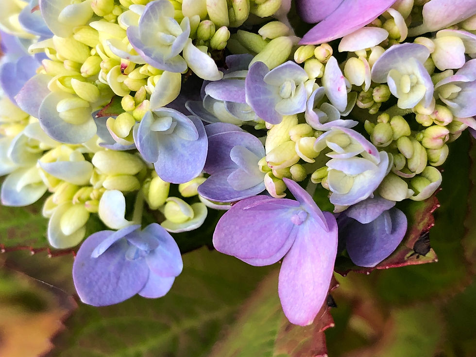
Here's a surprising truth: go outside and look for a fully saturated colour in nature. It's hard to find. The green of a leaf? Moderately saturated, with grey in it. The blue of the sky? Moderate — not electric blue. Even a "bright" flower usually has some desaturation when you look closely. Nature works in moderate saturation because it's calming and sustainable to look at for long periods. If the world were fully saturated, looking out your window would feel like staring at a cartoon. The exception? Tropical birds and flowers — and they're saturated precisely because they need to stand out against all that moderate greenery.
8
Saturation is relative: a muted colour next to a fully saturated colour looks even more muted, and vice versa
REAL WORLD EXAMPLE
Put a soft dusty pink next to a grey wall and it looks fairly colourful — it stands out, it has presence. Now put that same dusty pink next to a neon magenta. Suddenly the dusty pink looks nearly grey — all its colour seems to drain away in comparison. This is saturation relativity, and it's one of the most important things designers learn. It means you can make any colour look more vivid simply by placing it next to something muted — and you can make any colour look duller by placing it next to something vivid. Context controls perception.
Pro Connection
Photographers talk about “pulling back the saturation” for a more refined look. Film colourists say “the midtones are too saturated.” Brand designers specify “muted, desaturated tones for the secondary palette.” UI designers use “vibrant” colours for interactive elements and “muted” colours for backgrounds. Saturation control is one of the most common professional colour adjustments.
PROFESSIONAL TERMINOLOGY
CLICK TO REVEAL and CLICK TO COVER
The intensity or purity of a colour — from vivid (high) to muted (low) to grey (zero)
What is
SATURATION
A colour at high saturation — bright, intense, and eye-catching
What is
VIVID
A colour at low saturation — soft, subdued, and gentle
What is
MUTED
A colour with reduced intensity — moved toward grey
What is
DESATURATED
An image or palette with zero saturation — only black, white, and greys
What is
GREYSCALE
A selective saturation adjustment that boosts muted colours without over-saturating already vivid ones
What is
VIBRANCE
TINT-SHADE-TONE HUNT
You've been surrounded by tints, shades, and tones your entire life — you just didn't have the names for them. Today that changes.
what TO DO
Pick ONE colour — any colour you like.
Find 3 versions of that colour in your surroundings or on your phone.
TINT: a lighter, softer version (more white added) — e.g. pale sky blue if your colour is blue.
SHADE: a darker, deeper version (more black added) — e.g. navy if your colour is blue.
TONE: a muted, greyed version (grey added) — e.g. slate blue or dusty blue.
Photograph or screenshot all three. Label each one clearly.
CHALLENGE
DISCOVERY
You can use these SOFTWARES for this Discovery Challenge
FREE SOFTWARE : Snapseed, Adobe Lightroom Mobile, Phone Photos Editor, VSCO
PAID SOFTWARE : Adobe Lightroom Premium, VSCO Membership