
COLOUR STORYTELLING
The greatest filmmakers, photographers, and designers don’t just show you a colour — they tell you a story with it.
CORE CONCEPT
IMPORTANCE OF COLOUR STORYTELLING
KEY KNOWLEDGE
1
Colour storytelling = using colour deliberately to support, enhance, or drive a narrative

REAL WORLD EXAMPLE
In the film "Barfi," notice how director Anurag Basu uses colour. The past sequences are bathed in warm sepia and golden tones — they feel like a faded, beloved memory. The present sequences are cooler, more muted, more grey. The colour isn't just decoration — it's telling you which era you're in without a title card. Warm = past = nostalgia. Cool = present = reality. That's colour storytelling: the colour carries narrative information. You feel the time shift before you consciously register it. The colour told the story before the dialogue did.
2
Colour can change across a story, and that change carries meaning: warm to cool can signal loss, dark to light can signal hope
REAL WORLD EXAMPLE
Think of any film where a character loses someone they love. Notice the colour shift: before the loss, the world is warm, saturated, full of life. After the loss, the palette goes cold — blues, greys, desaturated tones. The world literally looks different because the character's emotional world has changed. Then, as the character begins to heal, warm tones slowly creep back in. The audience feels the recovery through colour before the character says a single word about feeling better. That's a colour arc — and it's one of the most powerful storytelling tools in cinema.
3
Film colour arcs: characters can be associated with specific colours that shift as the story develops

REAL WORLD EXAMPLE
In "Breaking Bad," Walter White begins the series in warm, soft khaki and beige — the colours of a mild, harmless teacher. As he transforms into a drug lord, his palette shifts to darker greens, then black. By the end, he's in pure black — the colour of his moral state. His journey from teacher to criminal is literally tracked through colour. The audience registers the shift subconsciously: "He doesn't LOOK like the same person anymore." He doesn't — because the colour story mapped his moral arc from innocence to darkness.
4
In photography, colour sets the emotional stage before the viewer reads any content in the image

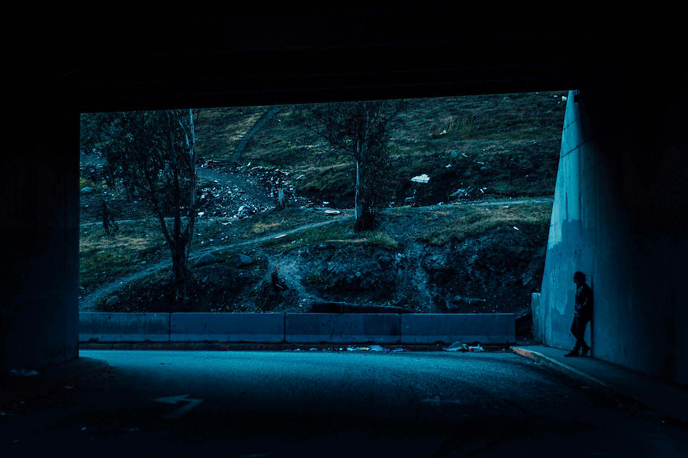
REAL WORLD EXAMPLE
A street photographer in Jaipur takes two shots of the same alleyway. In the first, the warm golden light of late afternoon fills the frame — the pink walls glow, a woman in a yellow sari walks through, the dust in the air catches the light. It feels romantic, alive, beautiful. In the second shot, taken on a cloudy morning, the same alley is grey-blue, the pink walls look faded, the woman's sari looks muddy. Same alley. Same composition. But the emotional stage is completely different — because the colour arrived before the content. The viewer feels the mood before they read the story.
5
Colour continuity across a series (posts, pages, episodes, rooms) creates a cohesive story world
REAL WORLD EXAMPLE
Look at any successful travel blogger's Instagram feed. There's a reason their grid looks like "one world" even though the photos are from 15 different countries. They maintain colour continuity: a consistent warm tone, a recurring teal accent, always warm skin tones. This colour continuity makes every post feel like a chapter in the same book. If one post were cold and blue and the next were warm and golden, the feed would feel disjointed — like chapters from different stories shuffled together. Colour continuity is the thread that stitches individual pieces into a cohesive visual world.

6
Colour contrast within a story creates emotional peaks: a burst of red in a blue world demands attention
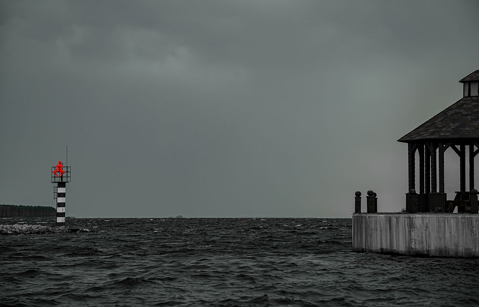
REAL WORLD EXAMPLE
In "Schindler's List," the entire film is black and white — until one moment. A little girl walks through a grey, horrific street scene wearing a red coat. That single burst of colour in a colourless world is devastating. Your eye locks onto her. Your heart breaks. Spielberg could have used any technique, but he used colour contrast to create the most emotionally powerful moment in the film. The lesson: when your colour world is consistent, breaking that consistency — even with one small colour — creates a moment of extraordinary emotional power.
7
Colour grading in film and photography is the process of adjusting colour in post-production to serve the story
REAL WORLD EXAMPLE
When a filmmaker shoots a scene, the raw footage looks flat and neutral — because cameras are designed to capture maximum information, not maximum beauty. The magic happens in the colour grading suite: the colourist takes that flat footage and paints it with the story's emotion. They push the shadows toward teal for a thriller. They warm the highlights for a romance. They desaturate for a documentary. The same raw footage can become a horror film or a love story depending entirely on how it's graded. Colour grading is where cinematography meets storytelling — and it's a career path in itself.
8
In spatial design (interiors, exhibitions, events), colour transitions guide visitors emotionally through the experience

REAL WORLD EXAMPLE
Walk through a well-designed museum exhibition. The entrance hall is cool blue — calming your energy, preparing you to be attentive. The first gallery is warm amber — you feel engaged and curious. The middle galleries shift to deep, dramatic tones — you feel the weight of the subject matter. The final gallery opens to bright, airy white — you feel released, reflective, hopeful. You never consciously noticed the colour changes, but they guided your emotional journey through the entire experience. That's spatial colour storytelling ��— the design of feelings through a sequence of spaces.
Pro Connection
Film colourists build colour scripts that map the emotional arc of every scene. Brand designers create “campaign colour worlds” that tell a seasonal story. Experience designers plan colour journeys through physical spaces. When a creative director says “what’s the colour story?” they’re asking how colour will carry the narrative across the entire project. This is where colour mastery meets storytelling mastery.
PROFESSIONAL TERMINOLOGY
CLICK TO REVEAL and CLICK TO COVER
The intentional use and progression of colour across a project to create emotional narrative and cohesion
What is
COLOUR STORY
The process of adjusting and enhancing colour in film, photography, or video to serve the mood and story
What is
COLOUR GRADING
The deliberate change in colour across a story or experience — like a character arc, but told through colour
What is
COLOUR ARC
Maintaining consistent colour choices across a series or project to create a cohesive world
What is
COLOUR CONTINUITY
A deliberate shift from one colour atmosphere to another within a story, space, or experience
What is
COLOUR TRANSITION
A visual plan mapping out the colour palette for each scene or section of a film, game, or experience
What is
COLOUR SCRIPT
THE FEELING MAP
What if every app on your phone was designed to make you feel a specific emotion before you even start using it? Today you find out if they succeeded.
what TO DO
Choose 5 apps on your phone that you use regularly.
For each app, write down: the main colour, and the feeling that colour gives you personally.
Then ask: does that feeling match what the app does? (A banking app should feel trustworthy; a music app should feel energetic or creative.)
Screenshot the icon or home screen of each app.
Bonus: find ONE app where the colour feels "wrong" — where the colour doesn't match what the app does.
CHALLENGE
DISCOVERY
You can use these SOFTWARES for this Discovery Challenge
FREE SOFTWARE : Google Photos, Canva, PicCollage, Google Keep
PAID SOFTWARE : VSCO Membership, Adobe Lightroom Premium