
COLOUR PSYCHOLOGY
You’ve never chosen your favourite colour randomly. Something inside you responds to it — and every brand, film, and space designer knows exactly how to trigger that response.
CORE CONCEPT
IMPORTANCE OF COLOUR PSYCHOLOGY
KEY KNOWLEDGE
1
Red: energy, passion, urgency, danger, excitement, appetite. Increases heart rate. Used for clearance sales, food brands, emergency signals

REAL WORLD EXAMPLE
Next time you walk into a Big Bazaar during a sale, notice the colour screaming at you from every banner: RED. "70% OFF!" in red. "Last Day!" in red. "Rush Now!" in red. Red literally increases your heart rate and creates a sense of urgency — your brain reads it as "something important is happening, act fast." That's why sale banners are never blue ("Relax, the sale will still be here tomorrow"). And it's the same reason Zomato, McDonald's, KFC, and Coca-Cola all use red: it triggers appetite and action. Red is the most emotionally demanding colour on earth.
2
Blue: trust, calm, professionalism, stability, reliability, sadness. The most universally “liked” colour. Used by banks, tech companies, social media

REAL WORLD EXAMPLE
Why is every bank blue? SBI — blue. HDFC — blue. ICICI — blue. Citibank — blue. Bank of America — blue. It's not a coincidence. Blue is the colour of trust, stability, and reliability — exactly what you want from the institution holding your money. It's also why Facebook, Twitter, LinkedIn, and Telegram are blue. These platforms need you to trust them with your data, your conversations, your professional identity. Blue says: "I'm stable. I'm not going anywhere. You can count on me." It's the colour of the dependable friend who always shows up on time.
3
Yellow: optimism, warmth, attention, happiness, caution. Highly visible. Used for warnings and joyful brands

REAL WORLD EXAMPLE
Think about two very different uses of yellow. Use one: a school bus. Why is it yellow? Because yellow is the most visible colour in peripheral vision — your brain notices it before any other colour, even when you're not looking directly at it. That's yellow for safety and attention. Use two: Snapchat's icon. Why yellow? Because it feels young, happy, and optimistic — like sunshine. That's yellow for joy. Same colour, two jobs: one practical (visibility), one emotional (happiness). Yellow carries both signals simultaneously, which is why it's both a warning colour and a celebration colour.
4
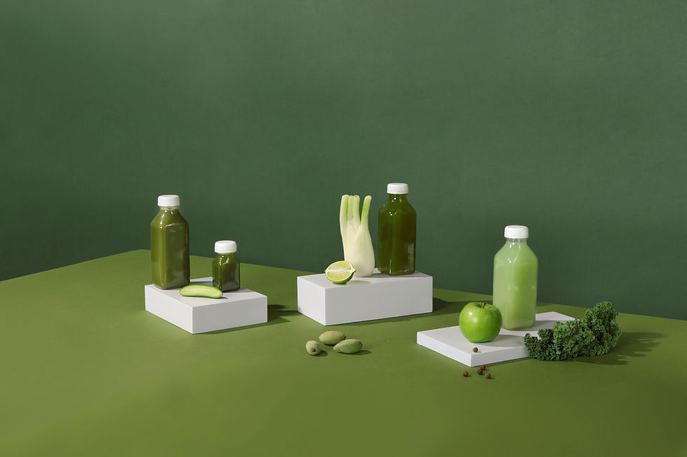
Green: nature, health, growth, freshness, balance, wealth. Associated with sustainability and wellness
REAL WORLD EXAMPLE
Walk into any pharmacy or organic food store. What colour dominates? Green. Patanjali — green. Organic India — green. Himalaya — green. Whole Foods — green. Green is so strongly associated with health, nature, and freshness that using any other colour for a wellness brand would feel like a mistake. It also signals growth and money (think of how stock market "up" is always green). When Spotify chose green, they were saying: "We're fresh, we're growing, we're alive." Green is the colour of things that are thriving.
5
Orange: enthusiasm, warmth, creativity, fun, energy. More approachable than red, more energetic than yellow
REAL WORLD EXAMPLE
Orange is an interesting colour because it has the energy of red without the aggression, and the cheerfulness of yellow without the caution. That's why Fanta, Nickelodeon, and Swiggy use it — it feels fun, friendly, and active. In India, orange has the added cultural dimension of spirituality and festival (think of the marigold garlands during puja, the saffron robes of monks). A creative agency is more likely to use orange than a law firm, because orange says "we're creative, energetic, and approachable" — while a law firm needs the seriousness of blue or black.

6
Violet/Purple: luxury, creativity, mystery, wisdom, royalty. Historically rare and expensive to produce
REAL WORLD EXAMPLE
Historically, purple dye was so expensive that only royalty could afford it — the dye came from thousands of tiny sea snails. That association stuck: purple still means luxury, royalty, and exclusivity. Cadbury knew this — their signature purple doesn't say "chocolate." It says "premium indulgence." Hallmark uses purple because it says "special, thoughtful, elevated." When a student uses purple in a design, they're tapping into centuries of association with "this is rare, this is precious." No other colour carries that historical weight.

7
Black: power, sophistication, elegance, mystery, formality. The ultimate neutral and the colour of premium

REAL WORLD EXAMPLE
Look at the packaging of any truly premium product: an iPhone box (black), a luxury watch case (black), a designer handbag dust bag (black), a premium whiskey bottle (black label). Black dominates the luxury world because it communicates power without trying. It doesn't compete with other colours — it absorbs them. It doesn't shout — it commands. That's why formal wear is black (not red or green). Black is the colour that says: "I don't need to demand your attention. You'll give it to me because of what I represent."
8
White: purity, simplicity, cleanliness, space, minimalism. Creates breathing room in design

REAL WORLD EXAMPLE
Open any Apple product page. What's the dominant colour? White. Open Google's search homepage. White. Walk into a newly renovated minimalist apartment. White walls, white surfaces, white accents. White is the colour of space, simplicity, and clarity. It creates "breathing room" — visually and psychologically. In design, white space (the empty space around elements) is considered just as important as the content itself. Designers often say: "Don't fill every space. Let it breathe." White is the breath. It gives every other colour room to exist.
Pro Connection
Brand strategists build entire brand personalities around colour psychology: “we’re a trust brand, so blue is our foundation.” Interior designers select colour palettes based on how they want a space to feel: “warm and welcoming” or “cool and focused.” Film directors and production designers choose colour palettes that support the emotional narrative of each scene. Colour psychology is the bridge between colour theory and real-world creative decision-making.
PROFESSIONAL TERMINOLOGY
CLICK TO REVEAL and CLICK TO COVER
The study of how colours affect human emotions, perceptions, and behaviour
What is
COLOUR PSYCHOLOGY
The automatic feeling or meaning triggered by a specific colour
What is
EMOTIONAL ASSOCIATION
The immediate emotional effect a colour creates on the viewer
What is
COLOUR IMPACT
The mental and emotional reaction triggered by a colour — often unconscious
What is
PSYCHOLOGICAL RESPONSE
THE FEELING MAP
What if every app on your phone was designed to make you feel a specific emotion before you even start using it? Today you find out if they succeeded.
what TO DO
Choose 5 apps on your phone that you use regularly.
For each app, write down: the main colour, and the feeling that colour gives you personally.
Then ask: does that feeling match what the app does? (A banking app should feel trustworthy; a music app should feel energetic or creative.)
Screenshot the icon or home screen of each app.
Bonus: find ONE app where the colour feels "wrong" — where the colour doesn't match what the app does.
CHALLENGE
DISCOVERY
You can use these SOFTWARES for this Discovery Challenge
FREE SOFTWARE : Phone Screenshot, Google Keep, Apple Notes / Samsung Notes, Canva
PAID SOFTWARE : GoodNotes 6, Notability