
COLOUR IN BRANDING
You can recognise Coca-Cola without reading the name. You can spot Spotify without seeing the logo. That’s the power of owning a colour.
CORE CONCEPT
IMPORTANCE OF COLOUR IN BRANDING
KEY KNOWLEDGE
1
Brand colour is the single most recognisable element of a brand — more memorable than logos, fonts, or taglines
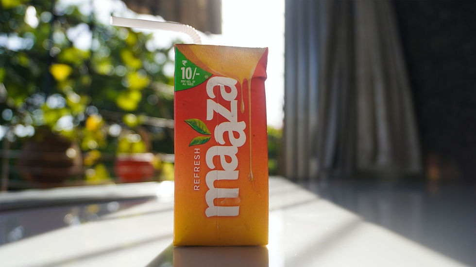
REAL WORLD EXAMPLE
Try this: close your eyes and think "Fevicol." What colour came to mind? Blue. Think "Frooti." Yellow and green. Think "Amul." Red and white. You didn't think of their logos, their fonts, or their jingles first — you thought of their colours. That's because colour registers in your brain faster than text or shape. Studies show that colour is processed 60,000 times faster than text. When Fevicol changed their tube from white to the iconic blue, sales didn't change because of better adhesive — they changed because the blue tube became instantly findable on every hardware store shelf in India.
2
Colour increases brand recognition by up to 80% — people remember colours before they remember names

REAL WORLD EXAMPLE
You're driving on a highway at 100 km/h. You see a large sign ahead. At that speed, you can't read the text yet — but you see the colour. Yellow and red? Must be McDonald's. Green? Maybe Starbucks or BP. Blue and yellow? Probably IKEA. The colour reached your brain hundreds of metres before the text became legible. That's why highway branding focuses on colour first, logo second, and text last. Colour is the first messenger. By the time you're close enough to read "McDonald's," your brain has already decided whether you're stopping.
3
Brand colour must communicate personality: trust (blue), energy (red), creativity (purple), nature (green), premium (black)

REAL WORLD EXAMPLE
Why did Cadbury choose purple? Not because someone "liked purple" — but because purple communicates luxury, indulgence, and premium quality. Why did Vodafone choose red? Because red communicates energy, connection, and urgency. Why did Asian Paints choose a specific blue-and-red combination? Blue for trust (you're trusting them with your home), red for energy and passion about colour. Every major brand's colour is a strategic personality decision. When a startup picks a colour randomly ("I just like green"), they're leaving their brand personality to chance.
4
Brand colour must differentiate: if every competitor uses blue, a contrasting choice (orange, green, red) helps you stand out

REAL WORLD EXAMPLE
In the Indian telecom market, Jio launched into a sea of blue competitors — Airtel was red-white, but Vodafone was red, Idea was yellow-orange. Jio chose blue — which matched the trust/tech association but initially made differentiation harder. Now compare this with the challenger strategy: when Dunzo launched into a market full of red and orange delivery apps (Swiggy, Zomato), they chose green — immediately standing out in the app drawer. When everyone zigs to blue, the smart brand zags to orange. Differentiation through colour is one of the fastest ways to be noticed in a crowded market.
5
Consistency is critical: the exact same colour must appear everywhere the brand exists — screen, print, physical space
REAL WORLD EXAMPLE
Imagine if Zomato's red looked different everywhere: slightly orange on the app, pinkish on their delivery bags, brownish on their office walls, and neon on their billboards. You'd subconsciously feel that something was off — like the brand is unreliable. That's why Zomato (and every well-managed brand) specifies their exact red with precise colour codes and enforces it ruthlessly. The same red on the app, the bag, the restaurant sticker, the uniform, the hoarding. Colour consistency isn't obsessive — it's what builds the trust that makes a logo feel like a promise.

6
Brands specify colours with precise codes: Hex (for screens), RGB (for digital), CMYK (for print), Pantone (for physical production)
REAL WORLD EXAMPLE
You can't just tell a printer "make it red." Which red? There are thousands. That's why brands specify colours with scientific precision: Zomato Red isn't "red" — it's Hex #CB202D on screens, a specific CMYK formula for print, and a Pantone number for physical production (bags, uniforms, signage). These codes ensure that the colour on a hoarding in Chennai matches the colour on a box in Delhi matches the colour on a screen in London. It's the reason a Coca-Cola can looks identical whether it's manufactured in Atlanta or Ahmedabad. Colour codes are the DNA of brand identity.

7
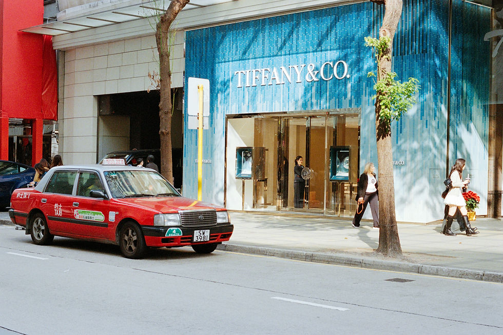
Some brands have trademarked their specific colours: Tiffany Blue, Cadbury Purple, UPS Brown, T-Mobile Magenta
REAL WORLD EXAMPLE
Cadbury actually took legal action when another chocolate brand tried to use a similar purple on their packaging. Tiffany & Co. has trademarked their robin's egg blue to the point where just seeing that colour on a box makes people think "engagement ring." These brands have invested so heavily in colour that they now legally own their shade. It's like owning a word — except it's a visual word that communicates before anyone reads anything. When a colour becomes so tied to a brand that no one else can use it, that's the ultimate proof of colour as identity.
8
A brand’s colour palette typically includes: a primary brand colour (the one people remember), secondary colours (for flexibility), and an accent or action colour

REAL WORLD EXAMPLE
Take Flipkart. Primary brand colour: that specific Flipkart blue — it's on the logo, the app icon, the header. Secondary colours: white and light grey — used for backgrounds, content areas, breathing space. Accent/action colour: yellow/orange — used specifically for "Buy Now" buttons, sale tags, and price highlights. Three colour roles, each doing a different job. The blue says "trust us." The white says "breathe." The yellow says "act now." Remove any one of these and the system breaks — the brand loses either its identity, its clarity, or its conversion power.
Pro Connection
Brand designers spend weeks selecting the right primary colour, testing it across digital and physical applications. When a designer says “that’s off-brand,” they often mean the colour is wrong. Brand managers enforce colour consistency with Pantone specifications and hex codes. The entire profession of brand design is, at its core, about creating a visual identity — and colour is the foundation of that identity.
PROFESSIONAL TERMINOLOGY
CLICK TO REVEAL and CLICK TO COVER
The primary colour associated with a brand — the one people recognise instantly
What is
BRAND COLOUR
The complete visual system of a brand: colour, logo, typography, imagery style, and tone
What is
BRAND IDENTITY
The precise specification of a colour in a specific system (Hex, RGB, CMYK, Pantone)
What is
COLOUR CODE
A universal colour matching system used to ensure the same colour reproduces exactly the same across all media and materials
What is
PANTONE
A document specifying exactly how brand elements (including colour) should be used — the "rulebook"
What is
BRAND GUIDELINES
Ensuring the exact same colours appear everywhere the brand exists, across all formats and media
What is
COLOUR CONSISTENCY
THE FEELING MAP
What if every app on your phone was designed to make you feel a specific emotion before you even start using it? Today you find out if they succeeded.
what TO DO
Choose 5 apps on your phone that you use regularly.
For each app, write down: the main colour, and the feeling that colour gives you personally.
Then ask: does that feeling match what the app does? (A banking app should feel trustworthy; a music app should feel energetic or creative.)
Screenshot the icon or home screen of each app.
Bonus: find ONE app where the colour feels "wrong" — where the colour doesn't match what the app does.
CHALLENGE
DISCOVERY
You can use these SOFTWARES for this Discovery Challenge
FREE SOFTWARE : Phone Screenshot, Phone Camera, Canva, Google Keep
PAID SOFTWARE : Canva Pro, Procreate Pocket