
THE SPACE BETWEEN THINGS
What if the most important part of any design isn’t the stuff IN it — but the space AROUND it?
CORE CONCEPT
IMPORTANCE OF THE SPACE BETWEEN THINGS
KEY KNOWLEDGE
1
Empty space is a design choice, not leftover room. Designers deliberately decide how much space surrounds every element

REAL WORLD EXAMPLE
Open your WhatsApp and then open a news website like Aaj Tak or NDTV. WhatsApp feels clean and easy to read. The news site feels like someone threw 200 things at your face at once. The difference? WhatsApp’s designers deliberately chose to leave space between messages, between buttons, between everything. That empty space isn’t laziness — it’s a decision. The news site chose to fill every pixel because they want you to feel the urgency of 50 stories at once. Both are design choices. Neither is an accident.
2
Negative space = the area around and between subjects. It’s sometimes called white space (though it doesn’t have to be white)
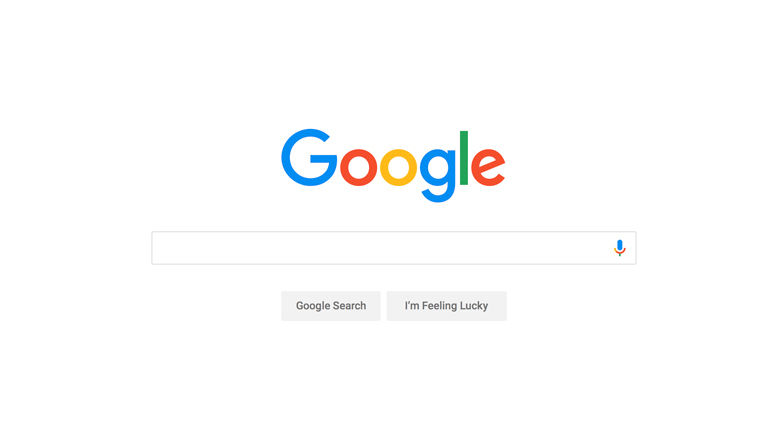
REAL WORLD EXAMPLE
Look at the Google homepage. It’s mostly nothing — a logo, a search bar, and a whole lot of empty screen. That “nothing” is negative space, and it’s the reason you know exactly what to do the second the page loads. Now imagine if Google filled that page with ads, links, news, and videos like some other search engines do. You’d feel lost. Google’s negative space isn’t white because of the colour — it’s white because the designers said: “the best thing we can put here is nothing.”
3
More negative space creates calm and elegance; less negative space creates energy and urgency

REAL WORLD EXAMPLE
Walk into a Tanishq jewellery store. There’s one necklace sitting on a velvet cushion with nothing else around it. It looks like it costs a lakh even before you check the price. Now walk into a local market jewellery stall where 300 pieces are piled on top of each other. Same gold, maybe — but totally different feeling. The Tanishq store uses space to say “this is precious.” The market stall uses no space to say “we have everything!” Space is what makes something feel expensive or energetic.
4
Less negative space = more energy, more urgency, more information density. Think news websites, busy market stalls, event posters

REAL WORLD EXAMPLE
Look carefully at the FedEx logo. Between the “E” and the “x,” there’s a hidden arrow pointing forward. You might have seen the FedEx logo a hundred times and never noticed it. That arrow isn’t drawn — it’s created by the empty space between the letters. The designers didn’t add anything. They shaped the nothing. That’s negative space becoming the design itself, not just the background.
5
Negative space can itself become a design element — some of the world’s cleverest logos hide shapes in their negative space
REAL WORLD EXAMPLE
Take your phone and look at the home screen. The gap between each app icon? That’s not random. Apple and Android designers tested dozens of spacing options before deciding exactly how many pixels should sit between each icon. If the icons were closer, the screen would feel cramped and your thumb would tap the wrong app constantly. If they were further apart, you’d fit fewer apps and waste screen space. That exact gap is a design decision made by someone who tested it hundreds of times.

6
On your phone screen, the space between app icons, between text and edges, and between images in a feed — all of it is designed
REAL WORLD EXAMPLE
Think about two classrooms. One has charts covering every inch of wall, projects hanging from the ceiling, supplies piled on every surface, and posters overlapping posters. The other has a few well-placed charts, clear walls, tidy shelves, and open floor space. Which one makes you feel calmer the moment you walk in? The second one — not because it has better stuff, but because your brain isn’t screaming “too much information!” Clutter stresses your brain. Space lets it relax.

7
Cluttered designs make people feel overwhelmed. Spacious designs make people feel at ease. This applies to screens, rooms, and physical spaces equally

REAL WORLD EXAMPLE
When you write a school essay, your teacher says “remove the extra words.” When a chef creates a dish, they don’t throw in every spice — they pick three or four that work together. Design works the same way. The hardest part of making a great poster isn’t finding things to put on it — it’s deciding what to leave off. Every element you remove gives the remaining elements more power. A poster with one big image and three words hits harder than one with ten images and fifty words.
8
The most important design skill might not be adding things — but knowing what to leave out

REAL WORLD EXAMPLE
If you’ve ever seen a Japanese room in a movie or online, you’ll notice something strange: it’s almost empty. A mat on the floor, maybe a low table, a single flower in a vase, and that’s it. No clutter, no extra furniture, no decoration overload. And yet it looks beautiful. In Japanese culture, the concept of “ma” means the beauty of empty space itself. The empty space IS the decoration. It’s the same idea behind a zen garden: a few rocks and raked sand — and somehow, the nothing is everything.
Pro Connection
Graphic designers talk about “letting it breathe” when a layout is too packed. UI designers specify exact spacing values between every element. Interior designers say “the room needs more air.” When a creative director says “less is more,” they’re often talking about using negative space to make fewer elements feel more powerful. It’s one of the most universal principles across all creative professions.
PROFESSIONAL TERMINOLOGY
CLICK TO REVEAL and CLICK TO COVER
The empty area around and between the subjects of a design — not leftover, but deliberately designed
What is
NEGATIVE SPACE
Another name for negative space, commonly used in graphic and web design (it doesn't have to be white)
What is
WHITE SPACE
When elements have enough space around them to feel uncrowded and comfortable — a sign of thoughtful design
What is
BREATHING ROOM
How tightly elements are packed together — high density feels busy and energetic; low density feels open and calm
What is
DENSITY
Too many elements with too little space — creates visual stress and makes it hard to focus on anything
What is
CLUTTER
THE SPACE FLIP
What if the most important difference between a beautiful design and a stressful one isn't colour, or fonts, or images — it's simply how much space is left around everything?
what TO DO
On your phone, find one app or website that feels spacious and calm — plenty of room around everything.
Find a second app or website that feels crowded and busy — elements packed tightly together.
Screenshot both.
Now look only at the SPACE: how much room is around the text? Between images? At the edges of the screen?
Write one sentence about each, using the words from the capsule: "This feels [calm/busy] because the space is [generous/tight]."
what TO SUBMIT
2 Screenshots | The spacious app and the crowded app — clearly labelled. |
Text | One sentence per screenshot: "This feels [calm/busy] because the space is [generous/tight] — specifically around [the text/images/icons/edges]." Then one more sentence: "The main design difference between them is [observation]." |
CHALLENGE
DISCOVERY
You can use these SOFTWARES for this Discovery Challenge
FREE SOFTWARE : Phone Screenshot, Snapseed, Google Keep, Markup / Photos Editor
PAID SOFTWARE : GoodNotes 6, Procreate Pocket