
GRIDS — THE INVISIBLE ARCHITECTURE
What if I told you there’s a hidden structure behind every beautiful website, every magazine page, and every well-arranged room — and once you see it, you can use it yourself?
CORE CONCEPT
IMPORTANCE OF GRIDS — THE INVISIBLE ARCHITECTURE
KEY KNOWLEDGE
1
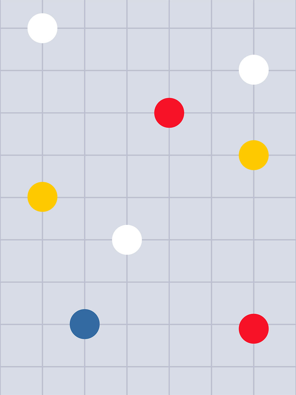
A grid is a system of invisible lines that organise a layout into consistent, aligned sections
REAL WORLD EXAMPLE
Take a ruled notebook and hold it up. Those horizontal lines help you write straight. Now imagine vertical lines too, creating little boxes. That’s basically what a grid does for designers. It’s a set of invisible lines they place on a page or screen BEFORE putting any content on it. Every image, headline, and text block “snaps” to these lines so everything stays aligned and neat. You can’t see the grid on a finished design, but you can feel it — everything lines up perfectly.
2
Grids make design easier: instead of guessing where to put things, you snap elements to the grid
REAL WORLD EXAMPLE
Imagine you’re arranging photos on your bedroom wall. Without a plan, you’d hold up each photo and guess: “Does this look right here? Higher? Lower? More to the left?” It takes forever and still looks uneven. But if you first stuck strips of tape on the wall in a grid pattern and then placed each photo inside a grid section, everything would align perfectly in minutes. Grids are that tape strip for designers — a shortcut that makes “where does this go?” an easy question instead of a guessing game.
3
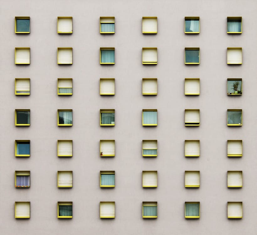
The simplest grid: divide a page into equal columns (2, 3, 4, or more) with gutters (gaps) between them

REAL WORLD EXAMPLE
Look at any newspaper. The page is divided into 5 or 6 vertical columns, with small gaps between them. Headlines span 2 or 3 columns, photos fill 1 or 4 columns, and text flows down each column. That’s the simplest grid in action. The columns keep everything aligned. The gaps (called gutters) keep the columns from blending into each other. It’s the same idea as lanes on a road — everyone stays in their lane, and traffic flows smoothly.
4
Grids create consistency: if every page or screen uses the same grid, everything feels connected and professional

REAL WORLD EXAMPLE
Open any textbook and flip quickly through 10 pages. Even though the content changes — different topics, different images — the pages feel like they belong together. That’s because every page uses the same grid: same margins, same column widths, same heading positions. It’s like a school uniform — everyone looks different, but the uniform creates a sense of “we belong together.” A consistent grid is a design’s uniform.
5
Grids are used everywhere: web design, app design, print layout, editorial design, poster design, and even architectural planning
REAL WORLD EXAMPLE
City planners use grids too. Think of Chandigarh — the entire city is laid out on a grid of numbered sectors. Streets run in straight lines. Sectors are rectangular blocks. You can find any address just by knowing the sector number. Compare that to old cities like Jaipur’s inner city or Varanasi’s lanes where streets curve and twist. The grid city is easy to navigate. The non-grid city is charming but confusing. Grids work the same way whether you’re designing a poster or a whole city.

6
Breaking the grid intentionally creates surprise and energy — but you need to know the grid first before you can break it effectively
REAL WORLD EXAMPLE
In cricket, a batsman learns the textbook shots first: straight drive, cover drive, defence. Only after mastering those can they play a reverse sweep or a switch hit. If a beginner plays a reverse sweep, it’s just a messy mistake. If Virat Kohli plays one, it’s genius — because he broke the rules ON PURPOSE. Grid-breaking in design works the same way. A designer who puts an image that deliberately crosses grid lines creates excitement. A designer who doesn’t know grids just creates mess.

7
Your phone’s interface is built on a grid: icons, text, buttons, and spacing all follow a mathematical grid system

REAL WORLD EXAMPLE
Android phones literally show you the grid when you long-press to move an app icon — you can see the rows and columns light up. Every icon is the same size, every row is the same height, every gap is the same width. The settings page, the notification panel, the app drawer — all grid-based. Even the keyboard you type on is a grid: rows and columns of letters, each key exactly the same size. You’re touching a grid hundreds of times a day without thinking about it.
8
Every newspaper page uses a column grid — the better the design, the clearer the grid will be

REAL WORLD EXAMPLE
Take a well-designed newspaper like The Hindu or The Indian Express and look at a page. Everything aligns. Headlines start at the same positions. Columns are even. Photos fit within column widths. Now look at a cheaply printed pamphlet or a badly designed local newsletter. Text is randomly placed, images are different sizes with no pattern, nothing lines up. The difference is the grid. Professional publications always start with one. Amateur ones never do. That’s why one looks polished and the other looks chaotic.
Pro Connection
Every design tool (Figma, Adobe XD, Canva) has grid and alignment features built in. Web developers use CSS Grid to build website layouts. Graphic designers set up grids before placing any content. When a designer says “nothing is aligning,” they mean the grid is broken or missing. When they say “break the grid here for impact,” they’re using the grid as a starting point for deliberate creative disruption.
PROFESSIONAL TERMINOLOGY
CLICK TO REVEAL and CLICK TO COVER
A framework of invisible lines that organises elements in a layout — the hidden architecture behind professional design
What is
GRID SYSTEM
A vertical division in a grid — content is placed within and across columns
What is
COLUMN
A horizontal division in a grid — creates horizontal alignment between elements
What is
ROW
The space between columns — prevents content from touching and creates visual breathing room
What is
GUTTER
Aligning elements precisely to the grid lines — creating clean, consistent positioning
What is
SNAP TO GRID
Deliberately placing something outside the grid for creative effect — powerful when done intentionally
What is
BREAKING THE GRID
THE SPACE FLIP
What if the most important difference between a beautiful design and a stressful one isn't colour, or fonts, or images — it's simply how much space is left around everything?
what TO DO
On your phone, find one app or website that feels spacious and calm — plenty of room around everything.
Find a second app or website that feels crowded and busy — elements packed tightly together.
Screenshot both.
Now look only at the SPACE: how much room is around the text? Between images? At the edges of the screen?
Write one sentence about each, using the words from the capsule: "This feels [calm/busy] because the space is [generous/tight]."
what TO SUBMIT
2 Screenshots | The spacious app and the crowded app — clearly labelled. |
Text | One sentence per screenshot: "This feels [calm/busy] because the space is [generous/tight] — specifically around [the text/images/icons/edges]." Then one more sentence: "The main design difference between them is [observation]." |
CHALLENGE
DISCOVERY
You can use these SOFTWARES for this Discovery Challenge
FREE SOFTWARE : Phone Screenshot, Snapseed, Markup / Photos Editor, Google Keep
PAID SOFTWARE : Procreate Pocket, GoodNotes 6