
KERNING, TRACKING & LEADING
What if the secret to making any text look professional isn’t the font you choose — but the SPACE between the letters? The space between letters, between words, and between lines is just as designed as the letters themselves. Get the space wrong, and even beautiful type looks amateur.
CORE CONCEPT
IMPORTANCE OF KERNING, TRACKING & LEADING
KEY KNOWLEDGE
1
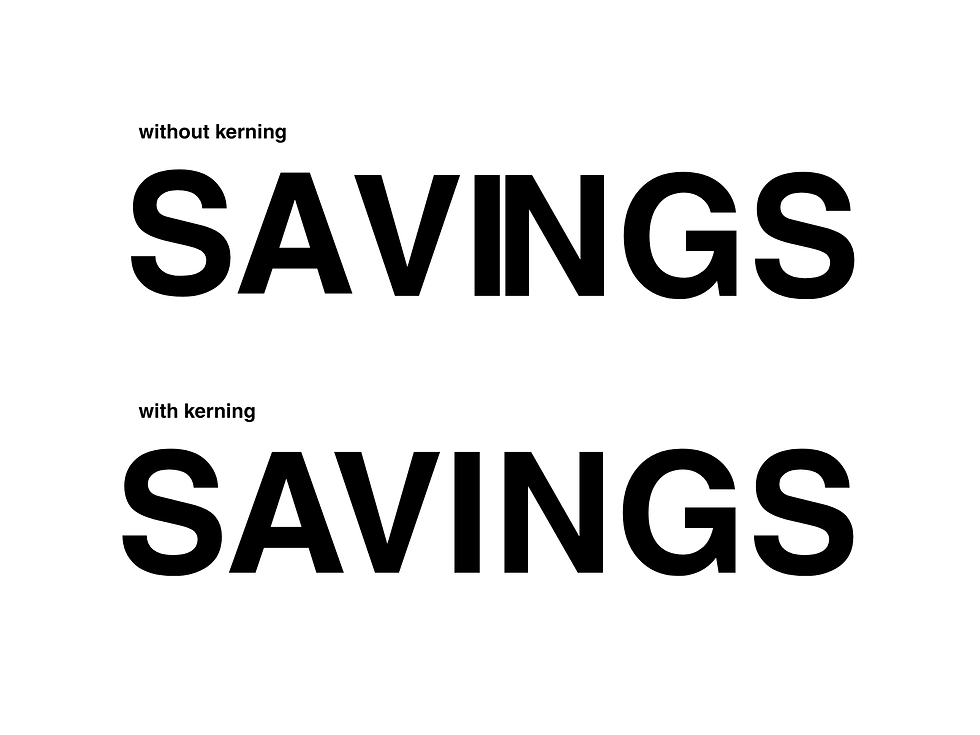
Kerning: adjusting the space between specific pairs of letters to make them visually balanced (e.g., “A” and “V” need less space because their shapes interlock)

REAL WORLD EXAMPLE
Write the letters "A" and "V" next to each other with equal spacing on either side. Now look — there's a big awkward gap between them because both letters are diagonal and open. The space between "A" and "V" looks wider than the space between, say, "H" and "I," even though the actual measurement might be the same. Kerning fixes this by reducing the space between specific pairs that create optical gaps. A type designer or graphic designer manually adjusts "AV," "To," "Wa," "LT" and dozens of other tricky pairs so that every pair of letters looks evenly spaced to the human eye — even though technically the measurements are all different. It's optical balancing, not mathematical spacing. Your eye doesn't measure — it judges. Kerning serves the judge, not the ruler.
2
Bad kerning creates awkward visual gaps or collisions between letters — this is one of the most common amateur typography mistakes
REAL WORLD EXAMPLE
There's an entire internet subculture dedicated to photographing bad kerning in the real world. A sign for "CLICK" where the "cl" is too close together and reads as something else. A shop called "MEGAFLICKS" where poor spacing creates an embarrassing misread. A "THERAPIST" sign where the gap falls in the wrong place. These photos go viral because bad kerning is funny — but for the business behind that sign, it's a disaster. Bad kerning doesn't just look unprofessional — it can literally change the meaning of words. It's one of those mistakes that ordinary people can't name but can absolutely feel. Something just looks "off." And that vague "off" feeling is enough to make a business look amateur, a poster look cheap, or a brand feel untrustworthy. The space between letters matters as much as the letters themselves.
3
Tracking (also called letter-spacing): adjusting the uniform space between ALL characters in a block of text

REAL WORLD EXAMPLE
Open any luxury fashion brand's website — Chanel, Prada, Dior. Look at the navigation menu. The letters are spaced apart: W I D E L Y. That's tracking — uniform extra space added between every letter. It feels open, luxurious, unhurried. Like the brand has so much room it doesn't need to squeeze. Now look at a breaking news headline on a news app: the letters are packed tight. That's tight tracking — minimal space between letters, creating density and urgency. Tracking is the volume knob of typography: wide tracking whispers elegance, tight tracking shouts urgency, and the default sits in the middle for comfortable reading. Unlike kerning (which adjusts specific pairs), tracking adjusts the spacing of all letters uniformly. It's a single slider that transforms the personality of any text.
4
Leading (line-spacing): the vertical space between lines of text. Named after lead strips used in traditional printing

REAL WORLD EXAMPLE
Open your phone's notes app. Type a full paragraph — maybe five or six lines. Now look at the space between those lines. Comfortable? Easy to read? That's because the app's designer set the leading (the vertical space between lines) at a reading-friendly value. Now imagine those same lines with zero extra space — each line touching the one above and below. Suffocating. Your eye would lose its place constantly, jumping between lines like trying to walk through a packed crowd. The term "leading" comes from actual strips of lead metal that old-school printers placed between rows of metal type to add space. The lead is gone, but the word survived. Today we call it "line-height" in digital design, and it's one of the first things any UI designer adjusts. Too tight = claustrophobic. Too loose = disconnected. Just right = invisible comfort.
5
Loose/wide tracking: feels open, airy, luxurious, elegant. Common in high-end branding and editorial design
REAL WORLD EXAMPLE
Walk through any five-star hotel lobby — The Taj, The Oberoi, The Leela. Look at the signage. The room number plates. The restaurant name. The letters are always spaced wide apart. G R A N D B A L L R O O M. There's no practical reason the letters need that much space — it's not for readability. It's for feeling. Wide tracking says "we have so much space, we don't need to crowd." It says "take your time." It says "luxury." Budget hotels don't do this — their signs are packed tight because they're communicating efficiency, not elegance. Next time you walk through a premium space, look at the letter spacing on the signage. Wide tracking is the typographic equivalent of high ceilings and marble floors — it communicates luxury through the sheer generosity of space.

6
Tight tracking: feels dense, urgent, compact, industrial. Common in headlines and bold statements
REAL WORLD EXAMPLE
Look at a breaking news ticker on any TV channel — NDTV, Republic, Aaj Tak. The text is packed tight. Letters almost touching. No breathing room. Why? Because tight tracking creates urgency. It says "this is important, this is happening NOW, read fast." Spotify does the same thing with its billboard ads — thick, bold text with tight tracking that feels like music pounding at full volume. Sports graphics use tight tracking to match the intensity of competition. A poster for a rock concert uses tight tracking because the music itself is loud and dense. The less space between the letters, the more urgency the text communicates. It's the visual equivalent of speaking fast — you lean in, you pay attention, you feel the pressure of every word sitting right up against the next.
7
On screens, generous leading is critical for readability — text that's comfortable to read on a phone has more line-spacing than you might think

REAL WORLD EXAMPLE
The next time you're reading a long article on your phone — maybe on Google News or a blog — pay attention to how much space exists between each line of text. It's more than you'd expect. On a phone, where the screen is narrow and your eyes are tracking small text on a glowing surface, generous line-spacing is the difference between reading comfortably for ten minutes and giving up after thirty seconds. Apple's Human Interface Guidelines specify exactly how much leading body text needs on iPhone. Google's Material Design does the same for Android. Both recommend more vertical space than most beginners would ever add. The professional rule: when in doubt, add more leading. Text on a small screen needs room to breathe — more than text in a book, more than text on a desktop. If it feels "too spaced out," it's probably just right.
8
Spacing is often what makes the difference between amateur and professional typography — the same typeface with better spacing looks dramatically better

REAL WORLD EXAMPLE
Here's an experiment any student can do: type the same sentence twice in the same typeface. Leave the first one at default spacing. For the second, add slightly more space between the lines and slightly more tracking in the heading. Put them side by side. The second version will look like it was designed by a professional, even though you changed nothing about the typeface, the colour, or the size — only the spacing. This is the great secret of typography that most beginners never learn: the difference between amateur and professional isn't the typeface choice. It's the spacing. A mediocre typeface with great spacing looks professional. A beautiful typeface with bad spacing looks amateur. Every time you see a poster that feels "clean" and "polished," look at the spacing first. That's where the polish lives.
Pro Connection
Designers say “open up the tracking” or “tighten the leading.” UI specifications include exact line-height values. Brand guidelines specify tracking for logo type. When a designer says “the text needs to breathe,” they usually mean the leading or tracking is too tight. Spacing is where the detail obsession of professional typography really shows.
PROFESSIONAL TERMINOLOGY
CLICK TO REVEAL and CLICK TO COVER
Adjusting space between specific letter pairs for visual balance — e.g., closing the gap between A and V
What is
KERNING
Uniform spacing between ALL letters in a text block — also called letter-spacing
What is
TRACKING
The vertical space between lines of text — also called line-spacing or line-height
What is
LEADING
Another term for tracking — the overall horizontal space between characters
What is
LETTER-SPACING
The digital / CSS term for leading — the total height of a line including the text and space above/below
What is
LINE-HEIGHT
Reduced spacing (between letters or lines) — dense and compact
What is
TIGHT
Increased spacing (between letters or lines) — open and airy
What is
LOOSE
THE HIERARCHY MAP
Right now, a screen is shouting at you, talking to you, and whispering at you — all at once. Can you tell who's who?
what TO DO
Open any app or website on your phone.
Find exactly 3 levels of text hierarchy: Level 1 — the HEADING (biggest and boldest), Level 2 — the BODY (the main content), Level 3 — the CAPTION (the smallest detail).
Take a screenshot.
Repeat with a second, different app.
Ask yourself: which app has clearer hierarchy? Which one makes it easiest to know where to look first?
CHALLENGE
DISCOVERY
You can use these SOFTWARES for this Discovery Challenge
FREE SOFTWARE : Notes App, Chrome Browser, Canva, Google Keep
PAID SOFTWARE : Canva Pro, Adobe Express Premium