
ALIGNMENT - THE INVISIBLE BACKBONE
Alignment is the invisible force that makes a page feel organised or chaotic. You can’t see it, but you can always feel when it’s wrong.
CORE CONCEPT
IMPORTANCE OF ALIGNMENT - THE INVISIBLE BACKBONE
KEY KNOWLEDGE
1
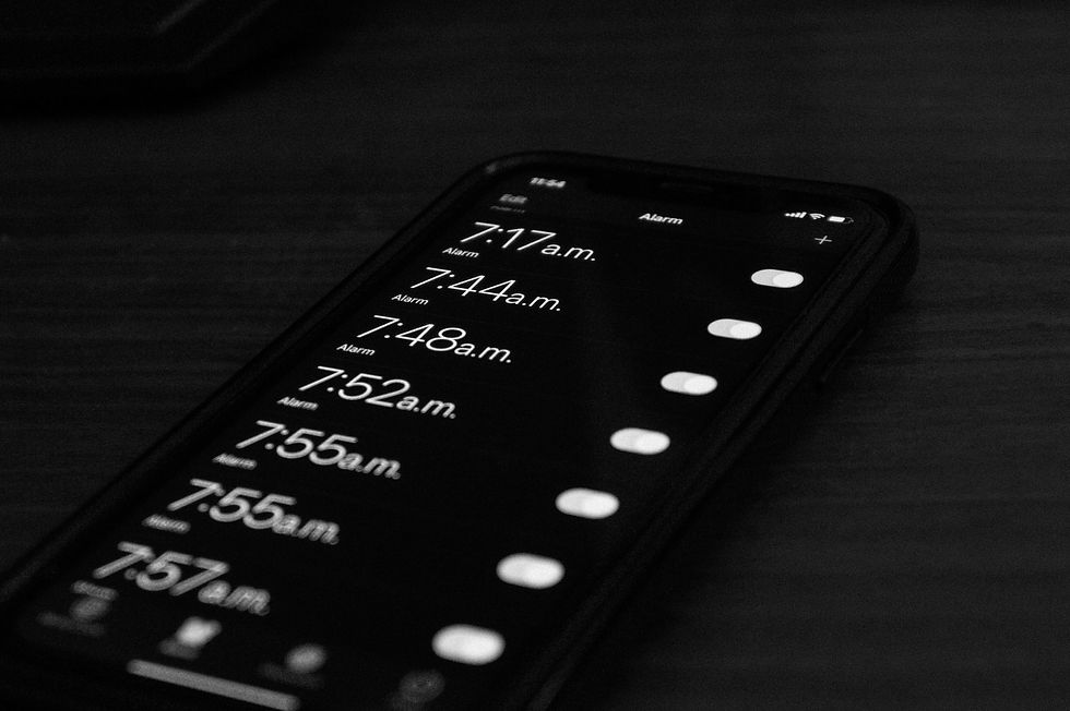
Left-aligned (flush left/ragged right): the most natural alignment for left-to-right languages. Easy to read, comfortable, modern
REAL WORLD EXAMPLE
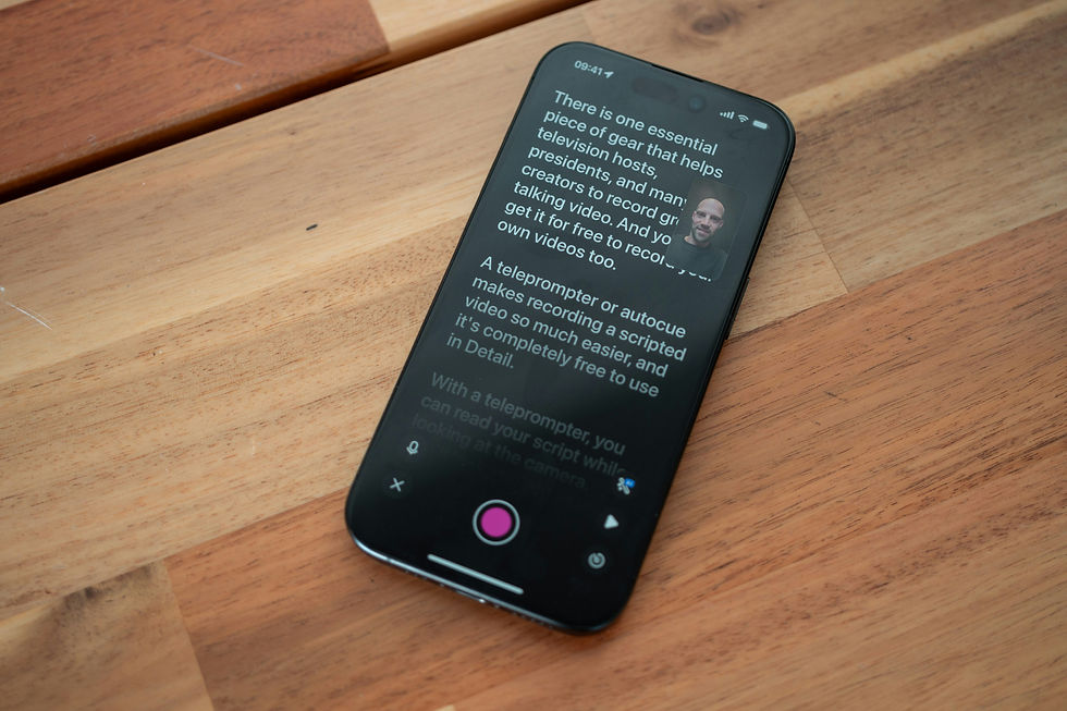
Open any chat app. Every message starts from the left edge. Every email starts from the left edge. Every article on your phone starts from the left. That's left-alignment — text starting from a clean, straight left edge, with the right side ending naturally wherever each line's words run out (the "ragged" right). It's the most natural alignment for languages read left-to-right because your eye always knows exactly where the next line starts — at the left edge. There's no hunting, no adjustment. It's the default alignment of the internet, of mobile apps, of modern design. If you're ever unsure which alignment to use, left-aligned is the safe choice. It's the typography equivalent of a white shirt — always appropriate, always readable, never a mistake.
2
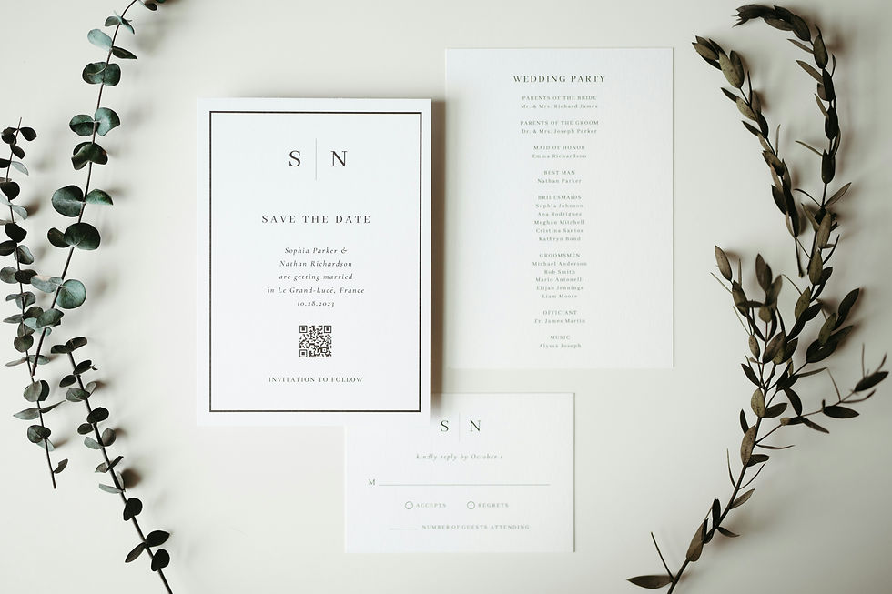
Centred: text is balanced around a central axis. Feels formal, ceremonial, elegant. Works for short text (titles, invitations) but is hard to read in long blocks
REAL WORLD EXAMPLE
Think of every school annual day programme you've received. The school name is centred. "Annual Day Celebration" is centred. The date and venue are centred. It feels formal, symmetrical, ceremonial — because centred alignment treats both sides equally, like a stage with the curtain in the middle. For a title or a formal announcement, it's perfect. But now imagine reading an entire newspaper article that's centred — every line a different length, your eye bouncing left and right trying to find the start of each new line. Exhausting. Centred alignment breaks down for long text because the starting position changes with every line and your eye loses its anchor. Short and formal = centred. Long and readable = never centred. That's the rule.
3
Justified: text fills both left and right edges evenly. Creates a clean block shape. Used in books and newspapers. Risk: can create uneven word-spacing (called "rivers")

REAL WORLD EXAMPLE
Pick up any novel from your bookshelf. Look at the text block — both the left edge AND the right edge are perfectly straight. That's justified alignment. The computer (or the typesetter) stretches the word-spacing in each line so that both edges are flush. It creates a beautiful, clean rectangular block of text — which is why books, newspapers, and formal documents love it. But there's a risk: when a line has few long words, the spaces between them get stretched wide, creating ugly gaps. When these gaps line up across multiple lines, they create vertical white streaks running down the page called "rivers." Good justified text requires careful attention to word-spacing and sometimes manual hyphenation. Bad justified text has rivers everywhere and looks worse than left-aligned.
4
Consistent alignment throughout a design creates visual order and cohesion

REAL WORLD EXAMPLE
Open a well-designed app — say, Notion or any clean productivity tool. Every text element on every screen shares the same alignment: left-aligned. The heading is left-aligned. The paragraph below it is left-aligned. The button label is left-aligned. The list items are left-aligned. Everything snaps to the same invisible left edge. It feels ordered, clean, intentional — like a well-made bed. Now think of that one classmate's project poster where the title was centred, the subtitle was left-aligned, the bullet points were right-aligned, and the bottom text was centred again. It felt chaotic — like someone moved the furniture around in the dark. Consistency of alignment is one of the simplest ways to make any design feel professional. Pick one alignment and commit. If everything shares an edge, the design holds together.
5
Consistent alignment throughout a design creates visual order and cohesionMixing alignments within a design creates visual tension — sometimes intentional, often accidental and messy
REAL WORLD EXAMPLE
Some designers deliberately mix alignments to create energy — a centred title over a left-aligned paragraph over a right-aligned caption. When done with intent, it creates dynamic visual tension that feels designed and purposeful. When done accidentally — because the student didn't think about alignment at all — it creates the visual equivalent of wearing stripes with checks. You can tell the difference immediately. Intentional mixed alignment has clear logic: each element's alignment serves a reason. Accidental mixed alignment feels random — elements drifting without connection. The test is simple: if someone asks "why is this centred and the rest is left-aligned?" and you can answer, it's intentional. If you shrug, it's accidental. And accidental mixing is one of the fastest ways to make a design look amateur.

6
Every text element in a professional design is aligned to something — nothing is "just placed randomly"
REAL WORLD EXAMPLE
Open any page on Amazon's app. Look carefully. The product name, the price, the star rating, the "Add to Cart" button, the delivery estimate — every single text element shares an alignment edge with at least one other element. Nothing floats. Nothing sits alone. Everything is connected to an invisible grid. This invisible structure is what makes the page feel organised despite showing enormous amounts of information. A professional designer can look at any screen and trace the alignment edges like an X-ray — "this aligns with that, which aligns with that." The moment you place something randomly — offset from every other element, aligned to nothing — the eye registers it as a mistake, even if the viewer can't explain why. In professional design, every placement is a decision.

7
Alignment works together with grids — in professional layout, text aligns to a grid system that ensures consistency

REAL WORLD EXAMPLE
Imagine a city where the streets are laid out in a perfect grid — Mumbai's Fort area or Chandigarh's sectors. You always know where you are. You can find anything because the system is consistent. Now imagine a city where every road was built without a plan — twisting, random, inconsistent. That's the difference between a design built on a grid and one built randomly. Professional designers start every project by setting up an invisible grid — columns and margins that text and images snap to. The grid is the city plan. Alignment is how each building follows that plan. Together, they create visual order so strong that a viewer can navigate a complex page without confusion. Every website you've ever found easy to use was built on a grid.
8
On mobile screens, left-alignment dominates because it's the most comfortable for reading on small devices
REAL WORLD EXAMPLE
Your phone screen is narrow — roughly 375 pixels wide. At that width, every typographic decision matters more. Centred text bounces the start of each line to a different position, making your eyes work harder. Justified text creates uneven word-spacing that looks terrible at narrow widths. Right-aligned text makes the starting position unpredictable. Left-alignment wins on mobile because it gives your eye a fixed anchor point: every line starts in the same place. No hunting, no adjusting, no effort. Apple, Google, Samsung, Amazon, Netflix, Instagram, WhatsApp — look at the main body text in any of these apps. Left-aligned. All of them. On a small screen, readability isn't a preference — it's survival. And left-alignment is the survivor.
Pro Connection
Designers say “align to the left margin” or “everything should share an edge.” UI design systems specify alignment rules for every text element. When a creative director says “the layout feels off,” the first thing they check is alignment. In professional typography, nothing floats without a reason — every element is connected to an invisible structure through alignment.
PROFESSIONAL TERMINOLOGY
CLICK TO REVEAL and CLICK TO COVER
How text is positioned relative to an invisible edge — left, right, centred, or justified
What is
ALIGNMENT
Text starts from a straight left edge with a ragged right edge — the most natural and readable alignment
What is
LEFT-ALIGNED
Text aligns to the right edge with a ragged left edge — used for stylistic effect
What is
RIGHT-ALIGNED
Text is balanced around a central axis — formal and elegant for short text, poor readability for long text
What is
CENTRED
Text fills both edges evenly creating a clean block shape — used in books and formal documents
What is
JUSTIFIED
When text aligns cleanly to an edge — "flush left" means the left edge is perfectly straight
What is
FLUSH
When one edge of text is uneven (not aligned) — natural and organic
What is
RAGGED
THE HIERARCHY MAP
Right now, a screen is shouting at you, talking to you, and whispering at you — all at once. Can you tell who's who?
what TO DO
Open any app or website on your phone.
Find exactly 3 levels of text hierarchy: Level 1 — the HEADING (biggest and boldest), Level 2 — the BODY (the main content), Level 3 — the CAPTION (the smallest detail).
Take a screenshot.
Repeat with a second, different app.
Ask yourself: which app has clearer hierarchy? Which one makes it easiest to know where to look first?
CHALLENGE
DISCOVERY
You can use these SOFTWARES for this Discovery Challenge
FREE SOFTWARE : Phone Screenshot, Google Keep, Markup / Photos Editor
PAID SOFTWARE : GoodNotes 6, Notability