
VISUAL SYSTEM
What if the reason your favourite brand feels the same everywhere — app, website, shop, packaging — is that someone designed an invisible system that ties it all together?
CORE CONCEPT
IMPORTANCE OF VISUAL SYSTEM
KEY KNOWLEDGE
1
A visual system = consistent rules about balance, contrast, and hierarchy applied across multiple pieces

REAL WORLD EXAMPLE
Think of your school uniform. The shirt colour, the trouser shade, the belt, the shoes, the tie — someone decided all of these once, and now every student follows the same set of rules every day. One student alone looks neat. Five hundred students together look like they belong to something. That's a visual system — not one great outfit, but one set of rules that makes everything feel connected. Swap the tie colour on just one student and your eye catches it immediately. That's the system doing its job.
2
Brands use visual systems: consistent colours, fonts, spacing, and layout rules across all touchpoints

REAL WORLD EXAMPLE
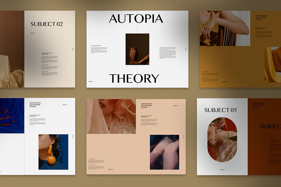
Close your eyes and think of Amul. The red logo, the polka-dot dress on the Amul girl, the white and yellow butter packaging, the hand-drawn topical ads with the same cartoon style for decades. Now think of Zomato — the red colour, the playful font, the witty one-liners, the same tone whether it's a push notification, a billboard, or an Instagram post. You recognise them before reading a single word. That's not luck — it's a visual system repeated so consistently that the brand lives in your memory as a feeling, not just a name.
3
A strong system makes everything feel connected and professional

REAL WORLD EXAMPLE
Imagine a school that has the same logo on the gate, the diary, the ID card, the website, and the annual day banner — same colours, same font, same placement. Without thinking about it, you trust that school more. It feels organised. Now imagine another school where the gate has one logo, the diary has a different one, the website uses completely different colours, and the annual day banner looks like it was designed by someone who never saw any of the other materials. Same quality of teaching, maybe — but one feels professional and the other feels like it's still figuring things out.
4
A weak system feels random and amateur — nothing relates to anything else

REAL WORLD EXAMPLE
You've seen that one restaurant — the menu card is pink with a cursive font, the signboard outside is green with block letters, the takeaway bag is plain white with a rubber stamp, and the Instagram page uses stock photos that look nothing like the actual food. Every piece was designed separately, by different people, with no rules connecting them. Each individual piece might be "okay" — but together they feel like five different restaurants pretending to be one. That confusion is what happens when there's no system.
5
Even a social media feed has a visual system (or should)
REAL WORLD EXAMPLE
Open Instagram and find that one account where every post looks like it belongs on the same page — same filter, same border, same colour tone, same text style. You scroll through it and it feels like flipping through a magazine. Now find an account that posts a meme, then a blurry selfie, then a motivational quote on a neon background, then a dark photo of food. Same number of posts — but one looks like a brand and the other looks like a shared family phone. The feed is the portfolio, and the system is what makes it feel intentional.

6
Visual systems scale: they work on a single poster, across a website, through an entire brand
REAL WORLD EXAMPLE
Think of the Indian Railways. The same font on a platform sign in Mumbai works on a ticket printed in Varanasi, on the reservation chart stuck to a coach in Chennai, and on the IRCTC website you open in your bedroom. One system — stretched across thousands of stations, millions of tickets, one website, and it still holds. That's the power of a visual system: design the rules once, and they work whether you're printing one poster or running the largest rail network in Asia.

7
Thumbnail sketches help explore system options quickly before committing

REAL WORLD EXAMPLE
Before an architect builds a house, they scribble twenty tiny drawings — rough, ugly, the size of a matchbox — trying out different layouts. Before a filmmaker shoots a scene, they sketch quick storyboards on paper. Before a designer finalises a poster, they draw six rough versions the size of postage stamps. These thumbnail sketches aren't meant to be pretty. They're meant to be fast — a way to test ten ideas in the time it takes to polish one. The worst mistake in design is falling in love with your first idea before seeing what else is possible.
8
What if the difference between a collection of nice work and a PORTFOLIO is simply: a visual system connecting it all?
REAL WORLD EXAMPLE
Imagine two students submitting project files at the end of the year. One has ten good assignments — but each on different coloured paper, different handwriting sizes, no title page, no consistent layout. The other has the same ten assignments — but every page has a neat border, the same title format, the same colour of ink for headings, and a cover page that ties it all together. The work inside might be identical. But the second file looks like it was made by someone who takes their craft seriously. The system didn't improve the work — it transformed how the work was received.
Pro Connection
Brand designers create “brand guidelines” or “design systems” that specify how everything should look. UI designers build coded design systems (like Google’s Material Design). This is the highest level of visual literacy: understanding how entire visual worlds are built.
PROFESSIONAL TERMINOLOGY
CLICK TO REVEAL and CLICK TO COVER
Consistent design rules applied across multiple pieces — creating cohesion and recognition
What is
VISUAL SYSTEM
The specific arrangement of elements on a page, screen, or space
What is
LAYOUT
A tiny, quick sketch exploring layout ideas before creating the final version
What is
THUMBNAIL SKETCH
Applying the same rules across pieces so they feel connected
What is
CONSISTENCY
A structured discussion analysing what works and what could improve
What is
CRITIQUE
THE MIRROR TEST
Some things want to be perfectly balanced — others want to surprise you. Which kind of world do you live in?
what TO DO
Look around the space you are in right now.
Find ONE thing that is SYMMETRICAL — if you drew a line down the middle, both halves would look the same. (A door, a window, a face, a clock.)
Find ONE thing that is ASYMMETRICAL — one side is different from the other. (A bag thrown in a corner, a plant leaning to one side, a photo on a wall.)
Take a photo of each.
Show your two photos to a friend or family member. Ask them: which one feels calm? Which feels more interesting or alive?
CHALLENGE
DISCOVERY
You can use these SOFTWARES for this Discovery Challenge
FREE SOFTWARE : Phone Screenshot, Phone Camera, Canva, Google Keep
PAID SOFTWARE : Canva Pro, Adobe Express Premium