
TEXTURE, MATERIAL & SURFACE
What if you could feel a design with your eyes? Smooth, rough, warm, cold, soft, hard — every surface tells a story before you touch it.
CORE CONCEPT
IMPORTANCE OF TEXTURE, MATERIAL & SURFACE
KEY KNOWLEDGE
1
Texture = the visual and tactile quality of a surface — how it looks and how it would feel to touch

REAL WORLD EXAMPLE
Close your eyes and run your hand across your school bag. Now run it across your phone screen. Now across your shirt. Three completely different feelings: rough canvas, smooth glass, soft fabric. Even with your eyes closed, you know exactly what each surface is. That’s texture — the feel of a surface. But here’s the cool part: even when you CAN’T touch something (like a photo on screen), your brain remembers the feeling. A photo of a rough brick wall makes your brain “feel” roughness. Texture works through both touch AND sight.
2
Even on screens, texture communicates: a photo of a rough wooden table feels warm; a photo of polished steel feels cold and precise

REAL WORLD EXAMPLE
Look at two different phone cases online. One has a picture of warm, golden wood grain. The other has a picture of brushed steel. You haven’t touched either, but one already feels “warm and natural” and the other feels “cool and techy.” Your brain associates textures with temperatures and moods from years of experience. Designers know this: a restaurant website with wooden textures feels cosy; the same restaurant with steel textures feels modern. The texture tells you the vibe before you read a word.
3
Common textures and their feelings: smooth = modern/clean, rough = natural/authentic, soft = warm/cosy, glossy = sleek/premium, matte = subtle/sophisticated
REAL WORLD EXAMPLE
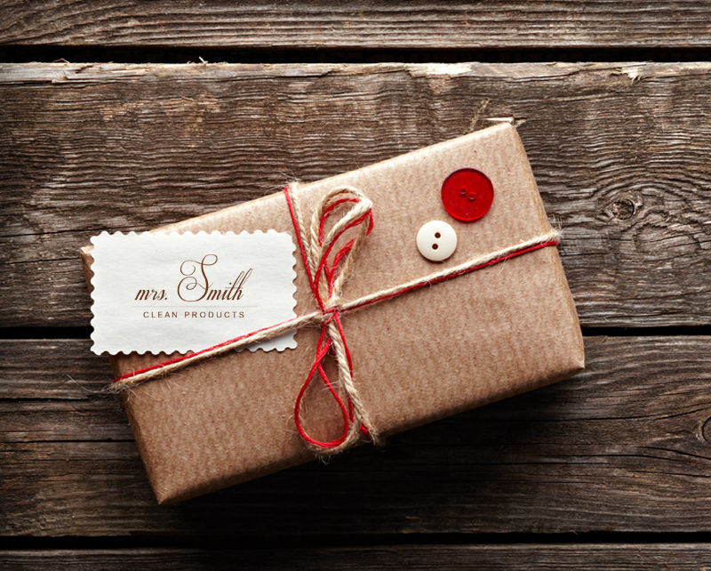
Think about chocolate packaging. A Cadbury Silk wrapper is glossy and shiny — it screams “premium, smooth, indulgent.” A handmade organic chocolate bar might come in rough, recycled-looking brown paper — it says “natural, honest, artisan.” Both are chocolate. But the texture of the packaging tells you a completely different story before you even taste it. Smooth and glossy = modern luxury. Rough and matte = authentic craft. Designers choose textures the way writers choose words — to set the mood.
4
Material choice defines personality: wood = warmth, concrete = rawness, glass = transparency, metal = precision, fabric = comfort, stone = permanence

REAL WORLD EXAMPLE
Walk into a coffee shop with exposed brick walls, wooden tables, and fabric cushions. It feels like a cosy living room. Now walk into a tech office with glass walls, steel furniture, and polished concrete floors. It feels like the future. The furniture could be the same shape in both places — but the materials completely change the personality. Material is the single biggest factor in how a space “feels.” It’s the difference between a warm hug and a firm handshake.
5
Texture adds depth to flat designs: using texture overlays, grain, or material photography makes 2D designs feel richer and more tactile
REAL WORLD EXAMPLE
Open Canva or any design app and look at templates. Some have a slight grainy, paper-like texture overlaid on the background. Others are perfectly smooth and flat. The textured ones feel handmade, artsy, and warm. The smooth ones feel digital, clean, and modern. That texture is just a transparent image of paper grain placed over the design — the content underneath is the same. But the texture layer adds a feeling of craft and depth that pure flatness can’t achieve.

6
Contrast in texture creates interest: a rough element on a smooth background stands out. Mixing textures (wood + metal, fabric + glass) creates richness
REAL WORLD EXAMPLE
Think about a beautifully plated dessert at a restaurant: a smooth, shiny chocolate mousse sitting on a rough cookie crumble base, drizzled with a glossy sauce, topped with a crunchy nut. The reason it looks amazing isn’t just colour — it’s the mix of textures: smooth against rough, shiny against matte, crunchy against soft. One texture alone is boring. Multiple textures together create visual and sensory richness. Design works the same way.
7
In spatial design, materials are one of the first decisions: they define how a space looks, feels, sounds, and even smells

REAL WORLD EXAMPLE
A temple made of sandstone feels and sounds different from a temple made of marble. The sandstone absorbs sound — it’s warm, quiet, and earthy. The marble reflects sound — it’s cool, echoey, and grand. Both are temples, but the material changes EVERYTHING: the look, the feel, the sound of your footsteps, even the temperature. When architects choose materials, they’re not just choosing a colour — they’re choosing an entire sensory experience.
8
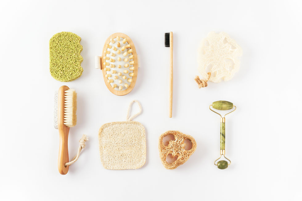
Sustainability is increasingly influencing material choices: natural, recycled, and eco-friendly materials are becoming a design priority
REAL WORLD EXAMPLE
Many new cafes and restaurants now use bamboo straws instead of plastic, reclaimed wood for tables, and recycled metal for light fixtures. These aren’t just environmental choices — they’re DESIGN choices. Bamboo and reclaimed wood have beautiful natural textures that make the space feel authentic and responsible. Brands like Fabindia build their entire identity around natural, handwoven materials. Sustainable material choices are becoming a design statement: “We care about the planet AND we look good doing it.”
Pro Connection
Interior designers create material palettes: boards showing samples of all the materials and textures planned for a space. Product designers choose materials that match the brand personality: an eco brand uses recycled materials; a tech brand uses aluminium and glass. Even UI designers use texture cues: a button with a subtle shadow and gradient feels “pressable” because it mimics physical material qualities.
PROFESSIONAL TERMINOLOGY
CLICK TO REVEAL and CLICK TO COVER
The visual and tactile quality of a surface — how it looks and how it feels (or would feel) to touch
What is
TEXTURE
The physical substance a thing is made from — wood, metal, glass, fabric, stone, plastic, concrete, etc.
What is
MATERIAL
The outer layer of any object or space — what you see and touch
What is
SURFACE
Relating to the sense of touch — a tactile surface invites you to feel it
What is
TACTILE
A surface that absorbs light rather than reflecting it — feels soft and understated
What is
MATTE
A surface that reflects light — feels sleek, polished, and premium
What is
GLOSSY
THE DIMENSION SWITCH
Architects live inside this challenge every single day — translating a flat drawing into a space you can walk through. Today you try it yourself, with a pencil and your phone.
what TO DO
Choose any room you're currently in or know very well.
Draw a simple floor plan (the 2D view from directly above): show the walls as lines, the furniture as simple shapes, and the doors as gaps. Rough sketching is completely fine — it doesn't need to be precise.
Take a photo of the same room from a corner (the 3D view as your eyes see it).
Compare your 2D drawing with your 3D photo.
Ask yourself: what does the plan show that the photo doesn't? What does the photo capture that the plan misses?
what TO SUBMIT
1 Drawing + 1 Photo | Your hand-drawn floor plan (photographed or scanned) and your 3D corner photo of the same room. |
Text | "The plan shows [specific information — layout, distances, arrangement] that the photo doesn't." "The photo captures [specific information — atmosphere, height, texture, light] that the plan misses." Then: "Moving between 2D and 3D thinking is useful for designers because [observation]." |
CHALLENGE
DISCOVERY
You can use these SOFTWARES for this Discovery Challenge
FREE SOFTWARE : Phone Camera, Snapseed, Google Keep, Canva
PAID SOFTWARE : Halide Mark II, VSCO Membership