
MOOD THROUGH LIGHT & COLOUR
Colour sets the emotion. Light sets the atmosphere. Together, they create the mood of everything you see.
CORE CONCEPT
IMPORTANCE OF MOOD THROUGH LIGHT & COLOUR
KEY KNOWLEDGE
1
Mood = the total emotional atmosphere created by the combination of colour and light working together
REAL WORLD EXAMPLE
Think of the last time you walked into a space and felt an immediate emotion — before anyone spoke, before you read any sign, before you consciously noticed anything. A warm café with amber lights and brown wood: "comfort." A bright hospital corridor with cool white LEDs and pale blue walls: "clinical calm." A dark restaurant with candles and deep red walls: "romance." That instant feeling IS mood — and it's created by colour and light working together as a single system. Neither colour alone nor light alone creates the complete mood. It's always the combination.
2
Colour provides the emotional association. Light provides the atmospheric quality. Together they create the complete mood
REAL WORLD EXAMPLE
Take the colour blue. On its own, it suggests calm, trust, melancholy. Now light that blue two different ways. Blue wall + soft warm candlelight = intimate, cozy, jazzy evening. Blue wall + harsh cool fluorescent = sterile, clinical, institutional. The blue provided the emotional base note. The light shaped how that note plays. Together, they created two completely different moods from the same colour. This is why mood-building is always a two-variable equation: colour × light = mood. Change either variable and the mood changes.
3
Warm colour + soft light = comfort, nostalgia, intimacy, romance

REAL WORLD EXAMPLE
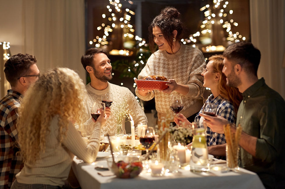
Picture a grandmother's living room during Diwali. Warm saffron curtains. Soft golden light from oil lamps and string lights. Terracotta-toned cushions. The warm colours say "home, love, tradition." The soft light says "gentle, embracing, intimate." Together they create a mood so powerful it becomes a core memory. That's warm colour + soft light. It's the mood of every nostalgic flashback in every Indian film. It's the mood of old family photos. It's the mood that makes you feel safe. Filmmakers recreate it because it triggers an emotion that exists in every human: the warmth of being held.
4
Warm colour + hard light = energy, excitement, heat, tension

REAL WORLD EXAMPLE
Think of a midday street scene in Rajasthan — bright, harsh sun overhead, casting hard shadows on vivid orange and red buildings. The colours are warm and energetic. The light is intense and unforgiving. Together, the mood is: heat, energy, almost aggressive vitality. It's exciting but not relaxing. It's the mood of a busy bazaar, not a quiet living room. Action filmmakers love this combination — a chase scene through warm-coloured streets under hard sunlight feels tense and kinetic. The same warm colours under soft light would feel like a holiday photo. Hard light turns warmth into heat.
5
Cool colour + soft light = calm, serenity, sadness, dreamy
REAL WORLD EXAMPLE
Imagine a bedroom at dawn — pale blue walls, cool white sheets, soft greyish light filtering through sheer curtains. Everything is quiet. Cool. Barely awake. The blue says "calm, peace, melancholy." The soft light says "gentle, diffused, distant." Together, the mood is serene — almost dreamlike. It's the mood of rainy afternoon scenes in films. The mood of a hospital room that's trying to feel peaceful. The mood of the sea at dusk. Cool colour + soft light creates a mood that's beautiful but tinged with sadness — like a memory that's already fading as you experience it.

6
Cool colour + hard light = clinical, technology, precision, cold
REAL WORLD EXAMPLE
Picture a sci-fi movie's laboratory scene: stark blue-white LED lighting, steel-grey walls, hard shadows from overhead panels, everything precise and angular. The cool colours say "technology, sterility, control." The hard light says "harsh, unforgiving, revealing." Together, the mood is cold precision — no warmth, no comfort, no human softness. This is the mood of operating theatres, data centres, and futuristic movie sets. When a brand wants to feel "cutting-edge tech," they use this combination: cool colours under hard, precise lighting. It says "we are the future" — efficient, powerful, and intentionally inhuman.

7
Saturated colour + bright light = vibrant, youthful, energetic, commercial

REAL WORLD EXAMPLE
Walk into a Chumbak store. Vivid colours everywhere — bright yellows, hot pinks, electric teals, saturated greens. Bright, even lighting that makes every colour pop at maximum intensity. The mood is immediately: fun, young, energetic, "I want to buy everything." That's saturated colour + bright light — the mood combination of choice for youth brands, children's spaces, festival décor, and commercial retail. It's impossible to feel sad in a fully saturated, brightly lit space. The combination is almost aggressively cheerful — which is exactly the point.
8
Desaturated colour + dim light = moody, atmospheric, artistic, reflective

REAL WORLD EXAMPLE
Think of a dimly lit independent café — the kind with exposed brick walls in muted browns, dusty sage-green plants, faded canvas art, soft amber bulbs at low wattage. Everything is desaturated and dim. The mood is: contemplative, artistic, "stay for three hours with your journal." It's the opposite of the Chumbak store — instead of energy, it creates reflection. Instead of urgency, it creates lingering. Film directors use this combination for introspective scenes: the protagonist sits alone in a dimly lit, muted room, processing a loss. The low saturation removes visual excitement. The dim light removes visual clarity. What remains is pure mood.
Pro Connection
When a creative director says “what’s the mood?” they’re asking about the combined effect of colour and light. When a cinematographer says “I want it warm and moody,” they’re directing both colour temperature and light quality. When an experience designer says “the entrance should feel calming,” they’re planning colour palette AND lighting design simultaneously. The ability to create and control mood through colour and light is the professional skill that connects every creative discipline.
PROFESSIONAL TERMINOLOGY
CLICK TO REVEAL and CLICK TO COVER
The overall emotional atmosphere of a visual — created by the combination of colour, light, shadow, and context
What is
MOOD
The general feeling or quality of a visual environment — shaped primarily by light and colour
What is
ATMOSPHERE
The overall, general light or colour environment — the base mood of a space or scene
What is
AMBIENT
An existing image or visual used to communicate the target mood of a project — widely used across all creative fields
What is
MOOD REFERENCE
The final adjustment of colour and light in photography/film to refine mood and create the intended emotional atmosphere
What is
COLOUR GRADING
A smooth transition from one colour or value to another — creates depth and atmospheric effects
What is
GRADIENT
THE LIGHT JOURNAL
The same object. The same room. Three different times. Three completely different worlds. One afternoon is all it takes to experience what photographers spend entire careers mastering.
what TO DO
Choose one object or space you can photograph multiple times throughout the day.
Photograph it under 3 different light conditions — choose from: morning light, midday light, evening light, window light, overhead artificial light, phone flashlight.
Keep the framing and angle as similar as possible in each shot — only the LIGHT should change.
Compare all three. Notice how the mood, texture, and depth change with each light condition.
Label each photo with the light source/time and a mood word.
what TO SUBMIT
3 Photos | The same object or space photographed under 3 different light conditions. Label each with the light type (e.g. "morning window light," "midday overhead," "phone flashlight"). |
Text | For each photo: "[Light condition] — mood: [word or phrase] — what the light does to the subject: [observation]." Then: "My favourite light is [condition] because [reason]." |
CHALLENGE
DISCOVERY
You can use these SOFTWARES for this Discovery Challenge
FREE SOFTWARE : Phone Camera, Snapseed, Adobe Lightroom Mobile, Google Keep
PAID SOFTWARE : Adobe Lightroom Premium, VSCO Membership