
ACCESSIBILITY
What if designing for someone who can’t see, hear, or move the way you do made your design better for EVERYONE?
CORE CONCEPT
IMPORTANCE OF ACCESSIBILITY
KEY KNOWLEDGE
1
Accessibility = designing so people of all abilities can use, understand, and enjoy what you’ve created

REAL WORLD EXAMPLE
Your favourite YouTube video has subtitles. That means a deaf viewer can enjoy it too. It also means YOU can watch it in a noisy bus or when your earphones break. Accessibility isn’t a separate, special version of design — it’s good design that works for more people in more situations, including you.
2
Disability can be permanent (blindness), temporary (a broken arm), or situational (bright sunlight)

REAL WORLD EXAMPLE
A permanently blind person uses a screen reader every day. A student with a broken arm can’t type for six weeks. You, on a sunny day, can’t see your phone screen. All three need the same design solution: bigger text, voice control, and high contrast. Disability isn’t just about permanent conditions — it’s about situations anyone can be in.
3
Accessible design helps everyone, not just people with disabilities: ramps, subtitles, voice control, large text — all benefit wider audiences
REAL WORLD EXAMPLE
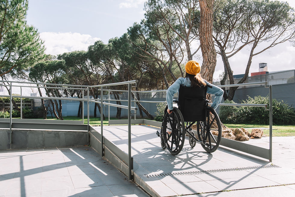
Ramps were built for wheelchairs. But watch who actually uses them: parents with prams, travellers with suitcases, delivery people with trolleys, skateboarders, elderly people with walking sticks. A solution designed for 5% of users ended up being used by 50%. That’s the beautiful secret of accessible design — it helps everyone.
4
Key areas: visual (colour contrast, text size, alt text for images), auditory (subtitles, visual alerts), motor (easy-to-tap buttons, keyboard navigation), cognitive (clear language, simple layouts)

REAL WORLD EXAMPLE
Open any app and do a quick check: Can your grandparent read the text? (Visual.) Can you understand it with the sound off? (Auditory.) Can you use it with just one thumb? (Motor.) Can a 10-year-old figure out what to do? (Cognitive.) If yes to all four, the app is well-designed for accessibility. Most apps fail at least one of these.
5
About 15–20% of the world’s population has some form of disability — ignoring accessibility excludes a massive audience
REAL WORLD EXAMPLE
In a class of 40 students, that’s 6–8 students who have some form of disability — maybe poor eyesight, colour blindness, dyslexia, or a motor difficulty. If your design doesn’t work for them, you’ve excluded 6–8 people in every classroom. Scale that to a city, a country, a world — and you’re excluding over a billion people.

6
Many accessibility features are now mainstream: dark mode, voice assistants, text-to-speech, zoom, subtitles
REAL WORLD EXAMPLE
You probably use dark mode because it looks cool and saves battery. You use voice typing because it’s faster. You turn on subtitles because you’re watching in bed and don’t want to wake anyone. All of these features were originally designed for people with disabilities — and now they’re features EVERYONE loves. Accessibility drives innovation.

7
Accessibility isn’t a nice-to-have — in many countries, it’s a legal requirement for websites and public services

REAL WORLD EXAMPLE
In many countries, if a government website can’t be used by a blind person with a screen reader, it’s breaking the law. Banks, hospitals, and public transport systems must be accessible. This isn’t just kindness — it’s law. And for good reason: public services should serve ALL the public, not just those who can see, hear, and move easily.
8
What if every design decision included the question: “Can everyone use this?” The world would be a more inclusive place

REAL WORLD EXAMPLE
Before you finalise any creative work, ask five words: “Can everyone use this?” Can someone with poor eyesight read it? Can someone with one hand tap the buttons? Can someone who doesn’t speak English understand the icons? If the answer is no, you haven’t finished designing. Those five words turn a good designer into a great one.
Pro Connection
UX designers follow accessibility guidelines (like WCAG). Architects design accessible buildings (ramps, elevators, tactile paving). Brand designers ensure colour contrast meets accessibility standards. When a designer says “this doesn’t pass accessibility,” they mean it excludes people — and needs to be fixed.
PROFESSIONAL TERMINOLOGY
CLICK TO REVEAL and CLICK TO COVER
Designing so people of all abilities can use and enjoy what you've created — no one excluded
What is
ACCESSIBILITY
A design philosophy that considers the full range of human diversity from the very beginning
What is
INCLUSIVE DESIGN
A written description of an image that screen readers can read aloud for people who can't see the image
What is
ALT TEXT
The measured difference between text colour and background colour — higher ratios are more readable for everyone
What is
CONTRAST RATIO
Design that works for the widest possible range of people without needing special adaptation
What is
UNIVERSAL DESIGN
THE ACCESSIBILITY AUDIT
One app. Three tests. Can you read it? Can you hear it? Can you use it one-handed? Professional audit complete.
what TO DO
Pick any app or website.
Test it for accessibility by trying these 3 things:
Test 1 (Visual): Can you read all the text comfortably? Is the contrast high enough? Is the text large enough?
Test 2 (Audio): Mute the sound completely. Can you still understand everything? Are there subtitles or visual cues for anything audio?
Test 3 (Motor): Try using the app with one hand only — can you reach all the important buttons? Is anything awkwardly placed?
Write what works and what doesn't for each test. Then write one improvement idea for the weakest test result.
CHALLENGE
DISCOVERY
You can use these SOFTWARES for this Discovery Challenge
FREE SOFTWARE : Phone Screenshot, Accessibility Scanner (Android), Google Keep, Chrome Browser
PAID SOFTWARE : GoodNotes 6, Notion