
BUILDING A COLOUR PALETTE
CORE CONCEPT
IMPORTANCE OF BUILDING A COLOUR PALETTE
KEY KNOWLEDGE
1
A working palette has 3–5 colours with clear roles: dominant, supporting, and accent

REAL WORLD EXAMPLE
Look at any well-designed brand you admire — say, Boat (the audio brand). Their palette isn't 15 random colours. It's about 4: black (dominant — edgy, bold), white (supporting — clean contrast), red (accent — energy, youth), and dark grey (supporting — depth). Each colour has a job. Black sets the mood. White gives it air. Red makes your eye land on the buy button. Dark grey fills in the details. Four colours, four roles, one unified feeling. That's the professional palette structure: few colours, clear roles, maximum impact.
2
The dominant colour occupies the most space and sets the overall mood
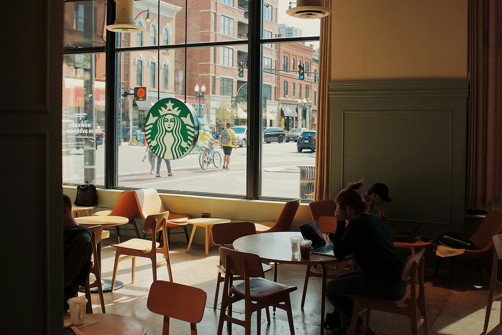
REAL WORLD EXAMPLE
Walk into any Starbucks. Before you see the menu, the logo, or the barista — you feel the brown. Warm wood walls. Brown leather chairs. Earthy toned counters. Brown is the dominant colour, and it sets the mood before you've consciously registered anything: warmth, comfort, earthiness, "stay a while." If the same store were dominated by white, it would feel clinical. Dominated by red, it would feel urgent. The dominant colour isn't just the most visible — it's the emotional thermostat of the entire space.
3
Supporting colours complement or contrast the dominant — they add depth and variety without competing

REAL WORLD EXAMPLE
In that same Starbucks, notice the supporting colours: warm cream on the walls, forest green on the apron and logo, soft white on the cups. None of them fight the brown. The cream warms the brown further. The green adds natural freshness. The white gives breathing space. Supporting colours are like backup singers in a band — they make the lead sound fuller and richer without ever stealing the spotlight. A palette without supporting colours feels flat and monotonous. A palette where supporting colours are too loud feels chaotic.
4
The accent colour is used sparingly — for highlights, buttons, calls-to-action, or features. It’s the “spark”

REAL WORLD EXAMPLE
On almost every e-commerce website you use, the "Buy Now" or "Add to Cart" button is a different colour from everything else on the page. Amazon's is orange. Flipkart's is yellow. Myntra's is pink. That button is the accent colour — used once, used small, but impossible to ignore. It's the reason your eye goes straight to it. If the entire page were that colour, nothing would stand out. The accent is powerful precisely because it's rare. It's the chilli flake on a pizza — a tiny hit that changes the entire experience.
5
Start with intent: what feeling should the palette create? Then choose colours that deliver that feeling
REAL WORLD EXAMPLE
A student is designing an invite for a college music fest. Before picking colours, they ask: "What should people FEEL when they see this?" Answer: energetic, young, loud, exciting. That intent immediately rules out pastels, muted tones, and cool blues. It points toward: vivid magentas, electric yellows, bold blacks. Now compare: a student designing an invite for a meditation retreat asks the same question. Answer: calm, peaceful, grounded. That points to: soft sage greens, warm off-whites, muted terracotta. Same design task. Completely different palettes. The difference was asking the intent question first.

6
Colour wheel relationships guide the selection, but observation and instinct refine it
REAL WORLD EXAMPLE
A designer knows from the wheel that blue and orange are complementary — high contrast, bold energy. But which blue? Navy? Sky? Teal? And which orange? Tangerine? Amber? Rust? The wheel gives the direction. But the final choice comes from looking at the world, testing options, and trusting your instinct. A surf brand might pick bright turquoise and burnt orange (fresh, outdoor, young). A law firm might pick navy and amber (traditional, trustworthy, warm). Same wheel relationship, wildly different feel — because observation and instinct refined the generic into the specific.

7
Pulling a palette = extracting colours from a photograph, artwork, or environment that already has your target mood

REAL WORLD EXAMPLE
A student wants to create a poster that feels like "monsoon in Goa." Instead of guessing colours, they open their favourite monsoon photo — lush green paddy fields, dark grey sky, red laterite soil, white temple spire in the distance. They use an eyedropper tool to pull colours directly from the photo: deep forest green, storm grey, laterite red, soft white. Instantly, they have a palette that doesn't just look good — it feels like monsoon. This is colour extraction, and professionals do it daily. Why invent a mood when you can borrow it from a photo that already nails it?
8
Testing a palette means trying it in context — colours that look great as swatches may not work in a layout, a room, or on screen

REAL WORLD EXAMPLE
A designer picks a gorgeous palette: coral, teal, cream, and charcoal. On the swatch card, it looks stunning. Then they apply it to the actual poster — and the coral text on the cream background is nearly impossible to read. The teal heading on the charcoal section looks dull instead of vibrant. The swatches lied. Colours behave differently in context — size, proportion, background, and neighbouring colours all change how they feel. That's why every professional tests their palette in the actual layout before finalising. Swatches are auditions. The layout is the performance.
Pro Connection
In every creative profession, “define the palette” is one of the first project steps. Brand designers create palette documentation. Film directors approve colour palettes before shooting begins. UI designers build palettes into coded design systems. When someone says “this is off-palette,” they mean a colour has been used that breaks the system. Being able to build, present, and maintain a palette is a daily professional skill.
PROFESSIONAL TERMINOLOGY
CLICK TO REVEAL and CLICK TO COVER
The complete set of colours selected for a project, with each colour having a specific role
What is
COLOUR PALETTE
The main colour in a palette — occupies the most space and sets the emotional tone
What is
DOMINANT COLOUR
A colour that works alongside the dominant to add depth and variety
What is
SUPPORTING COLOUR
A colour used sparingly for emphasis, energy, and drawing attention
What is
ACCENT COLOUR
Pulling colours from an existing image, photograph, or environment to build a palette
What is
COLOUR EXTRACTION
A small sample of a colour — used to show and compare palette colours side by side
What is
SWATCH
When the colours in a palette work together to create a unified, pleasing effect
What is
COLOUR HARMONY
THE COLOUR DIARY
What if you already speak colour fluently — and one day of paying attention is all it takes to prove it?
what TO DO
For one full day, pay deliberate attention to colour choices around you.
Find 5 colour choices: a shop sign, an app icon, a food package, a piece of clothing, and a room or space.
For each one, write the colour name AND the feeling it gives you — keep it instinctive: "red, energetic" or "pale blue, calm."
Photograph or screenshot each colour choice you found.
CHALLENGE
DISCOVERY
You can use these SOFTWARES for this Discovery Challenge
FREE SOFTWARE : Phone Gallery, Coolors, Canva, Google Keep
PAID SOFTWARE : Adobe Capture, Palette Cam